
Put Research Before Opinions to Improve Website Conversions
Do not change a website because someone prefers a new design, shorter form, or brighter call to action. Research before opinions means finding real evidence of what users do, where they struggle, and what they need – then turning that evidence into a hypothesis you can test.
A practical starting point:
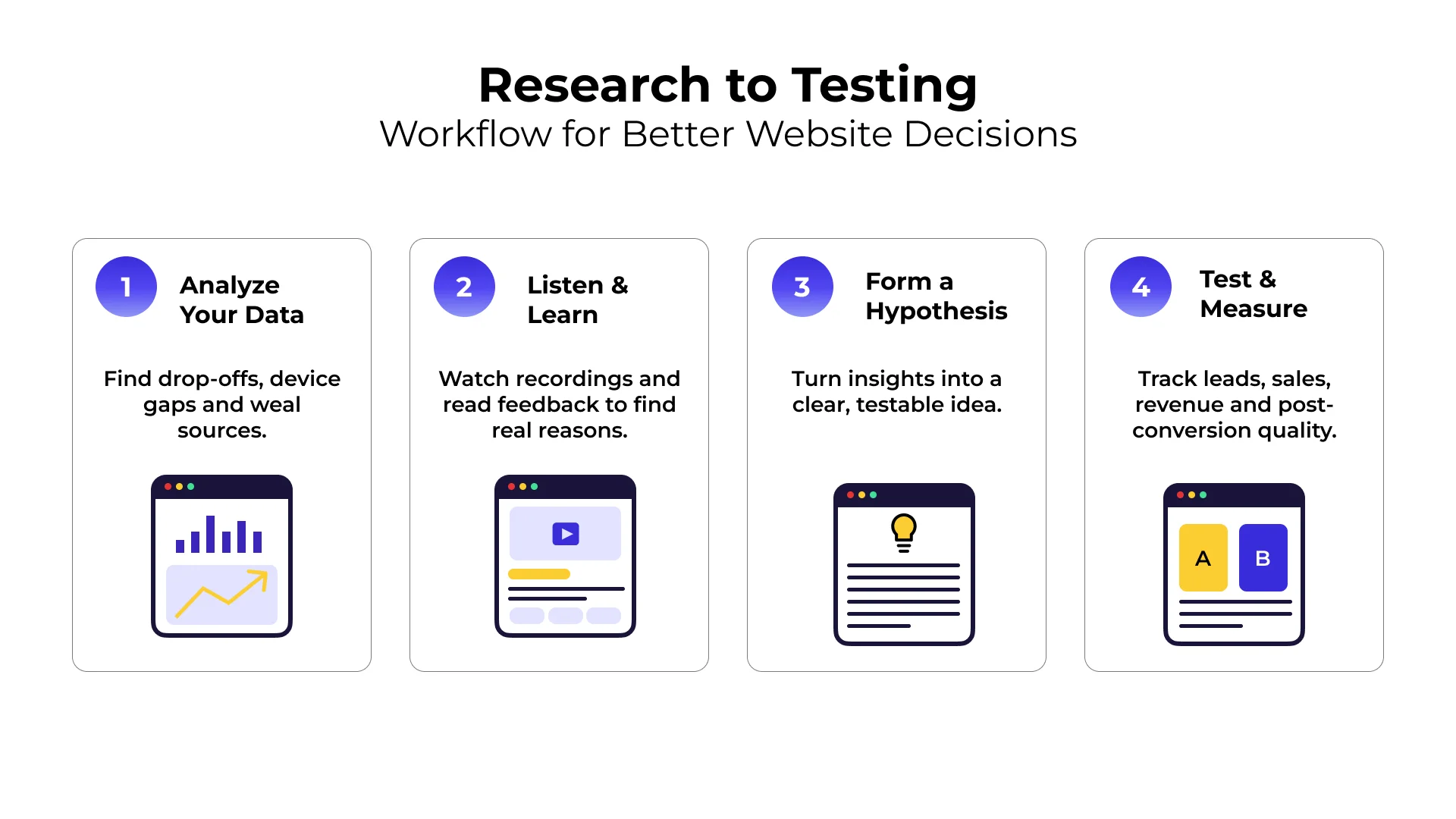
- Check analytics for funnel drop-off points, device differences, and weak traffic sources.
- Watch session recordings and read customer feedback to learn why people hesitate.
- Write a clear hypothesis, such as: “Reducing this form from eight fields to four will increase qualified leads.”
- Test the change and measure leads, sales, revenue, and post-conversion quality.
This approach helps teams reduce the risk of the HiPPO effect: decisions driven mainly by the highest-paid person’s opinion. A homepage redesign, CTA rewrite, or new navigation may sound promising, but until user behavior supports it, it remains an assumption.
At SiteTuners, our focus on Research before opinions. centers on replacing internal guesses with customer evidence and measurable website tests.
Why Teams Need Research Before Opinions for Better Results
Every day, business owners, marketing managers, and product leads sit in meetings and debate website designs. One person wants a minimalist layout. Another thinks the button should be orange. Someone else insists that removing the main navigation menu will increase landing page conversions.
These ideas might sound great in a conference room, but they are still just opinions. When teams act on subjective beliefs instead of evidence, they risk hurting performance or misallocating development resources.
Just as shoppers often evaluate details and compare options before buying, marketing teams can benefit from gathering user evidence before altering website layouts.
Consider these hypothetical scenarios illustrating how internal design assumptions can differ from actual user experiences:
- Hypothetical Assumption: “A video background on the hero section will make the brand look premium.”
Potential User Reality: In live testing or usability sessions, visitors might find the movement distracting, or heavy media assets may slow mobile loading. - Hypothetical Assumption: “Adding five more customer quotes will build trust.”
Potential User Reality: Users may scroll past generic praise when searching for concrete details like pricing, return terms, or delivery estimates. - Hypothetical Assumption: “Our audience prefers a modern single-page checkout.”
Potential User Reality: Mobile shoppers might experience confusion if accordion sections hide essential fields or validation errors.
When teams ground optimization efforts in visitor data, they can shift away from personal design preferences and focus on addressing verified user friction.
How Research Before Opinions Prevents Expensive Redesign Mistakes
Full website redesigns require significant time and resources. When teams treat a redesign purely as a visual update rather than an information system, new layouts can accidentally hide or remove details that visitors rely on to make decisions.
This happens when an executive feels the site looks dated and directs the team to focus on new styling while overlooking broken mobile filters, missing product specifications, or confusing calls to action.
Instead of relying on aesthetic assumptions, teams benefit from evaluating primary evidence from real visitor sessions and analytics. Research reveals what already works well on your current site so you do not break it during a visual refresh. It shows whether users leave because they cannot find shipping costs or because a checkout form asks for unnecessary information.
Turning Subjective Beliefs into Testable Hypotheses
Having an opinion is not inherently bad. Experienced marketers and designers develop useful instincts over time. The error happens when teams treat an instinct as a proven fact and roll it directly to all site traffic without validation.
A healthy conversion optimization process welcomes ideas from everyone, but it turns those ideas into testable hypotheses.
Consider this common situation:
- Opinion: “Our forms are too long. We should cut them down.”
- Evidence Review: Analytics show a sharp drop-off on the lead form. Session replays show visitors clicking into the “Annual Company Budget” field, hesitating, and leaving.
- Testable Hypothesis: “If we remove the non-essential budget field from the demo request form, form completion rates will increase without reducing sales-accepted leads.”
By structuring ideas this way, we shift the conversation from “Who has the best idea?” to “What does the data show, and how do we measure the outcome?”
Core Data Sources for Uncovering True User Friction
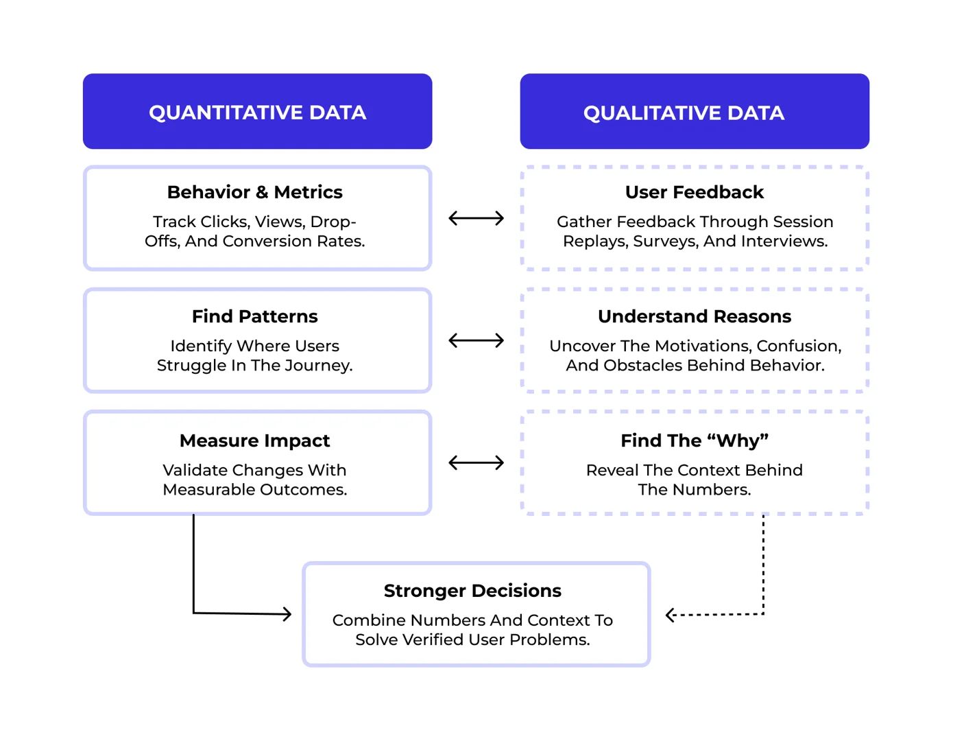
To build strong tests, we need both numbers and context. Quantitative data tells us where users struggle, while qualitative feedback reveals why they struggle.
| Research Method | Data Type | Primary Insight | Best Tool or Source |
|---|---|---|---|
| Funnel Analytics | Quantitative | Exact pages and steps where visitors drop off | Web Analytics Platforms |
| Device Segmentation | Quantitative | Performance gaps between desktop, tablet, and mobile | Analytics Reports |
| Heatmaps & Scroll Depth | Quantitative | How far users scroll and what elements get ignored | Behavior Mapping Tools |
| Session Recordings | Qualitative | Direct observation of hesitation, rage clicks, and broken elements | User Replay Software |
| Exit-Intent Surveys | Qualitative | Immediate reasons visitors give for leaving without buying | On-site Polls |
| Customer Support Logs | Qualitative | Recurring objections, confusing terms, and unmet expectations | Support Tickets & Live Chat |
Quantitative Analytics and Funnel Drop-off Points
Quantitative research starts with your analytics dashboard. Before deciding which pages to optimize, look at your traffic sources and high-level conversion paths.
Key areas to analyze include:
- Friction across devices: Does your mobile conversion rate lag behind desktop? If mobile visitors bounce heavily on product pages, the layout may hide essential specifications below the fold.
- Traffic source alignment: Are visitors from paid search ads bouncing immediately? The messaging on your landing page might not match the search intent of the ad copy.
- Micro-conversion drop-offs: Where do people leave in multi-step funnels? If shoppers frequently add items to the cart but drop off before checkout, your cart drawer might lack clear shipping and pricing summaries.
Thorough funnel analysis helps isolate friction points across different audience segments before drafting design changes.
Qualitative Feedback, User Surveys, and Session Recordings
Once you know where visitors are dropping off, you need to understand their intent and confusion. Quantitative tools can show that users leave a pricing table, but they cannot tell you that users found your tier descriptions vague.
Qualitative research fills these gaps through:
- Watching session recordings: Look for “rage clicks” where visitors repeatedly click unlinked images, or erratic scrolling where users search back and forth for basic details.
- Reviewing post-purchase and exit surveys: Ask customers what almost stopped them from buying. Their answers will expose missing information, payment concerns, or technical bugs.
- Auditing support tickets and chat transcripts: Search for recurring questions. If customers frequently ask your chat team about warranty terms, that information belongs front and center on your product page.
Building an Evidence-Based Testing Framework
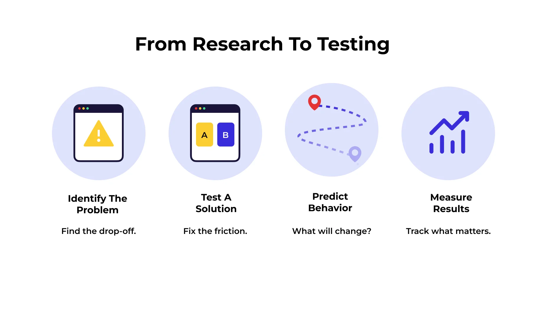
Once you gather user evidence, organize your findings into a prioritized testing plan. Random testing creates noise. A structured testing program systematically removes barriers and documents what works.
Using Research Before Opinions to Create Evidence-Based Hypotheses
Every experiment in your backlog should follow a standard framework:
- Problem Statement: Grounded in observed behavior (e.g., “Mobile visitors drop off at step two of checkout at a noticeably higher rate than desktop visitors”).
- Proposed Solution: A specific design or content adjustment addressing the root cause (e.g., “Display digital wallet buttons like Apple Pay at the top of the mobile checkout screen”).
- Expected Behavior: What the user will do differently (e.g., “Mobile shoppers will complete payment in fewer taps without typing billing addresses”).
- Primary and Secondary Metrics: What determines success (e.g., primary: mobile checkout completion rate; secondary: average order value and refund rates).
By following this flow, your team stays focused on measurable performance rather than personal taste.
Measuring Real Business Impact Beyond Surface Metrics
Conversion optimization is not just about increasing micro-clicks or short-term form submissions. A change that increases initial form fills by removing key qualifying questions might send lower-quality inquiries to your sales team.
Always measure downstream business outcomes:
- Lead Quality: Track whether new leads turn into qualified pipeline and closed revenue.
- Return and Refund Rates: Ensure clearer product page details reduce returns rather than just driving quick initial sales.
- Customer Lifetime Value: Monitor whether promotional copy attracts one-time bargain hunters or long-term high-value clients.
Frequently Asked Questions About Conversion Research
How do opinions differ from hypotheses in conversion rate optimization?
An opinion is a subjective preference based on personal taste or unverified assumptions (such as “I think we need a red button because red stands out”). A hypothesis is a structured, testable prediction backed by user data (such as “Based on survey responses stating return terms are unclear, adding a 30-day money-back guarantee badge near the checkout CTA will increase purchases”).
What is the fastest way to gather user evidence before a site redesign?
The fastest way is to review session replays of dropping-off visitors, analyze funnel reports across device categories, and deploy a simple one-question poll on your highest-traffic checkout or lead pages asking visitors what information they are missing.
Why do calls to action and forms fail when based solely on executive preferences?
They often fail because internal preferences prioritize company goals over user needs. Executives may want to collect extensive qualification data, resulting in ten-field forms that overwhelm mobile users. Evidence-based forms focus strictly on the minimal information needed to start a conversation, reducing cognitive friction.
Conclusion
Building a successful digital presence requires an evidence-driven culture. When teams prioritize research over internal assumptions, they stop debating subjective tastes and start solving real customer problems.
If your team is ready to identify conversion barriers and turn user insights into measurable revenue gains, consider scheduling a comprehensive conversion rate optimization review to pinpoint exactly where your site is losing qualified leads and sales.