
Recently Run Experiments
See recent wins from our happy clients
Explore the hypotheses, test variations, and measurable business impact generated through conversion optimization.
- Cart Drawer – adding trust – payment icons
- Global Navigation – change the link in the last position
- Product Detail Page – Progressive Accordion Options Test
- Move hamburger menu to the right – Mobile
- Add Urgency Message Near Add to Cart on PDP pages
- Combined Price & Image Test
- Garage Door Shopping Page Test
Cart Drawer
(Adding Trust – Payment Icons)

Hypothesis
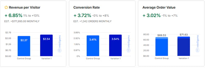
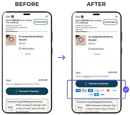
Adding recognizable payment method icons directly beneath the Proceed to Checkout button will increase checkout starts and completed purchases by reducing uncertainty at a critical decision point.
Results
After testing the change with more than 280,000 visitors, the variation delivered positive lifts across every primary business metric:
Conversion Rate: +3.72%
Revenue Per Visitor: +6.85%
Average Order Value: +3.02%
Estimated Monthly Impact:
+$171,995 in revenue
+1,324 additional orders
Why Did This Win?
The cart drawer is a high-intent moment where shoppers decide whether to continue or abandon their purchase. By displaying familiar payment options directly beneath the primary CTA, we addressed a common question before users had to click:
“How can I pay?”
Instead of forcing visitors to proceed to checkout to discover payment methods, the icons provided immediate reassurance and reduced perceived risk. Recognizable payment brands also contribute trust through familiarity, helping shoppers feel more confident moving forward with their purchase.
Global Navigation
Change the Last Navigation Link
Hypothesis
Changing which category appears in the final position of the main navigation will increase clicks and overall site engagement. The final navigation item naturally receives more attention because of recency bias, making it more likely to influence what visitors choose to explore.
Results
After testing with more than 275,000 visitors, the winning variation delivered measurable revenue improvements.
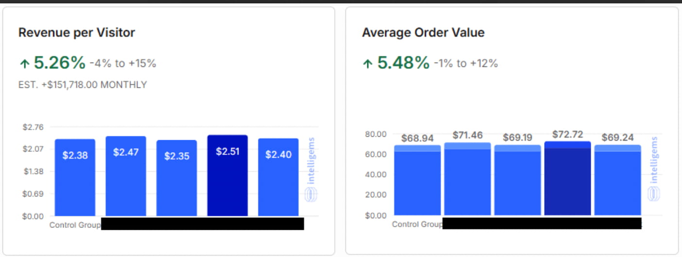
Conversion Rate: No change
Revenue Per Visitor: +5.26%
Average Order Value: +5.48%
Estimated Monthly Impact:
+$151,718 in additional monthly revenue
Why Did This Win?
The final navigation item acts as a visual endpoint. Because people naturally remember the last option they see, placing a more compelling category there encouraged more visitors to explore higher-value products.
The experiment influenced browsing behavior rather than purchase intent. While conversion rate remained unchanged, visitors were guided toward products that generated higher order values and increased revenue per visitor.
What We Tested
We ran an A/B/C/D/E experiment, comparing four alternative categories against the original navigation.
The winning variation proved that simply changing the position of a category within the navigation can influence shopping behavior without changing the site’s structure or creating friction for returning visitors.
Next Steps
Roll out the winning navigation structure across the live site.
Product Detail Page
Progressive Accordion Options
Hypothesis
Presenting product options one step at a time will simplify decision-making, reduce cognitive load, and encourage more visitors to complete their purchase.
Results
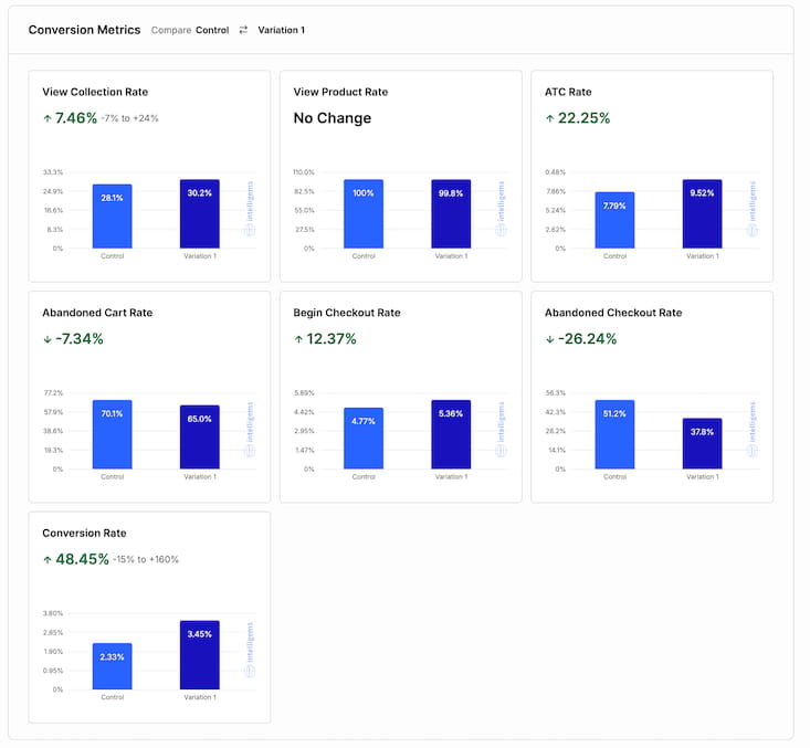
Current Status: Trending Winner (90.7% confidence)
Results so far:
Conversion Rate: +48.45%
Add to Cart Rate: +22.25%
Begin Checkout Rate: +12.37%
Abandoned Cart Rate: −7.34%
Abandoned Checkout Rate: −26.24%
Why Did This Win?
Showing every product option simultaneously can overwhelm shoppers, especially when multiple selections are required.
By progressively revealing choices, the experience became easier to follow. Visitors stayed focused on one decision at a time, resulting in fewer abandoned carts, more checkouts, and a substantial increase in completed purchases.
What We Tested
Instead of displaying every product option at once, the variation opened only the first section while keeping the remaining options collapsed until needed.
This progressive disclosure reduced visual complexity while still giving shoppers access to every available option.
Next Steps
Continue the experiment until statistical significance reaches the required confidence level before implementing sitewide.
Move Hamburger Menu to the Right (Mobile)
Hypothesis
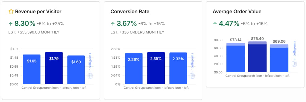
Moving the hamburger menu to the right side of the mobile header will better align with user expectations and improve accessibility, encouraging more visitors to browse the site.
Results
After testing with approximately 95,000 visitors, the winning variation delivered measurable improvements.
Conversion Rate: +3.67%
Revenue Per Visitor: +8.30%
Average Order Value: +4.47%
Estimated Monthly Impact:
+$55,590 in additional monthly revenue
Why Did This Win?
Most mobile experiences place the navigation menu in the upper-right corner, making it a familiar interaction pattern.
The new placement also made the menu easier to reach with a thumb, reducing effort and encouraging visitors to explore additional products before making a purchase.
What We Tested
We compared the existing left-aligned hamburger menu against a right-aligned version while leaving the rest of the mobile experience unchanged.
This isolated the effect of menu placement on browsing behavior and downstream revenue metrics.
Next Steps
Implement the winning navigation placement across all mobile devices.
Add Urgency Message Near Add to Cart
Hypothesis
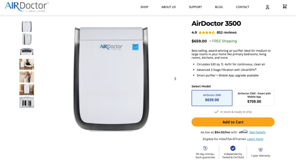
Adding a short, truthful urgency message near the Add to Cart button will reduce hesitation, reinforce product availability, and encourage more visitors to purchase immediately.
Results
After testing across approximately 21,000 visitors in two separate experiments, the winning variation improved the entire purchase funnel.
Add to Cart Rate: +12.73%
Conversion Rate: +23.14%
Revenue Per Visitor: +8.30%
Estimated Monthly Impact:
+$85,024 in additional monthly revenue
Why Did This Win?
Many shoppers postpone purchases simply because they believe they can always return later.
A simple message such as “In stock & ready to ship” reassured visitors that the product was immediately available while subtly encouraging them to act now. Rather than creating artificial urgency, the message reduced uncertainty and increased confidence at the final decision point.
What We Tested
We compared the original Product Detail Page against a variation that displayed a concise urgency message directly above the Add to Cart button.
Testing the message across two independent experiments confirmed that contextual reassurance consistently improved purchasing behavior.
Next Steps
Implement the winning variation across all eligible Product Detail Pages.
Combined Price & Image Test
Hypothesis
Improving the visibility of pricing and simplifying product selection on Product Listing Pages will encourage more visitors to continue shopping and complete a purchase. We also evaluated whether a third-party trust endorsement would further improve buyer confidence.
Results
After testing with approximately 17,000 visitors, the winning variation delivered strong improvements across every major revenue metric.
Conversion Rate: +21.97%
Revenue Per Visitor: +26.14%
Average Products Per Visitor: +34.82%
Average Order Value: +3.40%
Estimated Monthly Impact:
~+$217,000 in additional monthly revenue
Why Did This Win?
This experiment demonstrated that improving usability had a greater impact than adding another trust signal.
Making the product price larger and positioning it closer to the ratings helped shoppers evaluate products more quickly. At the same time, larger and more accessible style selector buttons reduced friction, particularly on mobile.
Interestingly, the Newsweek trust badge added to the hero image produced little measurable impact. The strongest gains came from improving visual hierarchy and interaction design.
What We Tested
This multivariate experiment evaluated several interface improvements simultaneously, including:
– Larger, repositioned pricing
– Improved mobile style selector buttons
– A hero image featuring a Newsweek trust endorsement
The results isolated which changes influenced customer behavior, revealing that the usability improvements—not the additional trust badge—were responsible for the performance lift.
Next Steps
Implement the winning Product Listing Page experience across the site.
Garage Door Shopping Page Test
Hypothesis
Repositioning the page around shopping rather than booking a consultation will better match visitor intent and encourage more qualified prospects to enter the lead funnel.
Results
The winning variation dramatically increased visitor engagement.
Online Showroom Form Submissions: +496.54%
Bookings: Nearly +100%
Why Did This Win?
Most visitors arriving on the page were still researching options rather than looking to schedule a consultation.
By leading with an interactive shopping experience instead of asking for an immediate commitment, the page better aligned with where visitors were in their decision-making journey. Helping people explore first naturally led to more qualified leads and more bookings.
What We Tested
The original experience focused on booking a consultation.
The variation reorganized the page around shopping tools, allowing visitors to browse styles, upload photos, and receive personalized recommendations before speaking with a sales representative.
Next Steps
Implement the winning experience while continuing to optimize the shopping-to-lead journey.
What Our A/B Testing Services Add to Your Existing Program
Your team doesn’t need another vendor handing over random ideas in a slide deck. You need better data before the test ever reaches the platform.
We analyze your analytics, heatmaps, and funnel friction before deciding what to test.
We turn raw data into sharp, evidence-based test ideas prioritized by actual business impact.
We calculate sample sizes and stopping rules in advance, protecting your team from unstable data.
We work within your existing tech stack, letting your internal team keep full ownership without slowing down.
Your Conversion Rate Hasn’t Moved in Six Months
Sound familiar? You hired a CRO agency. They ran 14 tests in six months. Two of them won. The dashboard looks busy, but the revenue line is completely flat, and nobody can explain what that $54K retainer actually bought.

This isn’t Conversion Rate Optimization. It’s just A/B testing without a strategy.

23 Years of Turning Friction Into Revenue
The patterns holding your site back are already in our library. The only question is what happens when we apply them to your business.
We will review your site live, identify the specific friction we see, and tell you exactly what we would test first. You keep the recommendations either way.