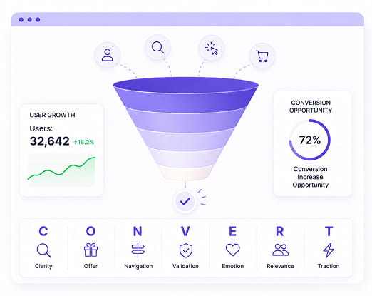
The C-O-N-V-E-R-T Model

SiteTuners Proprietary CRO Framework

Stop Guessing Why Visitors Leave Without Converting.

The CONVERT™ Model gives you a structured way to evaluate every website through seven critical conversion factors, helping uncover the hidden friction that prevents visitors from taking action.
Stop Guessing Why Visitors Leave Without Converting.

Where It Starts

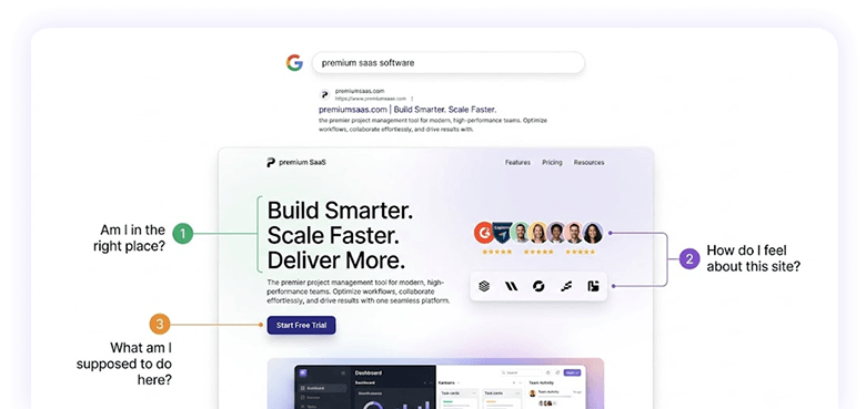
Every visitor asks the same three questions

Am I in the Right Place?

Match visitor intent and expectations

Don’t make your visitors think

How Do I Feel About This Site?

Well-executed design boosts website credibility

Social proof, security seals, transparency and available support builds trust

What Am I Supposed to Do Here?

Visual emphasis directs visitor’s attention

Navigation and calls-to-action are organized and presented in a simple coherent manner

Icon Excl Blue

If your website doesn’t answer these questions within seconds, visitors often leave before your offer ever has a chance to persuade them.

Where It Starts
Icon Excl Blue

If your website doesn’t answer these questions within seconds, visitors often leave before your offer ever has a chance to persuade them.

The Core Principle

Not every factor affects conversion equally. Some factors help visitors move toward conversion. Others create friction that stops them altogether.

The CONVERT™ Model helps prioritize what to fix first; so your optimization efforts deliver the greatest impact.

Icon Excl Blue

Improve what blocks visitors first.
Then strengthen what already works.

Accelerators

What moves visitors forward

  • C – Clarity
  • O – Offer
  • E – Emotion
  • R – Relevance


VS

Blockers

What stops visitors

  • N – Navigation
  • V – Validation
  • T – Traction
Icon Excl Blue

Improve what blocks visitors first.
Then strengthen what already works.

The 7 Factors Behind Every Conversion

Accelerators & blockers

Select a letter to see what it controls and the diagnostic tests we run against it.

C

Clarity

O

Offer

N

Navigation

V

Validation

E

Emotion

R

Relevance

T

Traction

Accelerators

Clarity

The entry point for everything else.

It doesn’t matter how strong your offer is, how much trust you’ve built, or how urgent your message is.

If a visitor can’t immediately orient themselves, they leave.

C

The Diagnostic Tests

5-second test
Show a stranger your page for 5 seconds. They must know what you do, who it’s for, and what to do next.
Squint test
Blur your eyes at your page. What does your eye go to first? That is your actual visual hierarchy.
Headline-only test
Cover everything except your headline and CTA. That pair alone must communicate value.

Accelerators

Offer

The reason people choose you.

A real offer answers what the visitor gains and why they should choose you specifically. It must be specific, verifiable, and impossible for a generic competitor to claim.

O

The Diagnostic Tests

Swap test
Could a direct competitor copy your headline without changing a word? If yes, it’s a category description, not a differentiator.
“So what” test
Read your headline aloud and ask “so what?” after each sentence. If you hit no real benefit, rewrite it.

Specificity test
Does your offer contain at least one claim that is specific and verifiable — a number, a certification, or a guarantee?

Blocker

Navigation

Navigation doesn’t create conversion, it destroys it.

Visitors should have one clear path toward conversion. Extra menus, competing CTAs, and visual clutter create friction and reduce action. Your job is to eliminate everything that doesn’t directly serve your primary conversion goal.

N

The Diagnostic Tests

Count the exits
How many clickable elements lead away from your conversion goal? Every one is a leak. On a landing page, this should be near zero.
Competing CTA count
How many different primary actions does your page ask for? More than one is too many. Pick the one that generates revenue and subordinate the rest.

Removal test
Go through your page element by element and ask, “What happens if I remove this?” If the answer is “nothing,” remove it.

Blocker

Validation

Trust should appear exactly where decisions happen.

Placement is everything. Trust signals placed next to the button answer the visitor’s final objection exactly when they’re about to act. The right signals are specific reviews, verifiable guarantees, and real certifications.

V

The Diagnostic Tests

Proximity test
Draw a box around your primary CTA. Are any trust signals inside or immediately adjacent to that box? If not, move them there.
Specificity test
Are your reviews generic (“great service!”) or specific with names, outcomes, and details? Generic reviews don’t convert.
Credibility Audit
Can a visitor verify any of your claims within 30 seconds? Unverifiable assertions get discounted.

Accelerators

emotion

Give visitors a reason to act today.

Internal urgency is the problem the visitor arrived with, don’t kill it with a confusing layout or hidden phone number.

External urgency (deadlines, limited slots) only works when it’s genuine and specific. Fake urgency destroys trust faster than it creates conversions.

E

The Diagnostic Tests

Internal urgency audit
Does your page acknowledge what the visitor is actually experiencing right now, or does it talk about your company?
Why-now test
Is there any specific reason on your page to call or submit today rather than tomorrow?

Credibility Audit
Can you actually back up every urgency claim? Fake countdown timers signal dishonesty.

Accelerators

Relevance

Continue the conversation visitors already started.

Your landing page should perfectly match the promise made by your ad, search result, or email. Every mismatch creates doubt and increases bounce rates.

R

The Diagnostic Tests

Message match audit
Read your ad headlines, then your landing page headline. Do they make the same implicit promise?
Segment Test
Which specific person is this page written for? If the answer is “anyone,” the page is for no one.

Keyword-to-CTA Path
Trace the journey from search term to ad to landing page to CTA. Any break in that chain is a bounce point.

Blocker

Traction

Make taking action effortless.

The visitor is convinced, trusts you, and has urgency, and then hits a massive form asking for too much information. You just killed the conversion. Every additional form field drops your completion rate by approximately 10%. Ask for the absolute minimum.

T

The Diagnostic Tests

Field audit
Do you absolutely need every field to make first contact? If it’s just for your convenience, remove it.
Mobile test
Fill out your own lead form on a phone using just one thumb. Every moment of frustration is a lost lead.

CTA language test
Does your button describe what the visitor gets? “Submit” is what they do. “Get My Free Estimate” is what they get.
SiteTuners – conversion rate optimization (CRO) experts

Let’s Find Out
Why Your Visitors Are Leaving.

Get a free 30-minute expert website review. We will apply the CONVERT framework to your site live, show you your biggest blockers, and give you a prioritized action plan to fix them.

Scroll to Top
Scroll to Top