
The Mobile Checkout Problem Costing You Real Revenue
If you’re looking to improve mobile checkout in 2026, start with the highest-impact fixes:
- Offer guest checkout – save account creation until after purchase
- Add accelerated payments – Apple Pay, Google Pay, Shop Pay, PayPal, and BNPL (buy-now-pay-later) options reduce typing
- Reduce form fields – remove anything that is not needed to fulfill the order
- Improve page speed and responsiveness – checkout must feel instant on mobile networks
- Use single-column layouts – easier for thumbs and small screens
- Show trust signals near payment fields – security cues reduce payment anxiety
- Display shipping, tax, and fees early – surprise costs remain a major abandonment trigger
Mobile cart abandonment remains high, and Baymard’s current benchmark puts overall ecommerce cart abandonment at about 70%. On mobile, friction is even more costly because typing, error correction, and comparison shopping are harder to control.
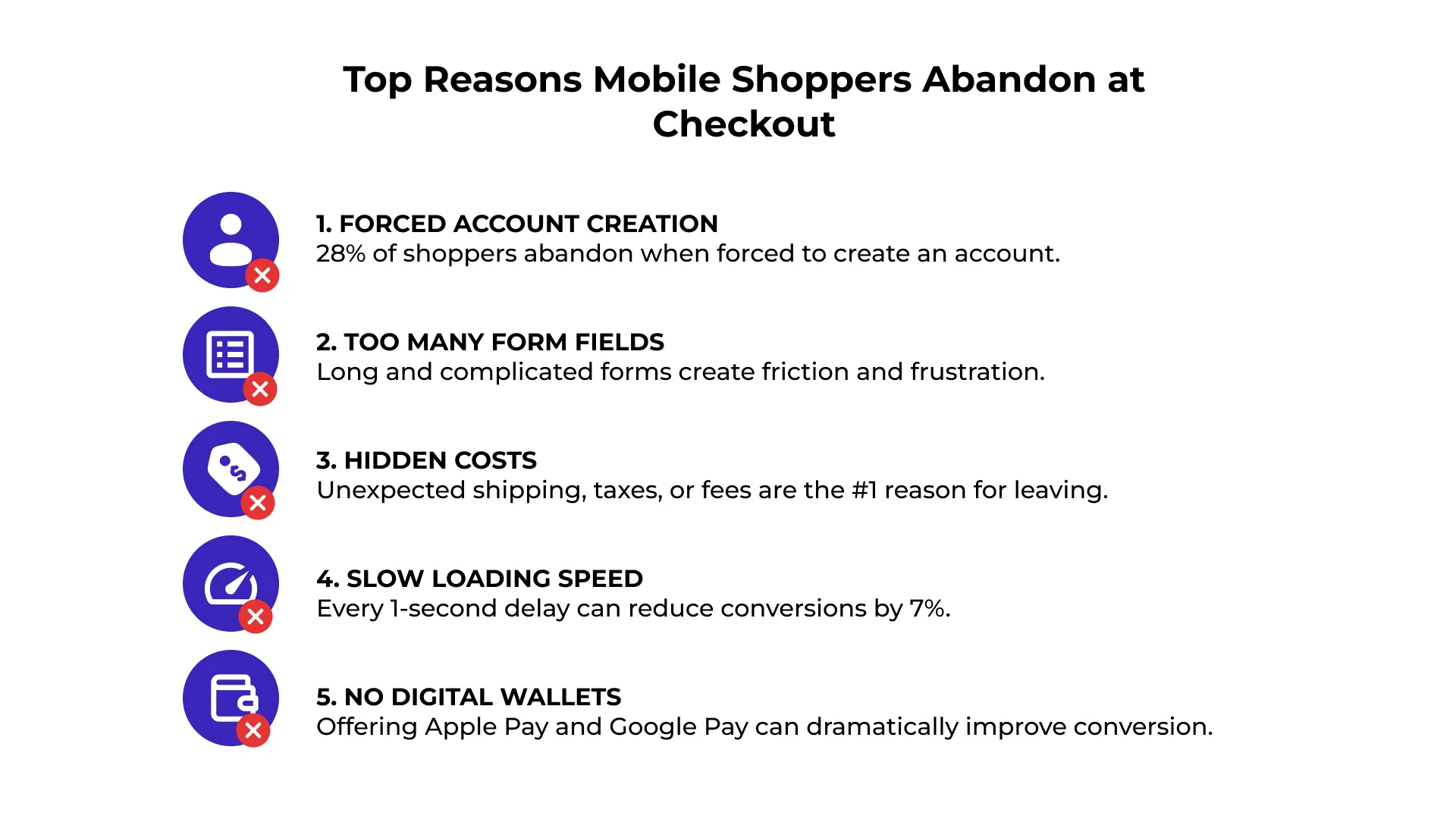
Mobile shoppers now drive most ecommerce traffic for many retailers, but mobile checkout still underperforms when forms feel desktop-first. Small screens, clunky fields, slow pages, missing wallet options, and late cost reveals all create reasons to quit.
The good news: these are fixable issues. Reducing checkout friction can meaningfully improve conversions.
Why Mobile Checkout Deserves Its Own Strategy
At SiteTuners, we’ve watched mobile shift from a nice-to-have to a critical part of the retail experience. If your checkout still feels built for desktop, you are handing revenue to competitors.
M-commerce keeps growing, but the conversion gap remains. Many businesses attract plenty of mobile visitors yet lose them at checkout. By solving common mobile usability problems, you can turn more taps into transactions.
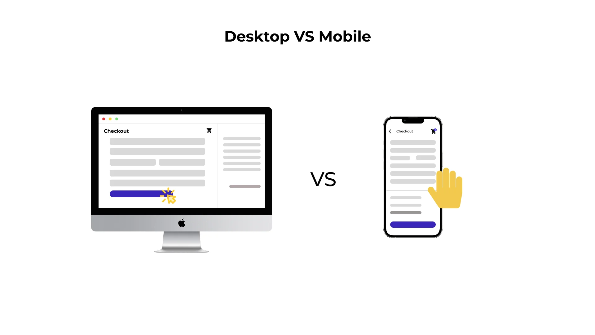
| Feature | Mobile Behavior | Desktop Behavior |
|---|---|---|
| Abandonment Risk | Higher friction from typing and delays | Lower input friction |
| Primary Input | Thumbs/Touch (Error-Prone) | Keyboard/Mouse (Precise) |
| Attention Span | Short/Fragmented | Focused/Stable |
| Top Exit Reason | Complexity, costs, and payment friction | Comparison Shopping |
The High Cost of Friction
Small roadblocks can have a major impact. Baymard’s checkout research continues to show that preventable UX friction, including forced account creation, long forms, unclear costs, and payment issues, causes many users to abandon purchases.
Mobile shoppers are often multitasking, so long forms and repeated steps feel especially costly. Smartphones are not inherently bad at conversions; many sites simply fail to design for mobile constraints. See our take on whether smartphones are bad at conversions.
Mobile vs. Desktop Behavior
To design checkout that works, respect how people hold and use phones. Unlike desktop users, mobile users rely on thumbs, touch targets, autofill, and saved payment methods.
Mobile users are also interruption-prone. If checkout does not save progress, validate fields inline, or preserve cart details after a refresh, many will not return. Avoiding common mobile mistakes helps distracted shoppers finish faster.
Streamlining the Form: Best Practices for Fewer Drop-Offs
Forms are where many mobile conversions die. On a small screen, a long list of fields looks like work. To reduce checkout drop-off, use a “less is more” approach.
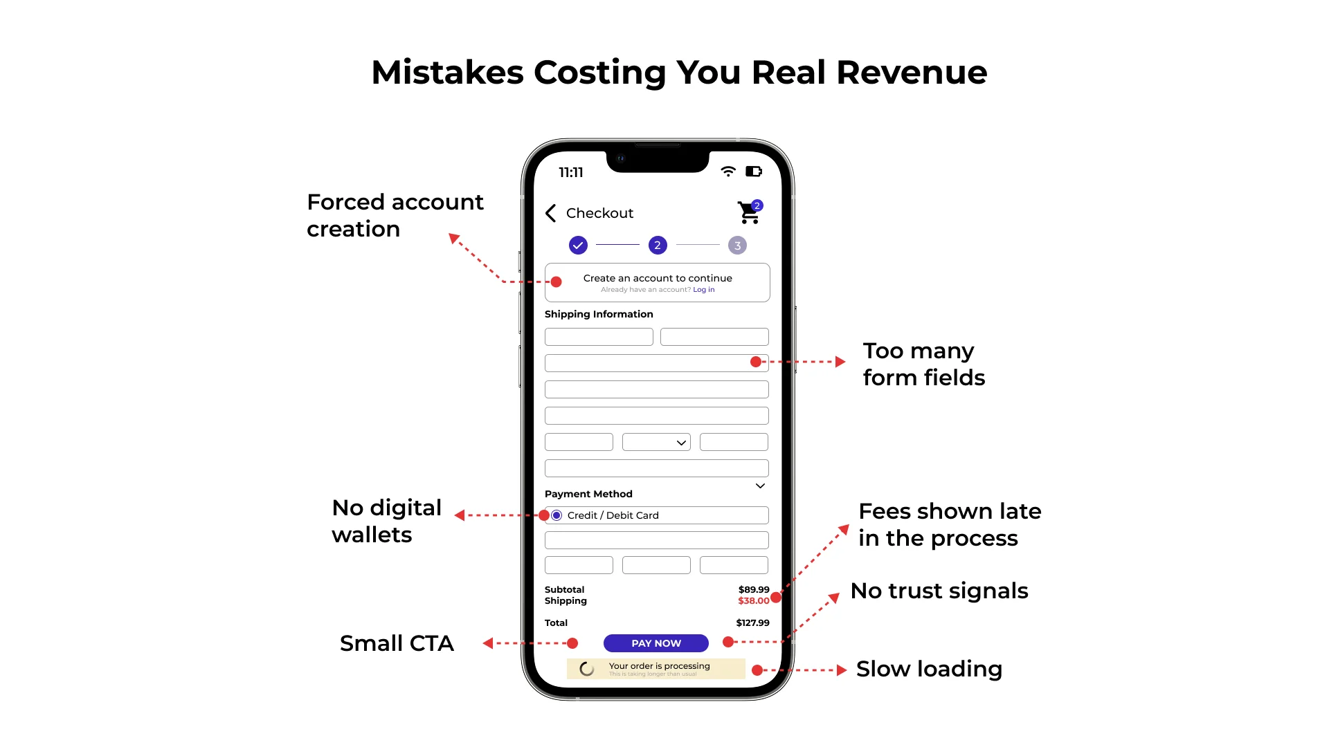
Use a single-column layout. Multi-column forms can cause users to skip fields or get lost when the screen zooms into an input. When you optimize mobile commerce conversion rates, start by auditing every field.
Form Field Strategies to Reduce Checkout Friction
Start by removing non-essential fields. Do you really need “Company Name” or a second phone number? Usually not.
Recommended form improvements:
- Use one “Full Name” field unless your fulfillment process requires separate names.
- Use persistent labels so field meaning remains visible after typing begins.
- Trigger the right keyboard for ZIP codes, credit cards, phone numbers, and email addresses.
- Collapse optional fields like “Address Line 2” so the form appears shorter.
- Validate inline so users can fix mistakes before submitting the page.
- Support passkeys or passwordless sign-in for returning customers, without making sign-in mandatory.
These changes reduce effort and help prevent the “fat finger” errors that hurt mobile shopping. For more ideas, see these mobile conversion tips.
Implementing Autofill and Address Validation
One of the best ways to speed things up is to reduce typing. Google Address Autocomplete can turn address entry into a few taps.
Use saved browser data, address validation, and platform autofill to pre-fill as much as possible. Typing on a touchscreen is slower and more error-prone than using a physical keyboard, so every avoided keystroke matters.
Design for the Thumb: UI Elements That Convert
The way people hold their phones should shape checkout design. This is often called “Thumb Zone” design.
Most users navigate with one hand and one thumb. Place key actions, such as “Proceed to Checkout,” within easy thumb reach. For related guidance, see these mobile navigation tips.
Buttons should be at least 44×44 pixels to reduce mis-taps. Small, crowded links are one of the 7 deadly sins of mobile web design because they create frustration and accidental clicks.
Visual Guidance and Progress Indicators
Mobile shoppers need to know where they are and what is left. A clear progress bar gives them a finish line:
- Step 1: Shipping
- Step 2: Payment
- Step 3: Review
Progress indicators, breadcrumbs, and sticky bottom buttons reduce uncertainty and keep the next action within thumb reach.
Eliminating Distractions
Checkout should have one primary goal: helping shoppers complete their purchase. Remove newsletter prompts, complex headers, unnecessary navigation, and distracting carousels.
In our mobile conversion webinar, we recommend creating a focused checkout “tunnel.” Keep the “Place Order” button prominent, and hide promo code fields behind a text link so shoppers do not leave to search for coupons. This focus is also important when deciding how to optimize marketing for mobile traffic.
Frictionless Payments: The Power of Digital Wallets and Speed
If you want to optimize mobile checkout, accelerated payment options are often among the highest-impact changes.
Digital wallets can replace a tedious card form with biometric approval.
Using Digital Wallets to Improve Mobile Checkout
Digital wallets like Apple Pay and Google Pay use tokenization — a safe code swapped in for the real card number — so the merchant never sees it. That helps build trust.
Also consider Shop Pay, PayPal, Venmo, and BNPL options where they fit your audience. The goal is not to show every payment logo at once; it is to make the most relevant low-effort payment path obvious.
Express checkout options can let returning customers skip the cart and form, finishing in seconds. In mobile shopping, saved seconds often equal saved sales.
The Critical Role of Page Speed
Speed is a conversion metric, not just a technical metric. Mobile shoppers expect fast pages, and drop-off increases when checkout feels slow.
To optimize checkout speed:
- Compress images so they do not slow the browser.
- Minimize JavaScript that delays interactivity.
- Use a CDN (a network of servers that speeds up loading no matter where the shopper is) to serve files faster by location.
- Audit third-party scripts such as chat, analytics, reviews, and payment add-ons.
Use analytics to review mobile speed specifically, not just sitewide averages.
Building Trust and Measuring Success
Mobile users may be cautious when entering payment details on a small device, especially on public connections. Build trust throughout checkout.
Forced account creation is a major trust-killer. Let shoppers buy first, then invite them to create an account after purchase. For returning customers, use passwordless options, saved addresses, and wallet payments to make login helpful rather than mandatory.
Be transparent about pricing and shipping before the final step. Unexpected fees remain one of the most common reasons shoppers abandon checkout. Place security cues, lock-icon security badges, delivery promises, return-policy links, and payment logos near sensitive fields and the “Place Order” button.
Optimization Tools and Analytics
You cannot fix what you do not measure. To optimize mobile conversions, observe how real users behave:
- A/B testing: Compare checkout versions, such as one-page vs. multi-step.
- Heatmaps: See where users tap and where they hesitate.
- Session recordings: Spot rage clicks, broken fields, and confusing steps.
- Mobile UX testing: Test across devices, browsers, wallet states, and operating systems.
- Checkout analytics: Track field-level errors, payment failures, coupon-code exits, and drop-off by step.
In 2026, mobile checkout optimization should also include AI-assisted and cross-channel shopping journeys. If shoppers arrive from social commerce, email, search, or AI shopping experiences, make sure carts, prices, discounts, and shipping promises stay consistent when they reach checkout.
Frequently Asked Questions About Mobile Checkout
Should I offer guest checkout on mobile?
Yes. Forcing password creation and email verification on a smartphone adds friction. Offer guest checkout first, then ask shoppers to save their information after purchase.
How many form fields are ideal for mobile?
There is no universal field count, but fewer is usually better. Remove fields that do not help fulfill the order, collapse optional inputs, use address autocomplete, and rely on wallet or browser autofill where possible.
What payment options should mobile checkout include in 2026?
Start with major card payments, Apple Pay, Google Pay, PayPal, and any wallet or BNPL option your audience already uses. Prioritize clarity over clutter: show the most relevant accelerated options first, then keep fallback payment methods easy to find.
What is a good mobile conversion rate?
Use industry benchmarks for context, but focus on improving your own baseline. Track mobile checkout completion rate, abandonment by step, payment errors, field errors, and revenue per mobile visitor over time.
Conclusion
At SiteTuners, we’ve spent over two decades finding and fixing the conversion barriers that keep businesses from growing.
To fix mobile checkout in 2026, prioritize speed, simplicity, thumb-friendly design, flexible payments, and trust. Reduce form friction, support accelerated payments, show costs early, and keep users focused through the final tap.
Improving mobile checkout can reduce abandonment, increase completed purchases, and maximize the value of the traffic you already have. If you’d like to identify where customers are dropping off, speak with a SiteTuners CRO expert.