How Do You Create Web Content That Drives Conversions?
Creating web content that drives conversions is not about writing the most clever prose or stuffing pages with high-volume keywords. AI search engines and smarter visitors have changed the rules. Today, visitors don’t just want information—they want a seamless path to solving their problems.
To succeed, design your content around user intent. When a visitor lands on your site, they are on a specific journey. If your content does not align with that journey, they will leave within seconds. This is why it’s important to distinguish between writing for traffic and writing for revenue. Traffic is a vanity metric; revenue is a business reality.
To bridge this gap, we rely on a structured system. By understanding the intersection of search engine visibility and conversion rate optimization (CRO), we can build a sustainable pipeline of qualified leads and sales.
What Is High-Converting Content and Why Does It Matter?
High-converting content is copy and media specifically engineered to persuade users to take a defined, measurable action. Whether that action is signing up for a newsletter, downloading a whitepaper, booking a demo, or making a direct purchase, every element on the page must work in unison to guide the user toward that goal.
Regular content is typically built for reach and awareness. It focuses on broad topics, high search volumes, and educational value. While regular content is excellent for filling the top of your marketing funnel, it rarely drives direct revenue. Conversion content, on the other hand, targets bottom-of-the-funnel (BOFU) search queries where buying intent is highest.
The stakes are high. Most websites convert only a tiny fraction of their visitors because their content fails to persuade. When visitors arrive, they are met with vague value propositions, confusing navigation, and weak calls-to-action. If you want to stop wasting this valuable traffic, you must focus on structuring your pages to answer the immediate questions your visitors have.
Every high-converting page must satisfy what we call the “three-question rule.” To prevent visitors from bouncing, you must ensure your page immediately answers:
- What is this page about?
- Who is it for?
- What should I do next?
If a user cannot answer these questions within five seconds of landing on your site, they will leave. By aligning your copy with these core questions, you transition your content from a passive informational resource into an active sales asset.
Understanding the Buyer’s Journey
To create high-converting experiences, meet your audience exactly where they are in their decision-making process. The buyer’s journey consists of three primary stages, and each requires a distinct content approach:
- Awareness Stage: At this point, the user is experiencing a problem but may not fully understand it. They are looking for educational resources, blog posts, and guides to help them define their challenges. Do not attempt a hard sell here. Instead, focus on building trust and demonstrating expertise.
- Consideration Stage: The user has clearly defined their problem and is actively researching potential solutions. Here, your content should address specific pain points, compare different methodologies, and showcase your unique approach. This is where comparison guides, case studies, and detailed product overviews perform best.
- Decision Stage: The user is ready to select a provider or purchase a product. They need a final, reassuring push. Your content must present a clear, friction-free path to purchase, backed by pricing transparency, guarantees, and strong calls-to-action.
_compressed.webp?alt=media&token=68ec6191-9c99-4e97-88b9-fa76cc0d41f8 "buyer's journey, awareness, consideration and decision")
By mapping your content strategy to these three stages, you ensure that you are not pushing for a sale too early, which can alienate potential customers.
What Copywriting Formulas and Psychological Triggers Drive Action?
To write copy that moves people to action, we use proven psychological triggers and copywriting frameworks. These are not manipulative tricks; rather, they are structured ways to align your message with how the human brain naturally processes information and makes decisions.
Several classic copywriting formulas can help you structure your pages for maximum impact:
- AIDA (Attention, Interest, Desire, Action): Grab the reader’s attention with a bold headline, build interest by explaining your solution, create desire by showing the benefits, and compel action with a clear CTA.
- PAS (Problem, Agitation, Solution): Identify a burning pain point your audience faces, agitate that problem by highlighting the emotional or financial cost of leaving it unresolved, and present your product or service as the ultimate solution.
- BAB (Before, After, Bridge): Paint a picture of the reader’s current, frustrated state (Before). Show them what their life or business could look like once their problem is solved (After). Position your offering as the path that takes them from before to after (Bridge).
When writing this copy, always translate features into emotional customer benefits. A feature is what your product is or does; a benefit is what your product enables the customer to achieve. Always ask yourself: “So what?” If your software has “automatic data syncing,” the benefit is that “your team saves five hours of manual entry every week, allowing them to focus on high-value tasks.”
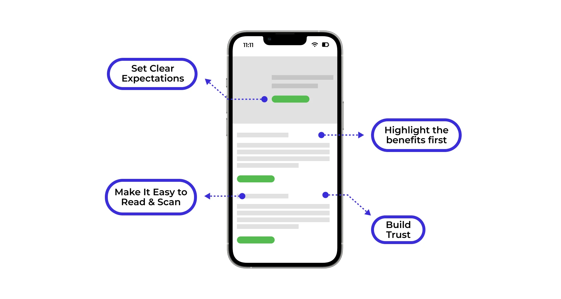
To build deep credibility, we must also avoid overused corporate jargon and empty buzzwords. Phrases like “next-generation,” “robust,” and “cutting-edge” mean nothing to modern buyers. Instead, use clear, direct, and human-centric language. Incorporating core trust elements is another vital step in this process, ensuring that your brand establishes immediate authority and reliability.
| Copywriting Formula | Core Focus | Best Used For |
|---|---|---|
| AIDA | Attention, Interest, Desire, Action | Landing pages, promotional emails, and sales pages |
| PAS | Problem, Agitation, Solution | Blog posts, lead magnets, and problem-solving services |
| BAB | Before, After, Bridge | Case studies, product reviews, and transformation stories |
The Power of Social Proof and Trust Signals
Skepticism is the default state of the online visitor. To overcome this resistance, place trust signals and social proof strategically throughout your content. Trust signals act as visual and textual reassurance that your business is legitimate, safe, and highly capable of delivering on its promises.
One of the most effective ways to build instant trust is by using real customer photos instead of generic, staged stock photography. A conversion test conducted by MarketingExperiments revealed that using authentic photos of actual customers or team members outperformed stock photos by 35% in conversion rate. Real faces humanize your brand and foster a genuine connection.
To maximize the impact of your trust signals, we recommend following these best practices:
- Place authentic, results-oriented testimonials directly near your calls-to-action to reassure users at the exact moment of decision.
- Display recognizable client logos, industry certifications, and security badges (like SSL certificates) prominently.
- Incorporate pricing transparency on your website. Providing clear baseline costs pre-qualifies your leads and filters out low-intent traffic, saving valuable time for your sales team.
How Do You Structure Web Pages to Minimize Cognitive Load?
Cognitive load refers to the mental effort required to process information. When a visitor lands on a cluttered, disorganized webpage, their brain must work overtime to find what they need. This mental friction leads to frustration, resulting in high bounce rates.
To maximize conversions, design layouts that match how people actually read online. The reality is simple: online readers do not read word-for-word. Instead, they skim. In fact, eye-tracking studies consistently show that visitors scan the page in an F-shaped pattern, looking for headings, bullet points, and visual cues that tell them they are in the right place.
Ignore this behavior, and visitors will leave. Long, dense blocks of text push people away. To prevent this, accept that most visitors skim, and structure your layouts for skimming.
A critical step in capturing immediate attention is crafting a powerful headline. We recommend using the 4U formula to write headlines that stop the scroll:
- Urgent: Give the reader a reason to act now.
- Unique: Highlight what makes your solution different.
- Useful: Promise a clear benefit or outcome.
- Ultra-specific: Use exact numbers or details to build credibility.
By utilizing generous white space, clean typography, and a clear visual hierarchy, you can dramatically minimize cognitive load to maximize conversions.
Formatting for Scannability
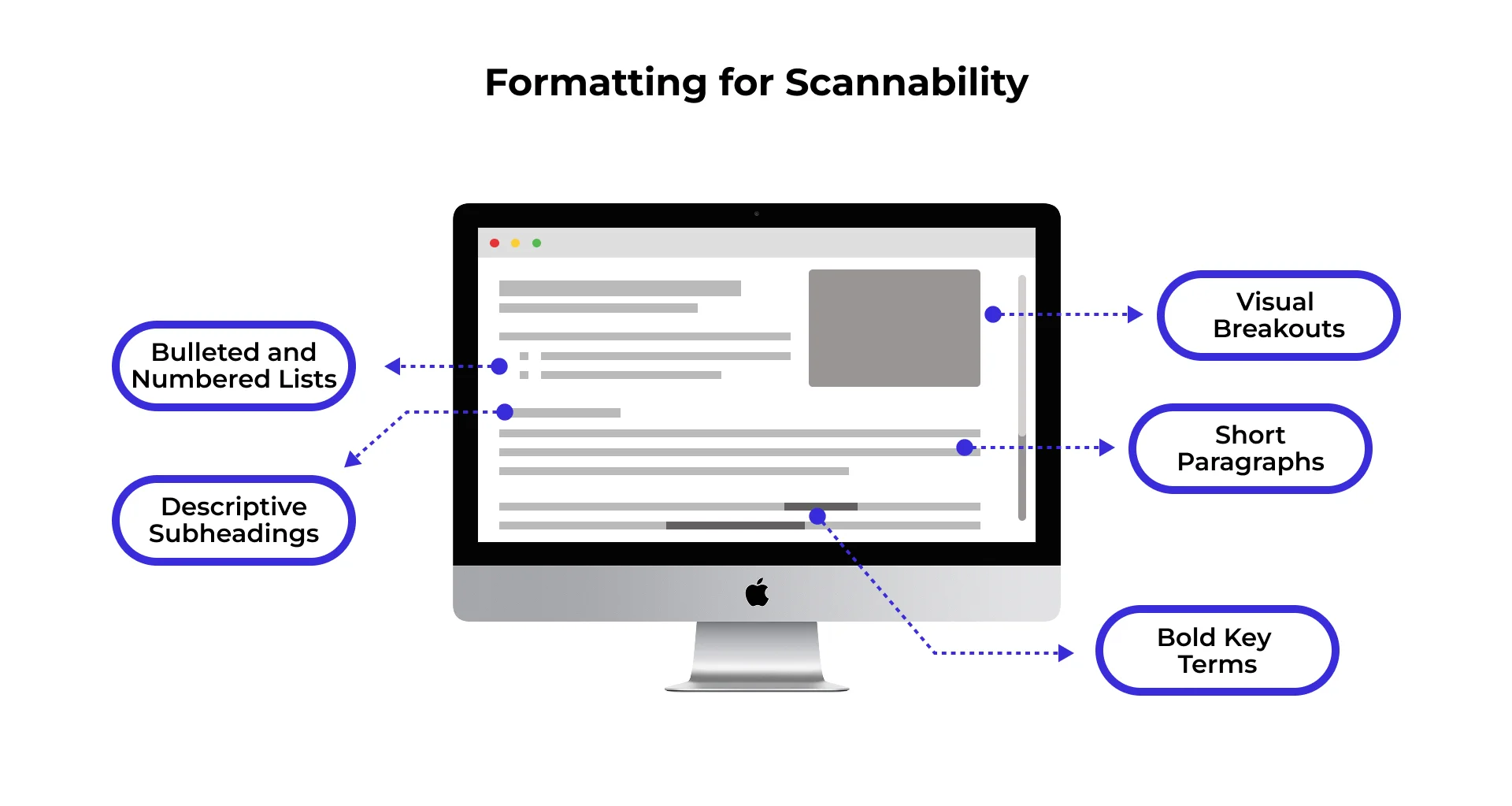
Formatting is the silent salesperson of your website. Even the most brilliant copywriting will fail if it is presented as an intimidating wall of text. To make your content highly scannable and easy to digest, break information into bite-sized visual chunks.
We recommend implementing the following formatting elements across all your key pages:
- Short Paragraphs: Limit your paragraphs to two or three sentences. This creates visual breathing room and keeps the reader moving down the page.
- Descriptive Subheadings: Use H2 and H3 tags that do more than just label a section. Make them benefit-driven so a skimmer can understand the entire narrative of your page just by reading the headers.
- Bulleted and Numbered Lists: Lists naturally draw the eye and make complex information or feature sets incredibly easy to digest.
- Bold Key Terms: Bold important phrases and statistics to highlight key takeaways for skimming readers.
- Visual Breakouts: Use callout boxes, quotes, and icons to disrupt visual monotony and emphasize critical points.
By restructuring your content layouts to prioritize readability, you keep users engaged longer, which directly correlates with higher conversion rates.
How Can You Design and Position Calls-to-Action (CTAs) for Maximum Clicks?
Your call-to-action (CTA) is the most critical element on your page. It is the gateway to your conversion. Yet, many businesses treat CTAs as an afterthought, using generic, uninspiring language like “Submit,” “Click Here,” or “Contact Us.” These phrases do not inspire action; instead, they highlight the effort the user must make rather than the value they will receive.
To design CTAs that get clicked, we must use action-oriented, benefit-driven language written from the user’s perspective. Instead of “Download PDF,” use “Get My Free Guide.” Instead of “Schedule Consultation,” use “Claim My Free Website Audit.” This subtle shift in phrasing focuses entirely on the value the user is about to receive, making the action feel rewarding rather than burdensome.
Placement matters just as much as wording. A high-converting page should feature CTAs at natural decision points:
- Above the Fold: For high-intent visitors who are ready to act immediately.
- Mid-Page: After explaining a core benefit or solving a major objection.
- At the Bottom: For analytical readers who need to consume all your content before making a decision.
To further reduce friction, we recommend adding a small line of reassuring microcopy directly below your CTA button. Phrases like “No credit card required,” “Takes less than 2 minutes,” or “Join 10,000+ professionals” alleviate anxiety and make the decision to click much easier.
By mastering the art of the ask and making your CTAs irresistible, you can eliminate the hesitation that kills conversions.
Optimizing CTA Placement and Design
The visual design of your CTA button plays a massive role in its click-through rate. A great CTA must stand out visually from the rest of your page layout. This means using high-contrast colors that naturally draw the eye. Your CTA button color does not need to match your brand’s primary color palette; in fact, it is often better if it contrasts sharply with the background so it is impossible to miss.
Additionally, we recommend the following design practices:
- Sticky Headers and Floating CTAs: On long-form pages or mobile devices, implement a persistent CTA that remains visible as the user scrolls. This ensures that the conversion path is always just one tap away.
- Limit Choice Paralysis: Every page should have one primary conversion goal. If you ask users to sign up for a newsletter, download a guide, follow you on social media, and book a call all on the same page, they will likely do nothing. Focus on one clear action.
If you are struggling to get your landing page visitors to take action, you may be making common structural errors. Diagnosing and resolving these issues is critical to ensuring your traffic does not go to waste.
How Do You Optimize Content for Both SEO and User Experience?
For years, digital marketers treated Search Engine Optimization (SEO) and Conversion Rate Optimization (CRO) as two entirely separate disciplines. Writers optimized pages for search crawlers by stuffing keywords, while designers optimized pages for human conversions. That siloed approach no longer works.
Today, search rankings and user experience are deeply connected. Google’s ranking systems heavily favor pages that demonstrate strong user engagement signals, such as high time-on-page, low bounce rates, and successful search task completion. If you write content solely to rank, visitors will quickly bounce, signaling to search engines that your page is not helpful. Conversely, if your page is beautifully optimized for conversions but lacks SEO structure, no one will ever find it.
We must balance keyword integration with natural, human-centric writing. This means placing your target keywords naturally in your headlines, subheadings, and body copy without disrupting the reading flow.
Technical performance is also a critical component of user experience. Page load speed is a major conversion factor; even a one-second delay in load time can reduce conversions by 7%. Furthermore, since more than half of all global web traffic originates on mobile devices, your content must be fully responsive, featuring thumb-friendly layouts and legible font sizes.
To build a comprehensive strategy that satisfies both search engines and human visitors, you must align technical performance with high-quality copywriting.
Preparing Content for AI Search and GEO
As conversational AI engines like ChatGPT Search, Perplexity, and Google AI Overviews redefine how users find information, traditional SEO is evolving into Generative Engine Optimization (GEO). AI engines do not present users with a list of ten blue links; instead, they generate a synthesized answer and cite only three to five highly structured, authoritative sources.
To ensure your content is selected and cited by these AI engines, we recommend adopting these structural strategies:
- Direct, Question-Based Headings: Structure your H2 and H3 subheadings as direct questions (e.g., “How do you align content with revenue?”). This matches the natural, conversational queries users type into AI chatbots.
- Answer-First Blocks: Begin your sections with a clear, direct, one-to-two-sentence summary that answers the heading’s question. AI engines can easily extract these concise blocks to build their summaries.
- Structured Schema Markup: Use Article, FAQ, Person, and Product schema to make your content highly machine-readable, helping AI engines parse and understand your data.
By structuring your content for both search engines and generative AI, you position your brand as a cited authority.
How Can You Continuously Test and Improve Your Content’s Performance?
The launch of a webpage is not the end of the optimization process; it is merely the beginning. A “set-it-and-forget-it” approach to web content is a guaranteed way to let your conversion rates stagnate. To achieve sustained growth, we must adopt a culture of continuous testing and data-driven iteration.
To understand how users interact with your content, we rely on qualitative behavioral tools:
- Heatmaps: These visual overlays show you exactly where users are clicking, scrolling, and hovering. If users are clicking on non-clickable elements, or ignoring your primary CTA, heatmaps will reveal it.
- Scroll Maps: These maps show you how far down the page users travel before abandoning it. If 80% of your visitors stop scrolling before reaching your primary offer, you know you need to move that content higher on the page.
- User Session Recordings: Watching real, anonymized recordings of visitors navigating your site allows you to spot points of confusion, broken links, or formatting bugs that disrupt the user journey.
Once you identify potential bottlenecks, you can use A/B testing to validate your hypotheses. By comparing two versions of a webpage (Version A and Version B) with a single variable changed—such as a headline, a CTA button color, or a form length—you can make confident, data-backed decisions rather than relying on guesswork.
To learn how to structure your pages for these tests, you should focus on creating clear, testable layouts with distinct variables. If you are looking for rapid improvements, start with quick fixes like optimizing your headlines, reducing form fields, and increasing button contrast.
Leveraging Expert Reviews and Audits
While automated tools provide invaluable quantitative data, they cannot tell you why users are behaving a certain way. That is where a professional, heuristic conversion audit becomes essential. A comprehensive expert review evaluates up to 185 different elements on a single page, analyzing everything from copy clarity and visual hierarchy to cognitive load and mobile usability.
At SiteTuners, we have spent over two decades helping businesses identify and eliminate the invisible barriers that prevent visitors from converting. As a dedicated Conversion Rate Optimization (CRO) company, we focus entirely on user-centric optimization. Since 2002, we have delivered measurable, data-driven results for over 2,100 satisfied clients across various industries.
Our team of experts can help you diagnose drop-off points, streamline your checkout and lead-capture funnels, and write copy that truly persuades. Whether you need a comprehensive, one-time audit or ongoing testing support, we are here to help you turn your website into a high-performing revenue engine.
If you’re ready to go beyond content optimization, explore what a CRO agency is and discover how a strategic conversion optimization partner can help your business generate more leads, increase sales, and maximize revenue.
What Are the Most Common Questions About Creating High-Converting Web Content?
What is the single most important element of conversion copy?
The headline is the ultimate gatekeeper of your website. Statistics show that 80% of people will read your headline, but only 20% will go on to read the rest of your content. If your headline is vague, clever rather than clear, or fails to promise a specific benefit, visitors will bounce immediately. You should spend a significant portion of your writing time crafting, testing, and refining your headlines.
How long should high-converting web content be?
There is no single “ideal” word count; the length of your content should be dictated by the price, complexity, and risk associated with your offer. Low-ticket items (under $50) or simple lead-generation offers require shorter, punchier copy (under 500 words) because the decision-making process is fast. High-ticket enterprise software or complex financial services ($5,000+) require longer, highly detailed copy (2,000 to 5,000 words) to thoroughly address objections, build trust, and answer technical questions.
Why is my website getting traffic but no conversions?
This common issue is usually caused by one of three friction points:
- Intent Mismatch: You are ranking for high-volume, informational keywords, but the landing page content does not align with what the searcher actually wanted.
- Weak or Hidden CTAs: Your calls-to-action are buried, visually unappealing, or use passive language that does not compel action.
- Lack of Trust Signals: Your page lacks social proof, reviews, real customer photos, or secure checkout badges, leaving skeptical visitors hesitant to share their information or credit card details.
What Are Your Next Steps for Conversion Success?
Creating web content that drives conversions is not a one-time project; it is an ongoing, strategic process of understanding your audience, structuring your pages to minimize cognitive load, writing persuasive copy, and continuously testing your results.
By shifting your focus from vanity metrics like pageviews to pipeline metrics like qualified leads and revenue, you can stop wasting the vast majority of your website traffic. Start by auditing your highest-traffic pages, rewriting your headlines using the 4U formula, clarifying your value propositions, and making your CTA buttons highly visible and benefit-driven.
You do not have to navigate this journey alone. Partnering with an experienced optimization team can save you months of guesswork and unlock hidden revenue within your existing traffic. At SiteTuners, we bring over 24 years of user-centric optimization expertise to help you identify and eliminate conversion barriers.
Let us help you build a high-performing website that works as hard as you do. Get your conversion audit today, or learn more about our SiteTuners Ongoing Support and start driving measurable business growth.