 SiteTuners’ client CREDO Mobile is a socially-conscious cell phone company based in San Francisco. They donate a portion of all revenues to progressive causes—groups that CREDO members help select.
CREDO was interested in improving the performance of a landing page for a new email campaign.
The original page is shown below:
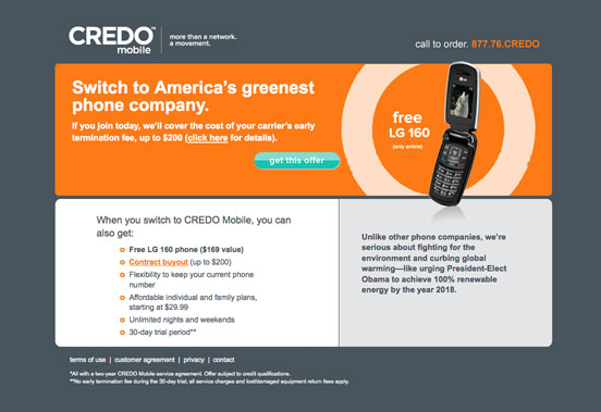
CREDO had SiteTuners conduct an Expert Review of their landing page in order to identify major conversion issues.
After the review they created a series of increasingly-refined redesigns that incorporated our best-practices recommendations and additional ongoing consulting feedback.
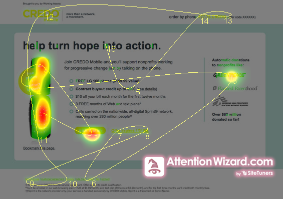
The final landing page is shown below:

The results were stunning. In a head-to-head test the new page performed 84% better than the original.
Why the radical difference?
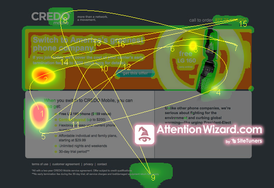
It can be argued that the landing pages are similar. Both show a single image of a phone and a distinct call-to-action button.
In order to answer this question SiteTuners employed advanced AttentionWizard attention-simulation capabilities.
By understanding the way the visual perception system and brain works, it is possible to accurately simulate how a web page will be viewed during the first few seconds of eye movement, and where attention will be focused. The results are instant and do not require expensive eye-tracking studies, or page-tagging and time-consuming data gathering to create mouse-tracking heatmaps.
The “before” page shows scattered eye movements (yellow lines) that bounce all over the page. Drawn by bright blocks of color and sharp areas of contrast, the eyes do not find a place to “settle”. The colored “attention heatmap” likewise shows attention spread into many areas on the page. In the midst of all of the visual “noise” the green call-to-action button is lost and ignored.
By contrast, the final page shows controlled gazing focused on the cell phone, and the call-to-action button. After briefly scanning the logos of the progressive causes that CREDO supports (“social proof” that provides a “halo effect” by association), the eye returned to the round offer call-out and the phone. The call-to-action button is one of three red attention “hot spots” on the page.
The morals of the story are clear:
-
- Huge conversion gains can be achieved by expert best-practices reviews
-
- Graphic artists need to follow a minimalist aesthetic that focuses on conversion and not “window dressing”
The new landing page may not be that exciting visually, but that\’s okay. In fact it is desirable. On a toned-down page the call-to-action emerges from the relative stillness of the page.
“Boring” works. And it makes you a lot more money – that should make it a lot more exciting.
Work with the best!Kickstart your optimization with a 90-minute Website Review from the pioneers in conversion rate optimization. Our CRO experts at SiteTuners can help diagnose your website from a conversion and usability perspective. |