 SiteTuners CEO Tim Ash’s session “Anatomy of a Purchase: Mistakes to Avoid” at the Internet Retailer Web Design & Usability Conference 2013 focused on zeroing in on customer experience. Tim showed the crowd of internet retailers how they can discover hidden hurdles in the path to purchase by looking at things from a user’s perspective.
The Attention Economy
Unlike you, your visitors do not care about your web site. By default, they have not invested much, and are just an inconvenience away from using the back button. This means that, unlike you, the users:
• don’t know much about the web site – they do not have a framework to fill in the gaps, and will not recover from many errors.
• are not patient – they will not put up with usability issues.
• do not care – they have not invested, and can walk away without thinking twice.
As there’s an oversupply of information on the web, there’s a scarcity of attention you can direct. You need to make sure you’re making the most out of the attention you’re getting; you need to sculpt the experience to maximize the chances of attention turning into interest, desire, and action.
The AIDA model
Think about the user’s decision process; it might help to go through each phase in a little detail.
Attention
Your web site may have a landing page, but the visitor’s first landing page is typically the search engine’s result page; your site does not exist in a vacuum. When they do land on your pages, make sure they can find where they are within your site:
• Make sure key categories are visually discoverable
• Don’t use banners with motion
• Stay away from carousels as a form of navigation
• Don’t rely exclusively on text navigation bar labels
Interest
To nurture interest, you need to make sure you don’t overwhelm the user. Tim’s example sheds light on this. While looking for a couch, he doesn’t need to be presented with brands, price ranges, or colors at the get-go; functions and styles serve as better forms of drilldowns first. Your ad may be designed to be loud, but once a visitor gets to your site, you want a quiet, tailored experience:
• Show only a small number of clear and useful choices
• Do not show product-level items too early
• Carefully consider what your early stage filters should be
• Make the category names clear and use product wizards to guide users
• Fix your onsite search
Desire
Just because the visitor wants something you are offering doesn’t mean you’re off the hook. At this point, the best thing you can do to feed the desire is to help the visitor take charge:
• Give the user details
• Help the user “experience” the product or service
• Where applicable, make the product customizable (color, accessories, etc.)
• Use spacing to group information
• Add a “saved” state, and make the customizations shareable
Action
When it’s time to close the deal, you just need to make sure you are trust-worthy and persuasive. Have your number available, display the secure transaction logos for the space, and carefully map out how you use elements:
• Be transparent and clear about costs
• Save buttons for important actions, and make your call to action pop
• Follow existing conventions
• Remove transactional barriers and make transactional trust elements prominent
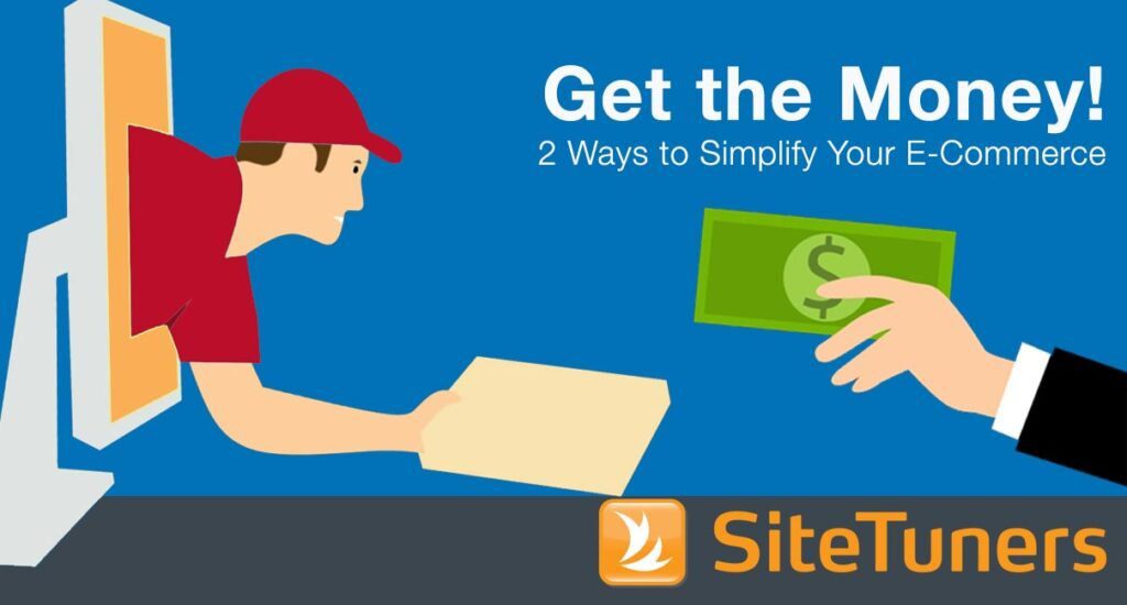
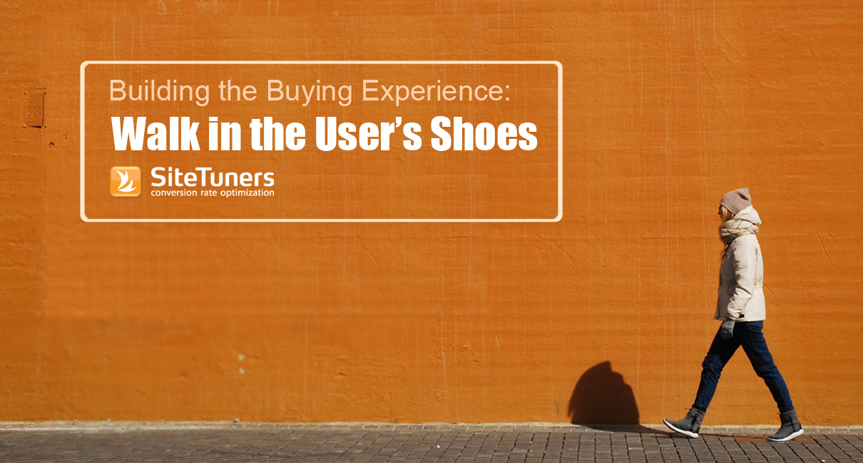
Empathy goes a long way in e-commece. Walk in your customers\’ shoes and make it easy for them to buy from you by clearing the path to purchase.
Work with the best!Kickstart your optimization with a 90-minute Website Review from the pioneers in conversion rate optimization. Our CRO experts at SiteTuners can help diagnose your website from a conversion and usability perspective. |