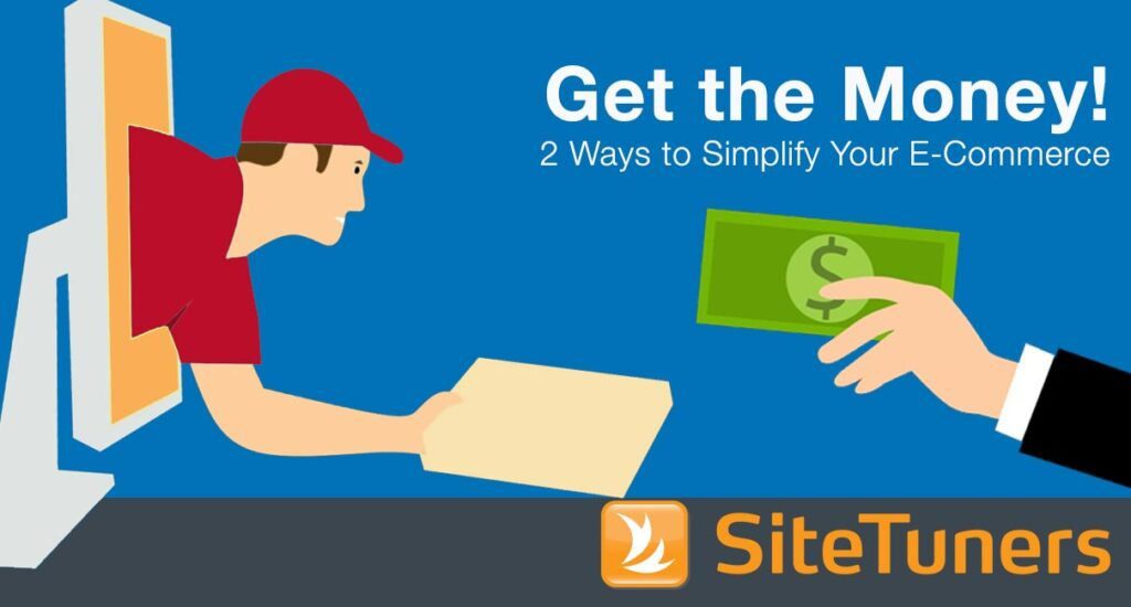
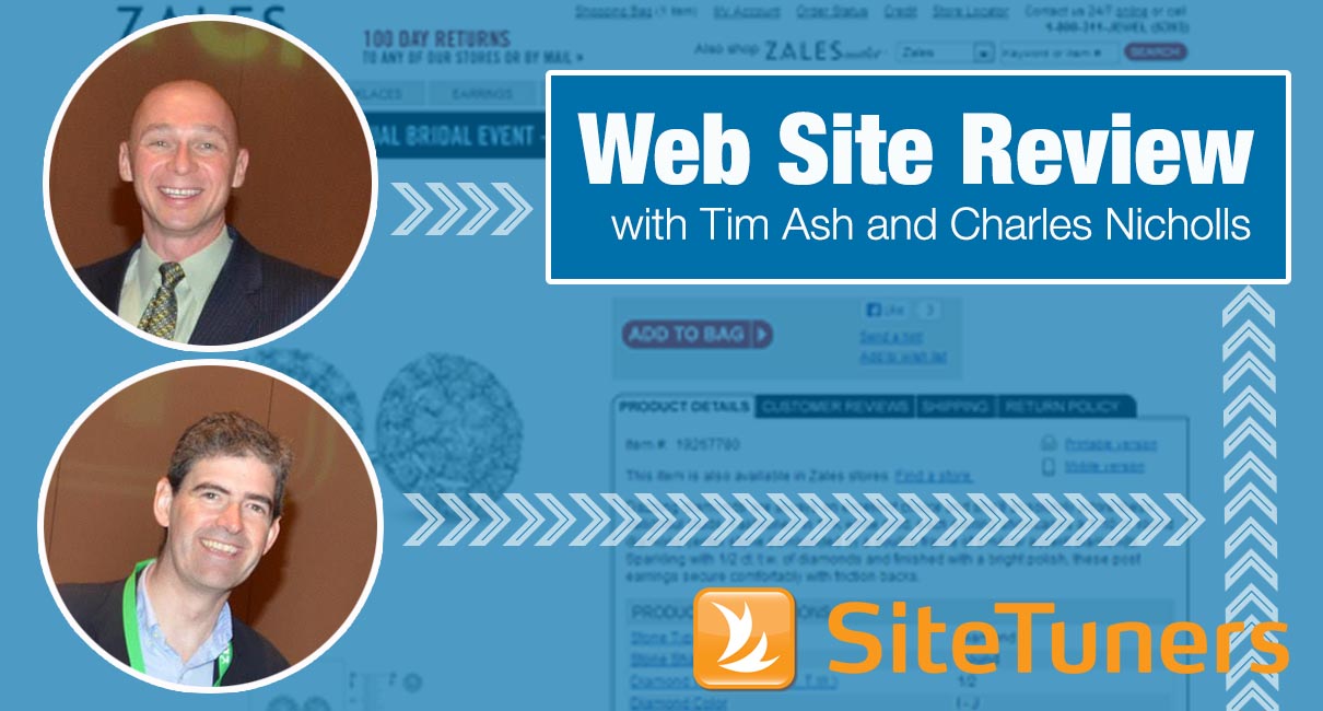
 In a webinar, SiteTuners CEO Tim Ash and SeeWhy.com Founder Charles Nicholls reviewed web sites selling products like computer hardware and software, travel tours, and clothes. Among those critiqued was Zales’s site, an online jewellery store. Here are their thoughts from the homepage to the company’s remarketing campaign – some of these are general enough to be useful for most sites.
1. Entry Pop-up offer
Charles thinks this is good as even without an incentive, pop-ups can up to 3% subscription, compared to about 1% to1.5% subscription rate without the pop-up. However, Tim, although not necessarily against collecting information early in the process, is wary of anything that blocks customer on the way to the website or interrupts the experience. He advises to test if having customers give out information early on will not cause an increase in the bounce rate. He says exit pop-ups are okay since customers are about to bail anyway.
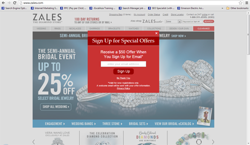
2. Subscription box
On the homepage, the subscription box is at the bottom. If the company is not going to use an e-mail collection pop-up, then the box should be at the top. Zales does a good job of indicating beside the subscription box why the customer needs to give out the e-mail address – to get offers, promotions, and discounts.
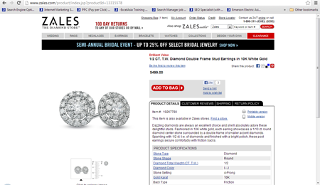
3. Product details page
The headline is small and is on the right. It should be placed in the middle of the page because it’s what the whole page is about. . The call-to-action should also be changed from “Add to Bag” to “Add to Cart.” The former, although clever, veers away from convention and will require the customer to go through the whole mental process of figuring out what the metaphor means.Tim also pointed out that as the product only has three Facebook likes, the likes should not be advertised next to the CTA.
4. Shopping cart summary page
The page’s color theme is pretty bland with shades of gray, black, and white. They also use red, and that’s a dangerous color to use because it usually signals an error. “Free Shipping” shouldn’t be in red as it’s a great benefit. Also, “Free FedEx Express Saver Shipping on orders $149 or more,” which is buried deep in the site, should be brought up higher and be made prominent.
The page also has a lot of calls-to-action, and that does not help the customer prioritize. Others should be demoted to text links. Tim and Charles also pointed out that upselling of higher priced earrings on the shopping cart summary page is not advisable because it will make the customer wander instead of completing the checkout process. The same is true with the promotional code text input field. Asking for a promotional code at this point will make the customer go find one (the company might also end up paying an affiliate fee if the customer looks and finds a code elsewhere). It should instead be made more discreet — a text link that opens a text input field.
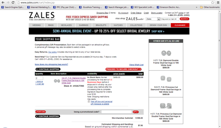
Shopping cart summary page above the fold
 Shopping cart summary page below the fold
At the bottom of the page, it has “Verified by Visa and MasterCard SecureCode” logos. This may sound positive, but according to Charles, his team did a consumer research that showed that 10% of consumers will bail once they see these logos. These logos tell the customer that there\’s an extra step which will require them to key in a password which they can never remember.
5. Remarketing e-mail
When a customer bails, Zales automatically subscribes the customer to their newsletter and sends a welcome e-mail. Charles points out that this – a commonly used remarketing technique by the Internet Retailers 250- is okay, because it means you’re not ignoring the customer. The downside is that the e-mail is in no way related to the customer’s purchase.
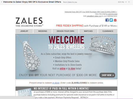
Companies should work on a more personalized remarketing campaign especially since it really works well for high ticket items. Tim and Charles agree that e-mails should even be gender-targeted. In Zales’s case, their e-mail could say “Imagine these earrings on her” if it’s for a male buyer. A big picture of the item on the cart should also be included to create a sense of continuity of desire.
Work with the best!Kickstart your optimization with a 90-minute Website Review from the pioneers in conversion rate optimization. Our CRO experts at SiteTuners can help diagnose your website from a conversion and usability perspective. |