
Start With Evidence, Not a New Homepage
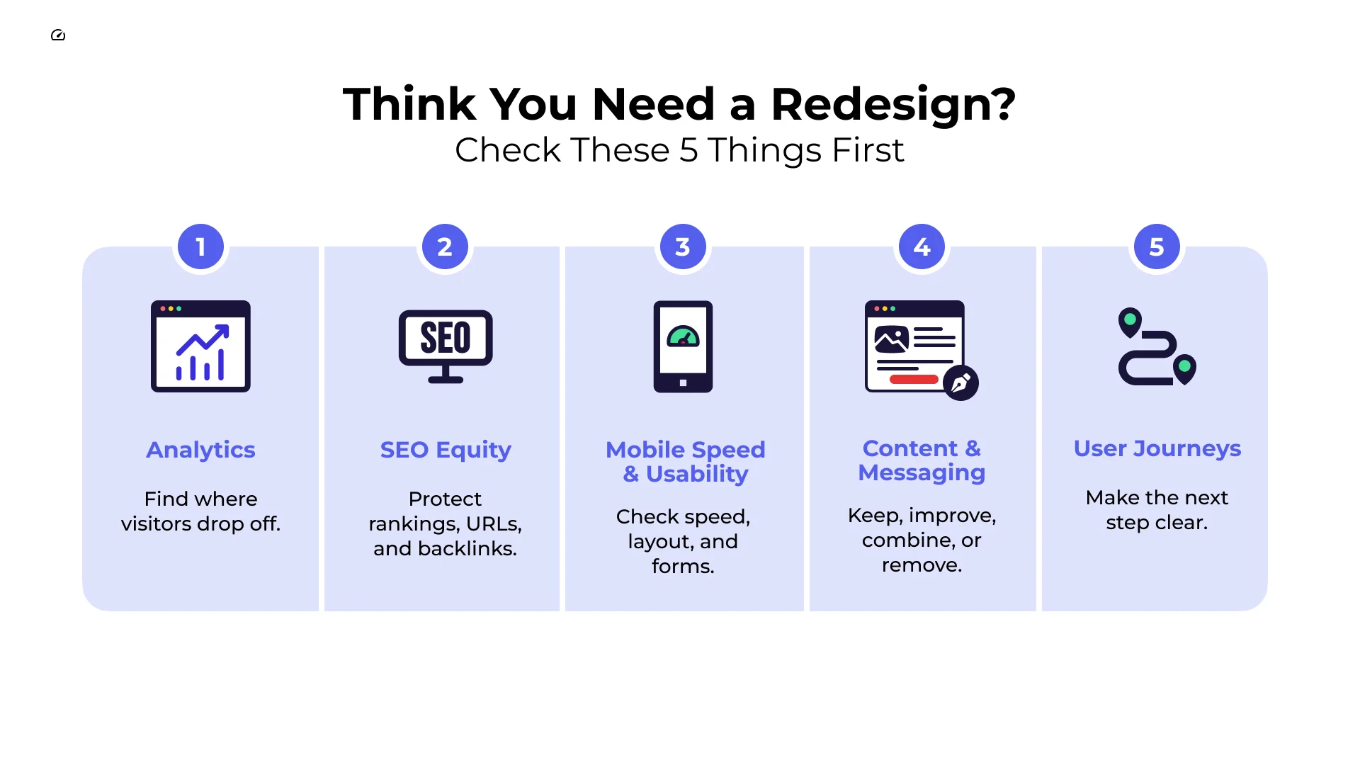
Before you redesign your website, check these five areas first:
- Analytics: Find the pages, traffic sources, and steps where visitors leave or do not take action.
- SEO equity: List the URLs, rankings, backlinks, and internal links that need protection.
- Mobile speed and usability: Test key pages on phones and note loading, layout, and form problems.
- Content and messaging: Decide which pages to keep, improve, combine, or remove.
- User journeys: Check whether people can find what they need, understand your offer, and take the next step.
A website can look old and still work well. On the other hand, a modern-looking site can lose leads when its message is unclear, its navigation is hard to use, or its forms create extra work.
Before choosing colors, layouts, or new images, find the real problems. That gives your redesign a clear purpose: make it easier for people to understand your business, trust it, and take action.
Before You Redesign Your Website: 5 Things to Check First
Many redesign projects begin with a homepage mockup. Teams spend time discussing colors, images, and button styles before they know what is getting in the way of visitors.
A better starting point is evidence. Look at how people use the site now. Then use what you learn to decide what needs to change.
The goal is not to redesign for the sake of a new look. The goal is to remove the problems that make it harder for customers to find information, understand the offer, or move forward.
Here are five checks to complete before you finalize new wireframes or designs.
Check Your Analytics First
Your analytics can show where people enter the site, what they do next, and where they stop. That information helps you focus the redesign on real user problems instead of assumptions.
Review these areas:
- Top landing pages: Find the pages that bring people in from search, ads, email, and other sources. The homepage may not be the main entry point.
- Important paths: Look at the steps people take before they submit a form, request a quote, call, or buy.
- Exit points: Find pages where visitors often leave. Then review the page for unclear copy, weak next steps, slow loading, or missing information.
- Device differences: Compare the experience on desktop and mobile. A page that works on a large screen may be frustrating on a phone.
Write down the baseline before the redesign begins. After launch, you will have a better way to judge whether the new site actually improved the experience.
Protect SEO Equity and Plan Redirects
A redesign can change page names, URLs, navigation, and content. If those changes are not planned carefully, search engines and visitors may have trouble finding important pages.
Before making changes:
- Create a URL list: Record the important live pages, their page titles, main topics, traffic, backlinks, and internal links.
- Map changed pages: For every URL that will change, choose the closest matching new page and plan a permanent redirect.
- Keep key internal links working: Check that important service pages and helpful content still connect to each other.
- Review search basics: Confirm that page titles, headings, canonical tags, sitemaps, and structured data will be reviewed before launch.
Do not send every old page to the homepage. A redirect should take visitors to the page that best matches what they were trying to find.
Test Mobile Usability and Page Speed
People often visit websites from a phone, so mobile testing should happen early, not after the desktop design is finished.
Choose your most important pages and complete real tasks on a phone. Can someone read the main message without pinching or zooming? Can they use the menu? Can they fill out the form without mistakes or frustration?
Also review page speed and Core Web Vitals. Slow loading, shifting page elements, and delayed buttons can make a site feel unreliable. Set clear performance goals before development starts so the new design does not add unnecessary weight.
Review Content and Messaging
A redesign is a good time to review every important page. Some pages may still help customers. Others may be out of date, overlap with another page, or no longer support the business.
Sort pages into four groups:
- Keep: Useful pages that bring qualified visitors, answer important questions, or support sales.
- Improve: Pages with a good purpose but unclear copy, weak structure, or outdated details.
- Combine: Similar pages that compete with or repeat each other.
- Remove and redirect: Pages that no longer help visitors or the business, with a redirect to the closest useful page when appropriate.
For each key page, ask a simple question: does a new visitor quickly understand what this page offers and what to do next? If not, fix the message before spending time on decoration.
Walk Through Key User Journeys
Visitors come to your site with different goals. One person may want pricing. Another may need proof that you can solve a problem. Someone else may be ready to contact you.
Walk through these journeys as if you were a first-time visitor. Look for unclear labels, dead ends, confusing page names, hidden details, and forms that ask for more than they need.
Use clear navigation labels that tell people what they will find. Choose words your customers use, not clever internal language. Each major page should also give visitors a clear next step, such as learning more, viewing services, or contacting your team.
What Is Tactical Design? Definition and Core Differences
Not every website needs the same kind of update. The right choice depends on the problem you need to solve.
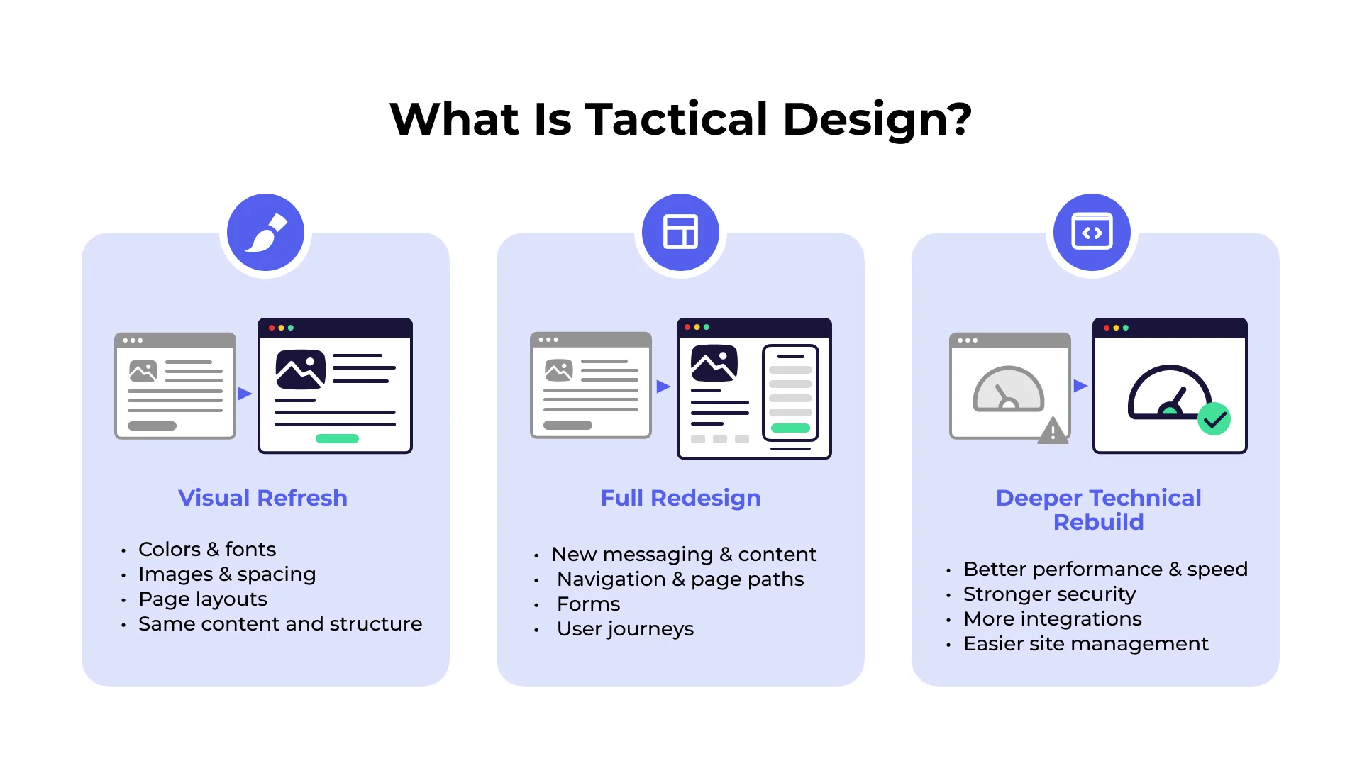
A visual refresh updates the look of the site. You may change colors, fonts, images, spacing, and page layouts while keeping most of the content, navigation, and technology in place.
A full redesign changes more than appearance. It may include new messaging, content, navigation, page paths, forms, and user journeys. Choose this path when the current site makes it hard for people to find information or take action.
A deeper technical rebuild may be needed when the platform itself limits speed, security, integrations, or the ability to manage the site. This should support a clear business need, not become the starting point for every project.
| If the main problem is… | You may need… |
|---|---|
| An outdated look but clear content and working paths | A visual refresh |
| Confusing navigation, weak messaging, or poor conversion paths | A full redesign |
| A platform that cannot support needed performance or business requirements | A deeper technical rebuild |
Start with the smallest change that solves the real problem. A visual refresh can be enough when the structure works. A full redesign makes more sense when the experience itself needs to change.
Wireframe the Customer Path Before the Visual Design
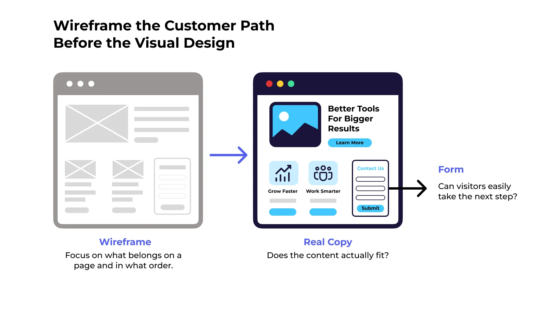
Wireframes help teams focus on what belongs on a page and in what order. They are useful because they put attention on the visitor’s needs before visual details take over.
Use real draft copy in wireframes whenever you can. Placeholder text can hide problems with page length, headings, forms, and calls to action.
When reviewing a form, ask whether every field is needed. Keep the steps simple, explain what happens next, and make the button text clear.
Planning Content and Conversion Paths for High-Impact UX
A useful redesign lets content guide the layout. Start with what a visitor needs to know, then design the page so that information is easy to find and understand.
Key points to review include:
- Clear order of information: Put the most important message, proof, and next step where visitors can find them easily.
- Easy-to-scan copy: Use short paragraphs, clear headings, and plain language so people can quickly find what matters to them.
- Accessible design: Use readable text, clear labels, enough contrast, and keyboard-friendly navigation.
- Helpful calls to action: Place the next step where it makes sense. Make it clear what will happen when someone clicks.
A page does not need to push every visitor toward the same action. Give people the information they need to feel confident moving forward.
Frequently Asked Questions About Website Redesigns
How long does a strategic website redesign take?
The timeline depends on the size of the site and how much needs to change. A small visual refresh may move quickly. A larger redesign can take longer because it includes research, content review, design, development, testing, redirects, and launch planning. Set the schedule after you understand the scope of the work.
Will a website redesign hurt current organic traffic?
It can if important URLs, content, internal links, and redirects are not handled carefully. A clear migration plan helps protect search visibility. Keep a record of important pages, map changed URLs to relevant new pages, test redirects before launch, and monitor the site after it goes live.
What is the difference between a website reskin and a full redesign?
A website reskin changes the visual style, such as fonts, colors, and images. A full redesign changes how the site works for visitors. It may update the content, navigation, page structure, forms, and customer paths. The right choice depends on whether the problem is mainly visual or deeper than that.
Conclusion
A successful website redesign is not about making a site look newer. It is about making the experience clearer, easier, and more useful for the people you want to reach.
Before you approve new designs, review your analytics, protect SEO value, test mobile pages, clean up content, and walk through key customer journeys. Those checks help you spend time and budget on the changes that can improve trust, understanding, and action.
After launch, keep watching how people use the site. Look for new friction points, monitor search visibility, and continue improving the pages that matter most. If you need help finding and fixing conversion barriers before a redesign, SiteTuners can help with conversion rate optimization services.