Summary – If your visitors know they are in the right place and they trust you, then you are 2/3 of the way to a perfectly converting website. After you’ve started building trust with customers on your site, the final step is making sure they know what to do next. In this article, you will learn how to effectively communicate to your visitor what they need to do in order to become a customer.
This is part 3 of a three-part series that answers the most important questions asked by visitors arriving at your website.
If you missed the other two parts you can find them here: Part 1 & Part 2
SiteTuners select, review, and recommend products/services independently.
If you buy through affiliate links, we may earn commissions. Learn more.
What Am I Supposed to Do Here?
When a visitor knows your website is the right place and they feel good about it, that is the perfect moment to lead them to the next step. If you did a good job at building trust with your customer, it’s now essential that you speak to the visitor and let them know what they need to do next in the process. It’s the driving force to let your visitors know where and when to click. To help you determine the best practices from website experts in different fields, here are some important tips to help in your website structure and why they are important to the visitor.
Let Your Visitor Self-Identify for You
If your business caters to both, businesses and consumers, then you should be clear on your home page and let the visitors self-select which they are, so they go down the correct path. Your message for businesses vs consumers is different so you don’t want to combine the messages on your home page because that will only confuse the visitor, which is counterproductive to building trust with customers on your site. Once they have self-selected, you can then direct the specific message for either a business or a consumer.
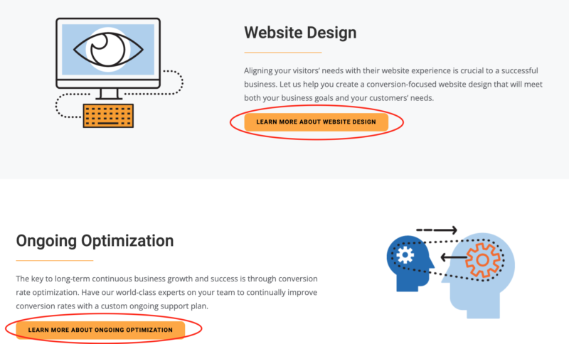
Improve your websites user experience and boost conversions
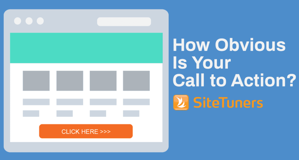
Benefit from Clear and Meaningful CTA’s that Helps Building Trust with Customers
One of the most important things to remember regarding your main CTA is that it should be above the fold, not buried further down the page. You want your website to explain the benefits of what you are offering then give them a CTA at the beginning of your web page so the visitor immediately sees it and can take action.
You should also keep to one CTA. If you give the visitor multiple CTAs, you are causing them to think and try to figure out which button they should pick. Instead, you should only give them one right up front and bury any secondary CTAs to lower in the page. This way if they are not sure they can continue scrolling to find what they are looking for.
Your CTAs should be consistent with the same color, font, and format throughout your website. You want to train the visitor to see the Blue Button and know that is what they click to get to the next step in the process. If you continually change the main CTA color, you are just confusing the visitor and making them think. This consistency means that when a user has spent a considerable amount of time on your website, they know on sight which button means what, without having to read the text on the button.
Does your page have a lot of information to tell? Whether you have a combination of long texts, images, or videos, if the user must scroll the page several times, there’s a chance that your CTA won’t be as effective. For your visitors to stay engaged, the key is to repeat your CTAs several times. Before they reach the bottom of the page, have your CTAs at regular intervals.
The CTA should be a button that is hard-to-miss, preceded by content designed to influence the customer to act. But, if the visitor is nearing the end of your content, and still not willing to act, you need to make a last-ditch attempt to persuade them.
It could be a short, insistent message accompanying the CTA button such as:
- “Hurry! Only a few seats remaining!”
- “Last day to take advantage of this offer!”
- “Register today to receive a 10% discount”
Messages like these usually bring about a sense of urgency in the minds of customers. If you succeed in convincing them it’s now or never, or they’re losing out on a good deal if they procrastinate in taking action, it might be just the push they need to get the conversion you wanted.
Use thoughtful words for your CTA buttons. Don’t use words like Submit, Next, and More these are generic words. Be more engaging regarding what is coming next. So, for example, if you are collecting their personal information for a webinar registration, instead of having the regular “Submit” button at the end, it’s more engaging to mention something like “I am ready to know more!”. If a visitor is browsing through your products, instead of an impersonal “Next” button for accessing more products, something that says “Show me more products” seems more personal.
The idea behind this is to keep the visitor excited and upbeat about the whole process by showing enthusiasm. They find navigation on your website easy so taking the desired conversion action comes more naturally to them.
This also remains true when building trust with customers that may already have an opinion or a new visitor that is about to make the decision about your website.
When users have this level of comfort while browsing through your website, you’re building trust with customers
Use Pop-up Windows to Your Advantage
Pop-up windows are helpful to use when your visitors look like they’re about to leave your page without taking any conversion action. It’s a last resort tactic to help you save a good lead. Your pop-up window could simply include a message like “Are you sure you want to leave?”, then repeat your irresistible offer. You can also use:
- “Explore more NOW!”
- “Still confused? Chat with our experts!”
- “Did not find what you are looking for? Tell us about it”
Basically, what you want to do here is just make the visitors trust you a little more, so they feel inclined to stay on the page a little longer. A few more seconds on your page can make all the difference if this time is used wisely.
So, if you are asking them to stay when they really want to move on, make sure you make it up to them. Either offer them a good deal, help them in their decision making, or ask for their feedback. If they aren’t satisfied, thank them for taking their time to give feedback, and promise to do better next time.
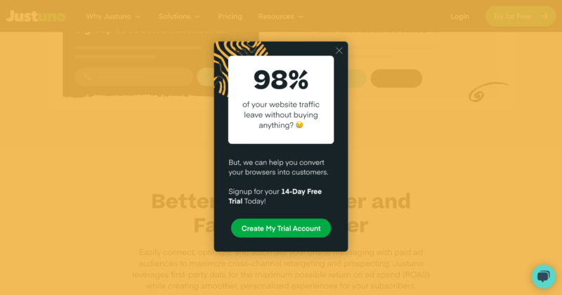
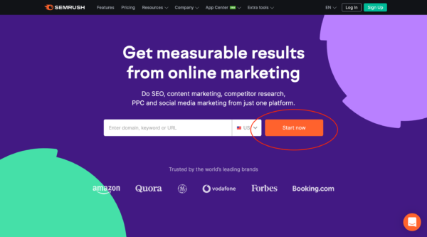
The image above shows how some websites offer a free trial in an attempt of building trust with customers and visitors by letting them try their services for free for 14 days.
Don’t Make Your Visitors Think
Every time you make your visitors think too much, they lose interest in staying on your website. Better yet, assume people who come to your website do not like to think at all. The looser ends you leave, the more they are going to be forced to think. Instead, offer solutions.
Offer enough content to help them decide and be with them throughout the decision-making process right up to the conversion. If you make visitors think too much about how to take the conversion action, you might be losing a valuable lead or even a potential customer.
Here are a few examples to simplify the user’s experience.
- When you have filtered search results, clearly display what filters they have used, so they don’t need to remember it
- When visitors have already looked at some links on your website, show these links in a slightly different color so they don’t have to remember which parts they have already browsed.
- If you have a website that sells products customers buy regularly, such as cosmetics, grocery items, etc., save the previous purchases. Once a visitor signs in, show the link to their previous purchases so they can easily select the things they need without having to go through the search process again.
- If you have a website that delivers food, the customer should have an option to repeat an order they have previously received without having to go through the selection and customization process again.
People Love Comparing
When it comes to buying, visitors obviously want the best deal for themselves. They want to know what the competitor website is offering in terms of price, features, add-ons, etc.
If a feature of your product or service compares better than others, find a way to tell this to your visitor without putting down your competitor. A good way to do this is to reference a website offering comparisons between products. Let the visitors know how your product or service ranks according to that website.
Make Your Content Easy to Scan
Visitors won’t usually read all your content, but they will scan it. If you remember this, you will understand why having lengthy, monotonous content on your website is a big NO. Most visitors will simply glance at it and skim through the content.
It’s best to do away with lengthy content on your website entirely and save it for your blogs. However, even then, make the content modular. Use sub-headings, bullet points, numbered lists, bold words and infographics. This increases the chances of visitors actively going through the content. If you have enough subheadings, visitors can choose to read only the parts they find relevant to their needs.
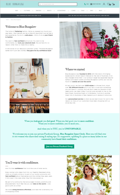
Blue Bungalow does a great job conveying the important information in a way that is easy to understand and to take in, while also displaying trust elements throughout their site to keep building trust with customers.
Conclusion
If you succeed in establishing your reputation as a trustworthy business in the eyes of your website visitors, that is one of the most important things you could do towards fulfilling your goals. And the best part is you also help the visitors realize they have reached a place where they can fulfil their goals too! Following these tips will help your visitors know they are in the right place; they will trust you and most importantly they know what they are supposed to do. A perfect alignment, wouldn’t you say?