Summary: Which attributes describe a good landing page experience? User experience encompasses all aspects of the visitor’s interaction with the company, its services, and its products. The first requirement for an exemplary user experience is to meet the exact needs of the visitor on your website, without complications. User experience aims to provide positive experiences that keep a user loyal to the product or brand. For this reason, the end user experience is the aggregate of many factors ranging from website design, navigation, transaction ease, and of course, page download and rendering times.
As the most powerful focal point of your marketing efforts, the experience of your website visitors can surely make or break your business. So in today’s fast-paced digital trends, how do you satisfy your visitors’ expectations? The answer is – invest in excellent user experience.
User experience is a person’s overall experience on your website and how convenient or pleasing it is to use. The goal here is to make it as simple as possible for your visitor to accomplish what they want.
Remember: Your desired conversion can only happen if your customers’ needs are being met.
Deliver What You Promised
You want to align with the visitor’s intent. Your upfront messaging needs to match the user’s expectations. You don’t want to make your visitor think. For example a visitor is searching for “Solitaire Diamond Rings”, the two following ads show in the search engine.
The first search result is from Diamond Exchange.

The second search result is from Bevilles.

Both are really good ads and you would expect to be delivered to a page with Solitaire Diamond Rings. Well Diamond Exchange takes you to the following landing page:

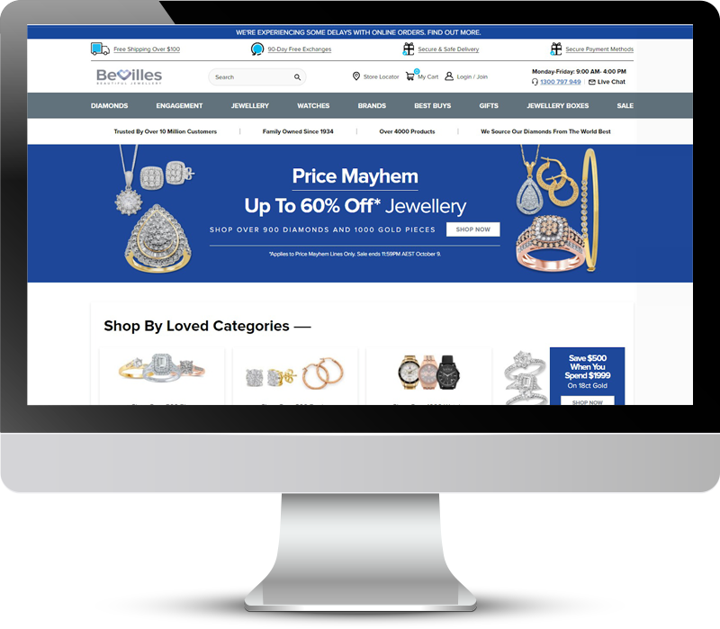
At no point does it show that the visitor has landed on Diamond Solitaire Rings. It is just showing a bunch of rings with diamonds, not exactly what the visitor was looking for. On the other hand Bevilles takes the visitor to the following landing page:

With this landing page, the visitor knows they have landed in the right place because the title bar in the landing page says “Solitaire Diamond Rings.” You want to make sure your landing page is delivering what the user wants.
Find out how Bevilles eCommerce increased conversions by 16% and sales by 30%!
Use Appropriate Color Schemes
Your visitors will react according to what they’re visually pleased with. No matter what you think, it’s always a bad idea to incorporate too many colors on your website. Instead, use subtle colors. Ideally, 2-3 primary shades from your brand color are great starters. You want to use one primary color for your main call to action (CTA) throughout your entire website. Any secondary CTA’s should be a subtle version of your primary CTA and all other CTA’s should be a non-competing color with your primary CTA.
A bad example of color schemes on their landing page is Oxford Seminars. Below is what their landing page looked like when they first approached SiteTuners to improve their landing page.

Their landing page was a kaleidoscope of colors, where the visitor had no idea where to start or find what they were looking for. After making improvements, you will notice a vast change in the landing page:

Notice how they now have one primary color for their main call to action button. This trains the visitor to know that color is what the visitor should press. The visitor immediately knows what they need to do next. Use your color scheme wisely to highlight specific areas on your page.
Remove Distractions
When visitors land on your page It is important to focus on which attributes describe a good landing page experience however, it is equally important to avoid distractions that would confuse the visitor. Stay clear from:
- Overuse of Colors
- Incorrect Visual Emphasis
- Rotating Banners
- Flash Animation
- Entry Pops
- Sudden Pop-ups, etc.
Remember that less is more. You want the visitor to focus on the most important elements of your landing page, specifically the CTA.
Below is a very distracting landing page with multiple CTA’s and an overuse of colors. The left sidebar is distracting from the overall page and confusing the visitor.

After coming to SiteTuners, the following changes were made where there was only 1 main CTA and the left sidebar was removed from the page. It was a much cleaner look and converted very well, much better than the previous landing page.

Use Videos Appropriately
In 2021, the average person will spend 100 minutes each day watching online videos. If you are using videos on your website as demonstrations, or to show testimonials from existing customers, make sure you follow standard guidelines for all your videos.
Never start a video automatically. They are distracting and can annoy a visitor. You want to give the visitor control of when and if they want to start the video. You should label the video with a short description and the duration of the video. Allow visitors to decide whether they want to watch the video.
For example, Heller Tax Grievance shows a video on their landing page with a title explaining what the video is about and how long the video is. This allows the visitor to decide if they want to watch the video or not.

Lightning-fast Page Loading Time
Believe us when we say that no matter how good your landing page is, a slow loading page will make your visitors leave and turn to your competitors. People value their time and are influenced by instant gratification. Make sure to fully optimize your website to attract more potential customers.
Capture Data Fields Easily for the Visitor
More than just making the visitor glance over your well-designed website, your goal is to make your visitors actually sign up, subscribe for emails, or click the purchase button. If you want them to take these actions, make sure that the process is as easy as possible for them. Here are a few things that you should put on your checklist:
- Mark all mandatory fields with an asterisk (*). Clearly indicate all fields marked with an asterisk are mandatory. It would also be useful to tell them why you need this information.
- When you require a date to be entered, clearly mention the format you need it in (example: mm/dd/yy). To make it even easier, you can provide individual boxes with dropdowns to enter the day, month, and year.
- When you require the address, have separate fields for country, city, state/providence, etc. Use dropdowns wherever possible. This way, there is less of a chance of typing errors. It also saves the visitor from typing too much.
If you have sent out an email or a text message with a discount code along with the link to your website, it is a good idea to have the coupon code auto-fill when they click on the link from the email or text. This is more convenient than making them manually re-enter the coupon code when they get to the website.
Did you Miss our webinar?
Avoid Impersonal Error Messages
Imagine how you’d treat a friend once you welcome them to your home. It’s similar to the way you should treat your website visitors. Treat your visitors like guests and guide them step-by-step. Even when you make it very easy for visitors to enter information, there are some who will make mistakes when filling out a form.
The last thing you want to do is to blame them for it. Avoid impersonal messages that just show an error has occurred, and aren’t very helpful in explaining what was wrong and how to fix it.
Here is a good example of using humor in your error messages. The visitor knows they did something wrong and Mailchimp has let them know what it is with humor.

Here is another example of making light of the situation and letting the visitor know they missed some fields.

One common thing about these well-established sites are their friendly, helpful tones even after the visitor commits an error. The only item recommended in these examples is to use a different color for the error messages. Red is a negative and you don’t want the visitor to feel stupid. A better color would be Yellow for caution, you have made a mistake.
The first step towards making your visitors feel at ease is to talk to them like a human, not a computer when they make mistakes. The simplest way to do this is to not rely on the programmer to write the error messages for you.
Ask yourself the question which attributes describe a good landing page experience and try viewing your site as a visitor landing on your page.
Give Reasons for Requiring Personal Information
It’s understandable for your visitors to be skeptical about sharing their personal information online. It’s your job to make them feel secure to trust you with these confidential details. To do this, be upfront on how you will use their personal information.
Here are some good examples of explaining why you are requesting their personal information.
Let them know that their email will be used to send their receipt and tracking information after they have purchased.
Let them know that you need their phone number in case there is a billing issue. This way they know you have no intention of spam calling them or selling their phone number to other companies.

Here is an example on a lead generation form. It’s just a friendly notification letting the visitor know how they plan to use their information.

Will you use their email address to send them a receipt or a confirmation? Whatever it is, if they’re going to trust you with their personal information, make sure they know exactly what they are signing up for.
Conclusion
User Experience is all about caring for your customers’ needs even before they realize how much they need it. The key is to make their browsing experience on your page easy so the visitor accomplishes what they intended. Hopefully, this article was beneficial in which attributes describe a good landing page experience. Which tips do you plan to incorporate in your next landing page?