Bevilles eCommerce Homepage Redesign – 30% Increase in Sales

16% rise in conversions and an increase of 30% in sales.
Bevilles is an iconic family-owned and operated company in Australia that sells a wide range of jewelry and watches.
The GM of Marketing knew that their e-commerce website could be performing much better in terms of sales and conversions, so they utilized SiteTuners’ conversion optimization expertise to tweak their homepage.
SiteTuners reviewed the homepage elements and recommended several tactical changes to not only improve user experience, but to also support the desired conversion goal of a completed sale.
Company
Type of project
Content strategy
Results
16% rise in conversions and an increase of 30% in sales.

We saw an immediate increase in conversion, and daily sales grew to numbers we have never experienced before. SiteTuners’ finely tunes your website to deliver a superior customer experience, which results in an immediate uplift in conversion and sales. The results were immediate and frankly extraordinary!
Overview
Improving Website Trust to Increase e-Commerce Conversions
Increasing website trust is one of the basics in conversion rate optimization. Trust is an important ingredient in online transactions. Web visitors must feel good about your site before they take the desired conversion action.
SiteTuners recently conducted a diagnostic review of the homepage for Australian jewelry retailer Bevilles’ online store to identify conversion leaks as well as seeking immediate opportunities for improving conversions and sales.
By implementing SiteTuners’ recommended changes for improved website trust, usability and user experience, Bevilles benefitted from a 16% rise in conversions and an increase of 30% in sales. These changes repaired major conversion barriers.
Fine-Tuning Bevilles’ Homepage
Bevilles is an iconic family-owned and operated company in Australia that sells a wide range of jewelry and watches. The company has 24 stores in Victoria, New South Wales and South Australia. The company also operates an e-commerce website for online customers.
The GM of Marketing knew that their e-commerce website could be performing much better in terms of sales and conversions, so they utilized SiteTuners’ conversion optimization expertise to tweak their homepage.
SiteTuners reviewed the homepage elements and recommended several tactical changes to not only improve user experience, but to also support the desired conversion goal of a completed sale.
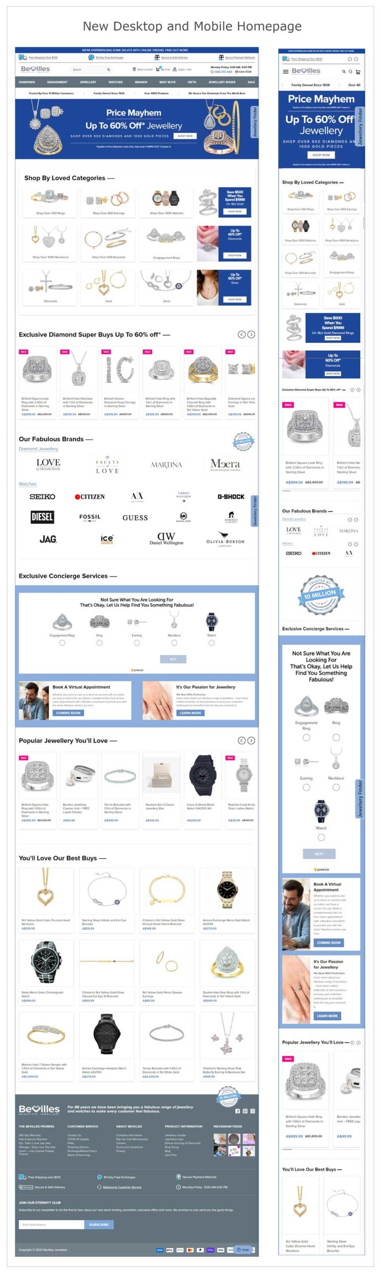
Bevilles’ original homepage (shown below) looked very templated and generic. It was missing trust-building elements and suffered from design and usability issues that led to a poor user experience.

After their review, SiteTuners recommended design and navigation improvements to the page. The result of Bevilles’ implementation of SiteTuners’ proposed changes is shown below:
Designing A Trustworthy Website
SiteTuners’ recommendations for Bevilles’ homepage are anchored on the principles of online trust and persuasion.
Building trust online may sound simple, but often, it isn’t.
Web visitors initially judge the trustworthiness of a website on a subconscious level. To effectively design to gain trust, you need to understand how online visitors think, then support the process of automatic decision-making. That is, you must avoid cognitive overload as much as possible and design for the shortcuts the brain uses to identify trustworthiness.
From years of experience, SiteTuners considers the following to be the foundations of building online trust:
Design Coherence
Design is especially important.
People will judge your business from the overall visual look of your website. While web users’ expectations of a good, modern design are influenced by design trends, the process they use to identify a trustworthy website has remained consistent:
People do not read online. You must make sure that your site is organized in a way that makes sense to them from the get-go. They should easily find information that is critical for them to establish the relevance of a web page to their task at hand. For this reason, a web page also needs to be free from unnecessary distractions.
Next, the human brain is wired to appreciate consistency. Online, this translates to people noticing if certain elements look different from others, or if colors used are appropriate to the theme or message that a website is trying to convey.
To improve the design of the Bevilles’ homepage, SiteTuners recommended the following:
Persuasive Numbers
Numbers are known to be highly persuasive elements.
On the web page, certain numbers can build visitor confidence if they are believable and real.
For instance, the phone number is the biggest trust symbol on the web. Having a phone number lets visitors know that they are dealing with a legitimate company. It also reassures them that they can call the company when they have any concerns or issues about their purchases.
Other numbers, such as the number of satisfied customers or number of years the company has been around are effective as social proof. These numbers indicate to your web visitors that you have other customers and that your business is one they can depend on.
The original Bevilles’ homepage missed the opportunity to use the persuasive power of numbers. Hence, SiteTuners suggested the following improvements:
Simplicity and Ease of Use
People dislike complexity.
Thinking is tiresome and energy-consuming to the brain, so it reserves heavy mental processing for more important decisions.
This is why online users will immediately bail out if they perceive a web page to be too complex. They would rather find another site than exert extra effort to figure out a convoluted web page.
Likewise, having a simple, easy-to-use website increases the likelihood that online visitors will stay and take the desired conversion action. Simplicity also lends transparency to a site, thereby building trust.
To achieve simplicity, you must aim to reduce cognitive friction. Usability expert Steve Krug wrote about this in his book “Don’t Make Me Think.”
SiteTuners applied the principle of simplicity and ease of use on the Bevilles’ website with the following recommendations:
Authority
Authority automatically earns trust.
People look to authority figures for knowledge and guidance and assume that they exercise high levels of competence and goodwill.
Well-known brands hold the same influence: people are more likely to trust them and their products as compared to those that are lesser-known. But, even unknown brands can benefit from established authority figures by utilizing the “halo effect” or borrowing some of that existing trust through simple association.
For instance, prominently displaying reviews, awards, media mentions, or trade associations on a website will extend the perception of authority from these well-known authority figures to the website.
While Bevilles is a relatively popular jeweler in Australia, the company’s e-commerce site also gets online visitors from Asia. Therefore, it made sense to boost the website’s authority with the following recommendation:
Transactional Assurances
E-commerce transactions carry a lot of risk for customers. More so when they involve big-ticket purchases, like expensive diamond rings for example.
Having prominent transactional assurances, like exchange policies and safety guarantees, will minimize online buyers’ perception of risk. Online visitors will be less anxious about buying something when they know they can return it for free if they’re not satisfied for any reason.
Bevilles’ original homepage showed transactional assurances, but these were inconspicuous and likely to be missed by online visitors. SiteTuners wanted to make this more prominent and suggested the following:
Clear Expectations
A large part of the visitor having a great experience is managing user expectations.
A website should make online users feel that they are in a safe environment by reassuring them that your company won’t break their trust.
Here are the best practices to meet the bare minimum for user expectations and bolster visitor confidence in completing the desired conversion action:
SiteTuners worked to improve the user experience on Bevilles’ homepage by recommending the following:
Results
Bevilles tracked website performance after implementing SiteTuners’ recommended homepage changes.
The results showed that:
Overall, Bevilles’ revenues and ROI from their paid ads have also increased.
Conclusion
Trust is essential to e-commerce websites.
Improving the trustworthiness of a site is one of the keys to optimizing a site for conversions. However, you cannot simply slap trust elements on to a website and then expect online visitors to be convinced to trust it.
To be credible, you need to focus on improvements that enhance the aesthetic quality along with the usability and user experience of the site.