So, how do you make sure most of your e-mails are read? And that, if and when, users do click through to your landing page they don’t bail?
In an episode of Landing Page Optimization, AWeber Senior Business Development Manager Hunter Boyle shared some tips on making your e-mails stand out from the crowd and on getting your audience to stick around and complete your desired conversion action.
1. Be compelling
The key to getting sign ups and sales conversions doesn’t really lie in the technology; it’s in making sure what you put in your e-mails reflects your content and your brand, in general.
Nobody’s going to be excited if you’re sending dull repetitive e-mails, whether they’re newletters or promotions. Nowadays, it takes more than good valuable information to stand out – you have to have a compelling edge, so people will look forward to reading your e-mails.
You can take AppSumo’s lead on this. They’ve grown their list to 750,000 in just over two years by having people expect certain e-mails that have really excellent content, a personal angle, and some surprises in them.
They’re a product-driven e-mail list with sales and offers on different services and some SaaS products, but every now and then, they throw in a curve ball that has a free giveaway or some other surprise element.
People gravitate towards e-mails that don’t treat them as merely list names or data points. And this where AppSumo excels; they give back and listen to their audience, and it makes that connection stronger with the people on the other end.
2. Make it personal
It’s not necessarily bad to talk about yourself in e-mails.
If you do it right, you can talk about personal experience. In fact, e-mails that do well add that personal approach.
From a digital marketing standpoint, the personal approach to e-mails – the signatures, the P.S. letter in plain text- can perform extremely well. People like to see e-mails coming from a real person on the other end, so, your emails should …
- have a component of storytelling, testifying, or relating from personal experience, and
- be written in a more conversational tone.
On the other hand, you should NOT …
- use a do-not-reply-from e-mail address,
- write ‘Dear’ then the customer’s first name in brackets,
These are a couple of things that put a barrier between the sender and the recipient.
E-mails that people look forward to the most are the same as what people want to see from their social feeds – they’re from people that we know and trust. People want to connect, not just get e-mails about updates or lead gen or sales.
Sure, e-mail’s a little bit different because when people sign up for an e-mail list after they’ve purchased something, they have a goal in mind. They want to know about the next vacation deals from a travel website, for example. What a travel website will want to do is use a more casual tone, or use an editorial tone that fits with the brand.
Personalizing could be spicing up your e-mails a bit by injecting humor, or throwing in some animated GIFs. Give your audience something to be interested in, even if not every single e-mail is going to be relevant, whether it’s interest in the offer, in tone of the copy, or in the graphics.
3. Set expectations and deliver on your promise
Maintaining the common thread is crucial to your entire e-mail marketing process. You have to match the message and the vehicle to the destination, whether it’s from the e-mail side to the landing page and the calls-to-action (CTA), or vice-versa (landing page into e-mail back to either another product pitch or free trial). You have to keep the user’s attention span by using urgency or a strong CTA.
If you’re sending people from an e-mail to a page that either doesn’t have a compelling offer, or doesn’t connect with the expectations set, you’re not going to get the sales, the trials, the leads, or whatever your intended conversion action is.
4. Optimize for mobile
In 2014, SeeWhy reported that 65% of email is opened on a smartphone first.
This year, Hunter says the mobile train will be moving at bullet train speed and will be way out of the station, so if your e-mails or landing pages are not set up for mobile, you really have to take a look at that.
Here are some things you should be doing to keep your e-mails mobile-friendly:
- Use a responsive template of some sort
- Make the font large and legible.
- Have a bit of extra white space and room for “fat finger” moments.
- Use image-appropriate links and CTA buttons that stand out.
- Use a single-column format.
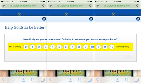
Hunter cites his experience with Goldstar as an example of how you should NOT do e-mails on mobile. He got an e-mail for tickets of a show he was interested in, but when he clicked through, not only was the landing page unrelated to the show, but a horizontal window pops up asking him how likely he is to recommend Goldstar. He had to scroll 3 across his iPhone to get to the X button. On top of these, when he did manage to close the window, the page underneath asked him to download the Goldstar app.
- Make links obvious (use some sort of design signifier, plus the CTA language, to let users know it’s a link).
- Find ways to break up thick paragraphs.
- Have CTAs stand a little bit more alone, so people can click on them without the uncertainty if this is where it’s supposed to be or if they have to pinch and zoom in to find the link.
Your landing page has to continue the experience and be mobile-responsive as well. If you’re using an overlay, Lightbox, or pop-up window, turn it off for the destination pages that you’re pointing to. You wouldn’t want users to be clicking through your mobile-friendly e-mails only to be taken to a mobile unfriendly page where two seconds in, a window pops up asking them to sign up for e-mail.
Get people excited to read your e-mails once they pop in the inbox by making content engaging with the right editorial tone and by surprising your audience. Also, maintain the intent and match the visitor’s expectations all the way through from the e-mail to the landing page and any downstream experiences. And, if you’re not aboard the mobile train, it left the station a while ago, so you better catch up somehow.
