Some marketing teams try to apply the same skills on the homepage design as they would on Chapter 1 of a book. They try to create lots of content they feel is useful, with blocks of text describing multiple aspects of the site.
While you can see where the good intentions are coming from, this approach often leads to failure. The website’s homepage doesn’t have a lot in common with a book. The book is supposed to make the reader stay and engage, while the homepage is supposed to get the visitor away from the page, and into the section the user is supposed to interact with.
In that sense, it has more in common with a sign post than a book.
The homepage exists for two reasons:
- to establish trust (so that visitors stick around the site), and
- to get visitors off the homepage (so they can drill down and find what they need)
For the homepage to do what it’s meant to do, it has to accomplish three things when visitors land:
- make visitors feel they’re in the right place
- make visitors feel good about the site
- make it clear what visitors are supposed to do next
Here are examples of homepages that succeed at these and how they do it.
1. PDFfiller

PDFfiller’s homepage design is immediately able to convey what the site is about when visitors get here:
- The company name and logo is in the upper-left corner which is where visitors tend to look to get oriented about where they are on the web.
- The headline tells users exactly what PDFfiller is and what it allows users to do.
The page has compelling trust elements. It leverages social proof by indicating that a significant number of forms have been filled, signed, and sent through this service.
Visual hierarchy is used effectively to draw the visitor’s attention to the calls-to-action (CTAs):
- The page uses orange for the main CTA – a color that pops out because of its contrast with the rest of the page.
- The secondary CTA “Start Free Trial” is de-emphasized because it’s in a ghost button. So, it’s bound to get less attention than the primary CTA.
It’s clear that there’s more content below, as the icons for the different ways users can upload documents are cut off above the fold.
Right below the fold, the page enumerates the benefits of using the service.
Customer testimonials, ratings, and money back guarantee/ security seals are also present. These help establish trust and credibility.
Towards the bottom, the page has different functionality entry points if users want to learn more about what they can do with their document through PDFfiller.
2. Nyraju

NyrajuSkinCare.com is an e-commerce site that sells natural skin care products exclusively for African Americans. This is made obvious right off the bat by the tagline and the messaging in the static banner.
The page makes visitors feel good about the site by putting trust elements front and center:
- The phone number is in the standard location – users expect it to be on the upper right portion of the page.
- Logos of media companies, where Nyraju has been mentioned, are visible above the fold.
- 100% Guaranteed Secure Shopping, the Norton Shopping Guarantee, and the Yahoo! Live Store Secure Site seals are present.
Similar to PDFfiller, Nyraju also uses a CTA color that contrasts with the rest of the page. Aside from the CTA buttons, green is used on the phone number. This makes the phone number stand out, and therefore, more effective as a trust element.
Right below the fold, Nyraju has visual navigation. It uses a collage of different items to represent product categories, making it easier for visitors to see what’s possible to buy on the site right away.
Showing a limited set of distinct choices also allows users to follow the information scent to go deeper into the site towards what they’re looking for.
Find out how SiteTuners helped Nyraju Skin Care increase their conversions by as much as 277%. |
3. Rosetta Stone

Rosetta Stone makes their unique selling proposition immediately clear with the headline and the body of text below it.
Visitors are likely to feel good about the site because of its modern look and feel.
The company is also able to establish authority by prominently displaying PCMAG.com’s Editor’s Choice seal above the fold and indicating that the brand has been awarded “Best Language Software” 7 years in a row.
The page body makes it easy for users navigate regardless of where they are in the sales funnel by presenting two pathways above the fold:
- “Try the Demo” for early to mid-stage visitors, and
- “Shop Now” for those who are ready to act
Below the fold, the page persuades visitors to take action by using benefit statements that answer “what’s in it for me?” from the customer’s perspective. These are paired with customer testimonials that support each benefit statement.
Further down the page, there are navigation entry points based on different types of learners. This adds ease of use for visitors to find the content that is relevant to them.
Lastly, aside from showing that the company has been around for a significant amount of time, the page borrows trust from other brands by displaying media mentions and marquee client logos.
4. Uber

Due to brand strength, Uber can get away with a vague headline and not putting trust symbols on their home page.
What’s good about Uber’s home page is how the tasks users can perform are presented as distinct choices (i.e. “Earn”, “Ride”, “Eat”, etc.).
It also caters to both late stage visitors who are ready to “Sign up” and to early stage visitors through a “Learn more about driving and delivering” text link.
Most web visitors are not ready to convert. Learn how to cater to top-of-the-funnel visitors.Read “Catering to Early Stage Visitors to Improve Conversions” |
5. B&H
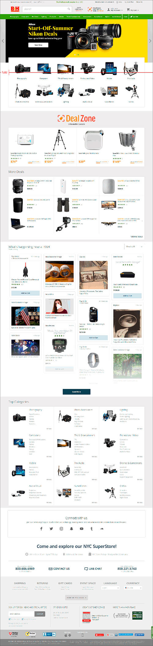
B&H follows web conventions by placing the company logo in the upper-left corner and the phone number in the upper-right corner of the page.
The site establishes leadership in the industry by indicating that the company has been “The Professional’s Source Since 1973”.
It also employs the scarcity principle with a timer to signify that deals are limited and that customers will do well to act sooner rather than later.
The slider can distract from user tasks, as it utilizes motion and presents promotions that only a handful of visitors might be interested in. Below it, however, is visual navigation that represents each product category with composite images, so it’s immediately obvious what parts of the product catalog are available for each category.
6. FreshBooks
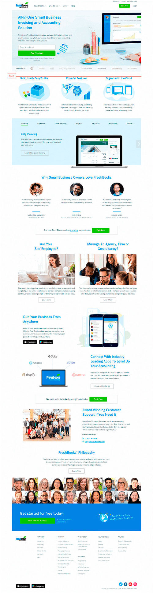
The tagline and headline succinctly convey what FreshBooks is, so visitors are likely to understand what the site is for when they land. The messaging below the headline states the benefits of using the software.
The page employs the social proof principle to nudge users to provide their e-mail address. It deliberately directs the user’s visual attention to the “Get Started” button with the “97% of customers recommend FreshBooks” callout.
The page inspires trust by displaying logos of media companies where the brand has been featured.
The page caters to top-of-the-funnel visitors by having “Learn More” CTAs (albeit below the fold) throughout the page.
Having a CTA in every screenful also enables users to take action regardless of where they are on the page.
The page is quite text-heavy, and that’s a problem because people generally don’t read on the web. This can be addressed by showing information in a manner that supports web users’ scanning behavior:
- Instead of paragraphs, information can be presented in bullet points.
- Important information-carrying words can be bolded, so they’re highlighted.
Make Homepage Design Conversion-Centered
Homepages are supposed to get visitors to the relevant parts of the site. It’s not supposed to make visitors stay on the page, or provide product-level information.
There are a few things you can do to ensure that happens:
- Place your logo where users expect it to be and have a functional tagline and description. This way users know right away that they’ve landed in the right place.
- Ensure trust elements are visually prominent, so users don’t second guess your credibility.
- Make it easy to identify how users are supposed to move forward:
- Make CTAs stand out.
- Allow users to self-select if you have pathways that cater to a significant group of visitors.
- Have visual navigation (i.e. have image collages visually represent your product groups).
If you do all that, your homepage has a better shot at getting visitors to stay on the site and, ultimately, take a conversion action.