[Editor’s note: This post was originally published in February 2016 and has been updated to include more actionable tips.]
People visit web pages because they have some sort of problem to solve.
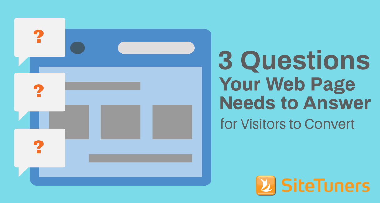
And to assess whether a page they land on is going to meet their needs, they instantaneously go through this checklist:
- Am I in the right place? (Does this match my intent?)
- Do I feel good about this site? (Is this site trustworthy?)
- What am I supposed to do here? (What do I click on to move forward?)
Visitors have to be comfortable with the answers to these questions before they move further down the conversion path.
1. Am I in the Right Place?
Visitors come from somewhere – an organic search result, a PPC ad, some other website, or a social media post click. This means that expectations are set about what your page is about before they get there.
The problem is, there’s often a disconnect with what people expect they’ll get versus what they actually get on the page.
This happens when the visitor’s intent, which they express by clicking on a search engine result or a social media post, is not matched.
The visitor will feel that they’re in the wrong place, and leave.
And that’s bad for everyone – that’s even detrimental to your search rankings.
Let’s say the visitor is looking for cheap hotel accommodations in Berlin. When they click on the search results page (SERP), you show them a list of all hotels in Europe, instead of budget hotels in Berlin. They’re going to hit the Back button – they’re “pogo-sticking” back to the search page.
Google will penalize you for that.
Match Upstream Message with Page Message
To make sure visitors stick around, the messaging on the ad you used or the browser page title that the visitor saw on a SERP should match the content on your page.
If you’re a beauty site, for instance, and the customer clicks on an ad for a deal you’re running on facial cleansers, take them to a dedicated landing page for that deal. Not your homepage.
Matching messaging does not only entail matching verbiage but also the visuals you use.
In a webinar, Barry Feldman of Feldman Creative gave examples of a page that doesn’t match upstream messaging versus one that does:

Mismatched. RelateIQ’s ad and the landing page don’t line up visually and verbally. The ad has a dark cluttered photo, while the page has an image of a clean desktop with tan wood finish. The ad talks about a CRM, but that’s not mentioned in the headline of the page. The only indicator that this page is connected to the ad is the logo on the upper left hand.

Matched. Domo’s ad and landing page establish a clear connection. The images they use have the same flavor and they keep the same headline.
Put Logo and Tagline in Standard Location
Another way to make visitors immediately feel that they’re in the right place is by putting your logo in the upper-left corner of the website. That’s where web visitors look to orient themselves about where they are online.
Under your logo, add 6 to 10 words that succinctly capture what you do and why people should trust you. Placing the description in the global header ensures that the visitor sees it regardless of which page they land on. If you’re a local business, you can have something like “Serving the Greater Atlanta Dentistry for 20 Years” or “Over 1,000 Satisfied Dental Clients”.
Communicate Who You Are Above the Fold
On your homepage, instead of gigantic hero shots and rotating banners above the fold, have a static banner. Use the valuable real estate to talk about who you are in a little more detail and what your unique selling proposition is. The messaging should answer “What’s in it for me?” from the customer’s perspective.
2. How Do I Feel Good About this Site?
Your page needs to be able to build trust instantly.
And while a professional, well-executed design certainly helps in this area, you need other trust signals on the site.
Having that short description under the logo that says how long you’ve been in business and that you’ve had a significant number of satisfied clients establishes your credibility.
Here are other trust elements that you need to highlight:
Phone number
A phone number is your biggest trust element. It says “I’m a real business with someone to answer your calls and not a fly-by-night company”.
Put your phone number along with your hours of operation in the top-right corner where users expect it to be.
On mobile, you don’t have to show the phone number. Instead, have a click-to-call icon which when tapped loads the number into the mobile phone’s native dialing app.
Security symbols
Show customers that you take measures to protect their information. Have privacy policies and computer security trust marks from well-known vendors (e.g. Norton Shopping Guarantee).
Client and media logos
Borrow authority by showing large clients you’ve done business with and media companies where you’ve been featured.
Testimonials and product reviews
What other people have to say about a product or service has a lot of influencing power over the decision customers eventually make. So make testimonials and user reviews visible on the page.

Buzzsumo shows off marquee client logos and testimonials on their homepage. Be careful not to drown your call-to-action by making the logos too prominent, though. You may want to have them in grayscale.
Learn more about persuading visitors to take action using user reviews.Read “8 Customer Reviews Best Practices to Optimize Conversion Rates” |
3. What Am I Supposed to Do Here?
When visitors get to your page, they should be able to tell right away where they need to click to get closer to their goal. Otherwise, they’ll leave and go somewhere else that requires less effort.
A visitor’s inability to identify what they’re supposed to do next could be because …
Your call-to-action is obscured by other visual elements
The call-to-action (CTA) should be the most prominent graphic on the page.
Supporting conversion actions should not be given the same visual emphasis as the primary CTA – consider demoting them to text links.
If an element does not directly support your conversion goal, eliminate it.
Your page has no clear navigation elements
On the other hand, we’ve seen pages overdo the decluttering bit and end up removing primary navigation elements.
Don’t sacrifice navigation for the sake of looking edgy. Remember that your page exists primarily to help users find what they need.
This is the first screenful of Johns Hopkins University’s homepage on mobile. Less savvy mobile users may have a hard time figuring out that they have to scroll down to see the navigation elements.
Keep in mind it’s not about you nor making the site look pretty. Website design should be based on who’s coming to your website and what they’re looking for.
If you’re an e-commerce site, have high-level product categories as entry points, instead of giving the visual emphasis to your bestsellers. You don’t know what the customer is looking for, so let them pick a category and go down the right path.
In Summary
If people are to convert, your page has to convince visitors right away that it matches their intent, it’s a legitimate site, and that it’s easy to find what they need.
Make sure you bring people to the correct page that matches the upstream message, the page looks professional, the trust signs pop out, and the main CTA and navigation elements are obvious.