Summary: Driving visitors to the website is an important skill.
For you to get more visitors to act, you need to learn to manage visitor attention, add elements that create a sense of urgency, and ensure that the product looks like a bargain.
It all begins with crafting a persuasive e-commerce call to action.
You should absolutely get good at SEO, social media management, and other acquisition-stage crafts. But even some marketing groups that have decent visitor acquisition teams fail when it comes to getting the hard-won visitors to act.
That’s a missed opportunity because, for most marketing teams, doubling the conversion rate is actually a more realistic proposition than doubling the site’s search engine traffic.
We are going to break down the most important steps and make your Call to action button Irresistible not to click.
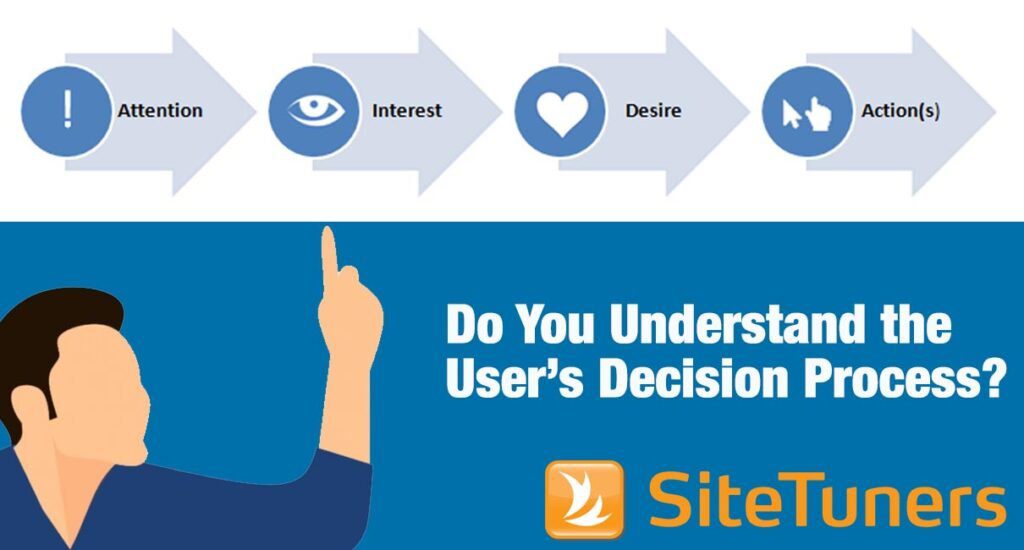
What is a Call to Action?
Calls to action (CTAs) contain the step marketers are inviting visitors to take.
- For a video, this can be a statement at the end asking the viewer to subscribe.
- For a blog, this can be a request to share the article with colleagues or friends.
- For a lot of sites, this is a button asking the visitor to add the item to a cart, submit a form, or download a trial.
When the CTAs are buttons on a site, there are some general guidelines you need to follow. By themselves, they should be persuasive – well-written, so it’s clear where they will take the visitors; and noticeable, so they command the user’s attention.
However, since CTAs do not exist in a vacuum, there’s more to the craft than just the buttons themselves.
Here are some ways you can optimize your e-commerce call to action:
1. Employ the scarcity principle
Telling people that something is available now, but it will not be for long, creates a sense of urgency. This gets people to act right away rather than putting off making the decision.
How effective is scarcity at persuading people? In a survey of 300 people, Hubspot found out that 45% of respondents were more interested when products were in limited supply, saying that the scarcity made them want to learn more about a product.
For online marketers, this means communicating when time or items are limited. Indicate the amount of time left until users can take advantage of a deal or the number of items left in stock until the product is sold out. This way, you convince people to heed your call to action.
For instance, Zalora.com.hk persuades customers to “Add to Bag” by putting the number of the item in stock close to the CTA button:

Meanwhile, Forever21.com tries to get customers to make a purchase now by offering a discount with a deadline:
Herschel’s product detail page (PDP), on the other hand, urges users to act now despite not offering any type of discount and the item not being low in stock. It plays off of people’s desire for instant gratification – it tells them they’ll receive a product soon, but only if they act within the day:
In his book “Pre-Suasion”, Robert Cialdini notes that “the scarcity of an item … raises the judged value of that item”. He notes that putting “any constraint on access” tends to increase the perceived worth of a product.
ShopDisney.com seems to leverage these observations by making it immediately clear when a product is released in limited quantity:
- There’s a “Limited Edition” callout.
- The product title explicitly states that the product is released in limited quantity.
- Access to the product is restricted. There’s a 1 per household purchase limit.
- The quantity released is indicated in the product details section.
2. Leverage social proof and authority
There are two things marketers need to remember to make an e-commerce call to action effective:
- the human brain is lazy, and
- people are social creatures
Decision-making tires the brain, so it uses shortcuts to avoid exerting too much effort.
One of these shortcuts is social proof. In situations where we are unsure what the best course of action is, we tend to look to others, who are or were in the same situation, for guidance.
Kiehls.com, for example, leverages social proof above the fold on their PDP in two ways:
- There’s a “Best Seller” callout to indicate that a lot of other people have bought the product.
- The average customer rating is positioned close to the CTA button.
By driving attention to what others have done before and conveying that others have gotten good results, those site elements make it more likely for the visitor to act.
Another shortcut that our brain uses is authority.
People don’t have the time to develop domain expertise about everything. And one of the ways we mitigate against that is to look to authority figures or experts in a given field.
For example, SK-II borrows trust from authority by displaying, above the fold, awards it has won from popular magazines. This way, potential customers are influenced to take action because they’re assured of the product’s effectiveness:
The brain’s shortcuts won’t make someone who hates your products buy something. However, they can increase your chances at converting when a visitor is actively evaluating your offerings.
- There’s a “Best Seller” callout to indicate that a lot of other people have bought the product.
- The average customer rating is positioned close to the CTA button.
By driving attention to what others have done before and conveying that others have gotten good results, those site elements make it more likely for the visitor to act.
Another shortcut that our brain uses is authority.
People don’t have the time to develop domain expertise about everything. And one of the ways we mitigate against that is to look to authority figures or experts in a given field.
For example, SK-II borrows trust from authority by displaying, above the fold, awards it has won from popular magazines. This way, potential customers are influenced to take action because they’re assured of the product’s effectiveness:
3. Alleviate uncertainties
Giving customers the ability to reverse a risk makes decision-making easier. This is the idea behind return policies such as H&M’s “Buy now, decide later” and IKEA’s “It’s OK to change your mind”. These essentially tell customers that they don’t need to worry about buyer’s remorse because they can still undo their action.
Nudge customers to click your CTA by displaying your transactional assurances prominently. These symbols not only help alleviate decision-avoidance, they also convey your confidence in your products and services.
For example, Shoes.com relieves point-of-action anxiety by showing “free shipping, free exchange, and 100% price guarantee” in a checklist format close to the CTA button:
By making sure visitors feel like they can “undo” their actions, you’ll make them more likely to feel safe and increase the chances of them acting on the page.
4. Utilize anchoring
People have a tendency to rely on the first piece of information they’re presented with. We evaluate subsequent pieces of information against the first one we see.
In marketing, this means consumers will judge the price of an item to be inexpensive or exorbitant based on the first number they’re shown.
On Dr. Marten’s PDP for instance, the original price with the strikethrough provides context to the discounted price. By anchoring customers on the original price, the sale price is likely to be perceived to be an excellent deal:
This also employs the scarcity play. It conveys that if customers don’t take advantage of the offer now, they’ll miss out on the reduced price and might have to pay the full retail price later.
Learn other price presentation techniques to make parting with money less painful for customers.
5. Place elements in the standard location
If something cannot easily be seen by users, then it might as well not exist. And if users can’t see your CTA, then they can’t act.
This is why predictable is good for your website. You want to follow web conventions and put elements where users expect to find them.
For PDPs, users expect to see the product image on the left and the CTA block on the right.
Epiphanie.co, for example, makes users hunt for the CTA by breaking predictability:
- The PDP deviates from convention by having the product description on the left and the product image on the right.
- The CTA button is located too far down the page.
Additionally, ensure that the CTA block does not become invisible when users enlarge the product image. The CTA is the point of your PDP, so make sure it doesn’t get hidden.
The action block on Kate Spade’s PDP gets covered by the overlay, for instance, when the user zooms in on the image:
You need to avoid these pitfalls. Make the CTA obvious, put it in a location most users expect to find it, and you’ll improve your conversion batting average.
6. Make the button text specific, instead of vague
A vague button cannot compel users to act. If users don’t understand what your button will do, they will not click on it.
Make sure there are no uncertainties about what happens when users click a button by making the copy straightforward. Avoid labels that are unclear like “Continue” and “Submit”.
For example, iRobot.com’s checkout flow can be improved by making the buttons specific. After the user provides their payment information, it’s not obvious whether the user can still review their order or if their credit card will be charged if they click “Continue”. This can make customers apprehensive about clicking the button:
So, ensure your button communicates what happens exactly if it’s clicked on. ShopDisney.com, for instance, conveys that customers can still review their order in the next step by saying “Continue to Review” in the button:
Being clear helps with conversions, so work on your CTA verbiage and make sure it sets user expectations.
7. Make the call to action obvious
Some e-commerce sites opt to use things like ghost buttons for their main call to action, while others use colored or underlined text.
That’s generally not a very good idea.
For your buttons to get clicked, at a minimum, users should be able to tell that they’re buttons (obvious).
So, it’s critical that your CTA button looks like a button. Ideally, there should be a solid color block around the text. If your template allows for rounded buttons, that can help drive attention to the button as well.
The more the CTA looks like a button, the more you can make it pop on the page, and the more likely it is for users to click them.
Make the call to action stand out
Given that the call to action should grab web users’ attention, one of your priorities is to ensure it jumps off the page. This means using a color that contrasts with your site’s background for your CTA.
There is no question, for instance, about what users need to click to add a product to the cart on Beard & Blade’s PDP, as the CTA pops:
Another technique available to you is to leave the immediate area next to the CTA empty. Utilizing negative space will help make your CTA visually salient.
Create visual hierarchy
If you have more than one CTA on the page, their order of importance should be obvious. You can make secondary CTAs less visually interesting by making them duller, smaller, or demoting them to a text link.
It’s easy to identify, for example, that Pottery Barn primarily wants users to click on “Add to Cart” because of its placement and contrast against the page. “Add to Registry” may be the same size as the main CTA, but it’s demoted to a ghost button and sort of blends into the background:
8. Display your differentiator
Help customers decide and get them to act by communicating your unique selling proposition. Make your e-commerce call to action more appealing by clearly communicating what makes you different from the other options.
People Tree, for example, is a sustainable fashion brand. And the company makes that fact hard to miss by communicating it in their tag line. They also make their PDP more compelling by prominently displaying certification and guarantee logos above the fold:
Communicating your unique value proposition helps get people to act.
9. Have user behavior-triggered modals
An interstitial can be annoying, especially if it shows up right after the visitor lands on the webpage. (That interrupts users on their way to the site.)
However, a modal that waits for the visitor to do something and then shows up when it’s appropriate can help make your e-commerce call to action compelling.
Ensure that you have a behavior trigger attached to the modal. It can be something like showing deals when the visitor has looked around the product section, essentially behaving like someone with buying intent.
Or you can do something similar to what fast fashion companies Cotton On and Forever 21 do. These brands remind shoppers, who have stalled out, to act by showing modals that employ the scarcity principle:


You can also consider getting people, who are about to leave the site, to act through an exit-intent modal. If the visitor is moving their cursor out of the active browser window, that would be an appropriate time to trigger the modal. They’re leaving, so you can make a last-ditch effort.
Persuade with an Irresistible E-commerce Call to Action
Refining your e-commerce CTAs is part art, and part science. You need to test and refine your ideas, but the ideas you start with need to be sound.
You’ll make your site likely to convert if you …
- employ scarcity where it makes sense to,
- take advantage of shortcuts like social proof and authority,
- give users the feeling that taking the desired action is safe, and
- use anchoring to make discounts pop
If you complement those strategies with tactics like …
- making your buttons look like buttons,
- following web conventions,
- displaying your unique value proposition, and
- using modals that are triggered by visitor behavior
… you’ll be better positioned to make the visitors act on your pages.