The human brain hasn’t evolved in about 50,000 years. We still use the same brain hardware our ancestors used as hunter gatherers with finite resources, so we feel loss acutely.
Money is an artificial construct that lets us control resources – with it we can buy food, shelter, etc. We view money as a finite resource, so we experience spending it as loss of resource. And that experience maps to the same part of the brain that reacts to any kind of loss, including physical pain.
Here are some price presentation techniques you can employ to make parting with money less painful and scary for customers:
1. Remove the currency symbol
If it’s obvious that the number represents a price, drop the currency symbol, as the brain associates the symbol with pain. If you can’t remove the currency symbol, at least make it obscure.
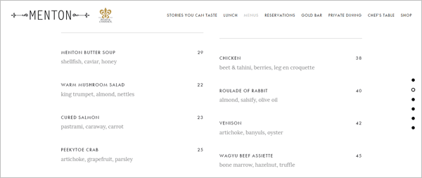
Menton, a high-end restaurant in Boston, omits the dollar sign from their menu.
2. Strip out extra characters
The brain uses shortcuts and is great with simple choices – we can easily compare items and identify which one is smaller and which one is bigger based on appearance.
This is why at first glance, the amount on the left-hand side seems higher – the comma, decimal point, and digits after the decimal point make the price longer hence, bigger.
Make prices seem lower by taking out extra characters.
3. Lower the position of the price
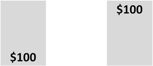
The same kind of biasing can be done with physical position. If you lower the position of the price, you also decrease its perceived cost.
By putting the price at the top of the box, the price on the right is perceived by the brain as being more expensive, and consequently, more painful compared to the price at the bottom of the box.
4. Tuck a smaller price into an insignificant position
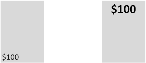
You can make tip #3 even more effective by making the price physically smaller and relegating it to an insignificant position.
5. Change the leading digit
The brain pays a lot of attention to the leftmost digits of a price, and not so much on the numbers after the decimal point. The first digits have a massive effect on whether a price is deemed relatively affordable or expensive.
In a study conducted by Kenneth C. Manning (Colorado State University) and David E. Sprott (Washington State University), participants were asked to consider two pens – one priced $2.00 and the other $4.00. The researchers found that …
- when the prices were presented as $2.00 and $3.99, 44% of the participants opted for the higher-priced pen, but
- when the pens were priced $1.99 and $4.00, the percentage of people who chose the higher-priced pen decreased to 18%
The difference between $1.99 and $4.00 was perceived to be bigger because of the prices’ leading digits; this in turn resulted in participants choosing the less expensive option.
So, make the price seem lower by decreasing the leading digit. You can also amplify the left-digit effect by making the fractional digits smaller and less important.
6. Drop a whole number
If possible, drop a whole number from the price. You’ll make the price seem significantly smaller by shortening it.
7. Divide the price
Another way to make price seem cheaper is by breaking it down into smaller units. This is especially powerful if you’re selling something costly. An annual subscription price can be chopped into cost-per-month, and a monthly subscription can be divided into cost-per-day.
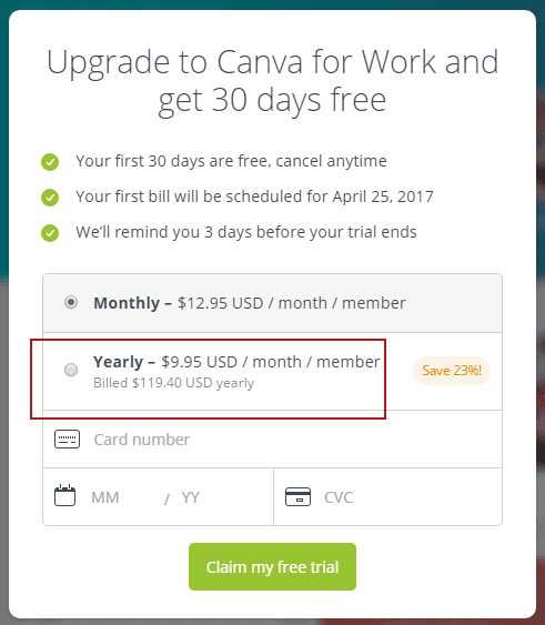
Canva.com, for example, encourages customers to get the annual plan by chopping it into cost-per-month although the customer will actually be billed the total yearly price. (I’ve drawn a red box on the image to highlight how Canva chops down the price)
8. Combine the savings
On the other hand, if you want to emphasize that you have a much better deal compared to competitors, you can roll up the difference in lifetime costs. It might be a small difference on a monthly basis, but you can make it seem significant by aggregating the long-term savings.
T-Mobile highlights the total amount customers save every year by choosing T-Mobile over its competitor.
9. Show price in decreasing order
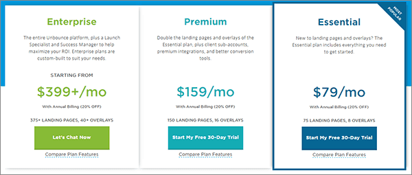
People evaluate information based on the first thing they see. If you put the $2.00 plan first, by the time the customer sees the $6.00 plan, they’d consider the price exorbitant as it’s 3x the cheapest plan. On the contrary, if the customer sees most expensive plan first and anchors on that, they’re more likely to consider the least expensive plan a good deal.
Unbounce.com presents plans in decreasing price order.
10. Add an option that will not sell well
You can bias people towards the item you want them to pick by adding an inferior option. The inferior option will serve as a decoy – it will frame the choice you want people to make. In that context, the sale of your reasonable compromise will increase.
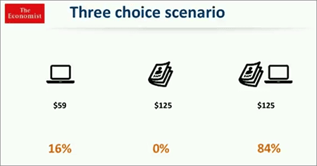
Consider behavioral economist Dan Ariely’s experiment on The Economist’s subscription packages. He asked 100 students to pick one from the following:
- Online subscription – $59
- Print subscription- $129
- Online and print subscription- $129
This selection yielded these reults:
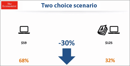
Since nobody from the first group chose the print-only plan, Dan removed it and presented only two options to another set of students.
Here’s how the second set of participants chose:
The brain is good at making simple choices. In the three-choice scenario, most people only considered the combined edition because that was the obvious choice.
By removing the $125 print-only plan, the average revenue per person dropped by 30%. What seemed like a useless option actually served as comparison point that emphasized the value of the combined print and online edition offer.
It Pays to Optimize Price Presentation
The human brain views money as a finite resource, and spending it maps to the same parts of the brain where we feel physical pain. If you …
- remove the currency symbol,
- make the price physically smaller and shorter,
- put it in an insignificant position,
- decrease the leading digit,
- show the prices in decreasing order,
- and manipulate the context of the offer by adding an inferior option
… you alleviate the pain, nudge customers to make the purchase, and increase the average order value in the process.
