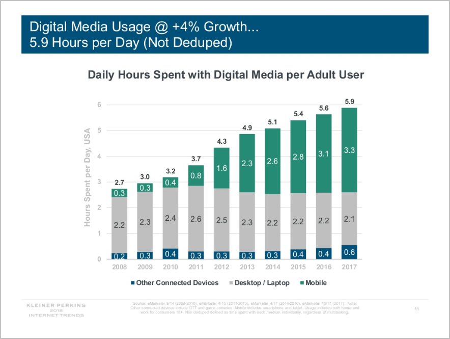
 In 2017, according to research by Kleiner Perkins, adults averaged 3.3 hours consuming digital media on a mobile phone, up from 3.1 hours the year before. Desktop and laptop usage has been below mobile usage since 2014, and adults have “only” spent 2.1 hours on traditional devices last year:

For marketers, this presents a slew of challenges:
- Omnichannel user journeys (where people bounce around from mobile phones, laptops, and tablets when researching, comparing prices, and doing actual shopping) are notoriously difficult to track. And attributing all the value to the device last used for the conversion FEELS wrong.
- Despite advances in smartphone technology, mobile phones still have lower connectivity speeds and processing power compared to desktops and laptops.
- Mobile phone conversions are typically lower than desktop/laptop conversions.
To maximize your opportunities, you need to carefully think about …
- the stages of the user journey,
- the mobile experience you offer, and
- and how you can diagnose and course correct using the tools available to you.
Here are ways to optimize mobile commerce conversion rates:
Compare the Top Pages Viewed by Mobile, Tablet, and Laptop Users
On traffic monitoring tools like WebTrends, you’ll usually have some way to segment by device type. You can do this at a high level and get data like this:
- 42% – desktops/laptops
- 8% – tablets
- 50% – mobile phones
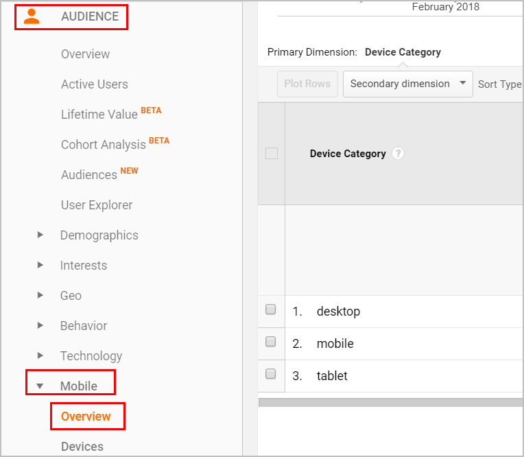
That’s good to know, and that’s a standard report for those of you who are using Google Analytics. (Audience> Mobile> Overview)
The problem is, that data in itself is not very actionable.
You’ll need to see which pages people consume most while using a particular device type if you want to run an actual analysis that can lead to course corrections.
If you’re on GA, you’ll need to use advanced segments for the device type, then view page reports like Behavior> Site Content> All Pages.
You’ll then need to see the top pages viewed by device to see how they are different.
It might be that the cart traffic is primarily a laptop thing, the form pages are a laptop and tablet thing, and product browsing is dominated by mobile phone traffic. You can then work on the desktop cart experience, enable autocomplete for forms to make it easier to type on tablets, and make sure you enable product comparisons on mobile devices.
By segmenting the data, you’ll generate ideas about what to fix most for which device types – the areas where a little improvement disproportionately affects success by device.
Make Mobile Pages Load Quickly
Mobile phones are getting faster and more connected all the time, but desktops and laptops are still superior in that department.
Weaker internet connections means more page load time. So, what mobile phones lack in connectivity, your site has to make up for in terms of image sizes, content delivery networks (CDNs), optimized scripts, and an array of other strategies to make the site load faster.
1. Use a content deployment network
If your company can afford to use a CDN to speed up the site, it’s usually a good idea.
2. Reduce overall image sizes
If you can run a tool that reduces image sizes for the entire site in the background, it’s usually worth the investment. Otherwise, you can just manually decrease the image sizes before using them on the site.
3. Untangle redirect chains
One of the things that can add to page loading time is redirect chains. This is when you have more than one redirect to get to the destination page, whether because you had a domain move or you’ve changed your information architecture. Instead of having multiple redirects, point all of your pages to the new URL you want to use to save load time:
4. Think about the sequencing of scripts
Some scripts wait for other scripts to load (synchronous), while others quietly load in the background without interrupting or waiting for anything to finish loading (asynchronous). You need both types of scripts, usually with tracking scripts like those for traffic monitoring, heat maps, and tag management loading asynchronously, so the users don’t notice the effect on total page load.
5. Use different images for mobile pages
If you have a different mobile site, this shouldn’t be a problem. However, if you’re using technologies like Responsive Web Design (RWD) to build your site, it’s not as easy to have separate, smaller images loaded on mobile devices. You’ll still have options, though. Work with your developers to deploy things like srcset, where a lighter image can be pulled by mobile devices even with RWD, and reduce the image footprint on your mobile pages.
Enable “Continue Later”
One of the challenges with omnichannel marketing is that sometimes, users will want to switch devices between the different tasks in the sales journey.
If they’re willing to put in products to the cart while using a mobile device but not willing to check out on that device, you can’t let the experience end there. You need to have some way to let your visitors continue the experience on another device without losing what they’ve already done.
It’s a technical challenge you need to figure out with your development team, and you need to incentivize people to let them know they can log in and continue with the shopping experience on a different device, but it should help you maximize conversion opportunities.
Improving Mobile Conversion Rates
It takes some effort to maximize omnichannel opportunities.
You’ll need to have a passing understanding of traffic monitoring tools and web technologies. You’ll need to project manage multiple teams to get some things to work properly. And you’ll need a healthy dose of patience since not all of this line up very quickly.
That said, if you play it right, you’ll have more opportunities to maximize than your competitors.
Take your conversions to the next level.Learn how our experts at SiteTuners can help kickstart your conversion rate optimization process or get better results from your CRO efforts. Give us 30 minutes, and we’ll show you a roadmap to your digital growth! |


