 Tablets are, in many ways, a nightmare for a lot of retailers.
Don’t get me wrong, smartphones ultimately made the expectations tougher for everyone. However, optimizing for a four-inch screen is ultimately very different from optimizing for 19 inches and up. Say what you will about how difficult it is to create a good smartphone experience, but the tasks for mobile phones are often different enough from desktops that the changes you’ll often need to make are obvious. They won’t always be easy to execute on, but the compromises you’ll need to make will be clear:
- sacrifice descriptions in favor of creating distinct, easy-to-tap choices;
- use the real estate for easy navigation in favor of complete details; and
- leverage vertical scrolling — i.e., worry less than with desktops about what’s “above the fold.”
With tablets, those choices aren’t always as clear cut. You have the same hot spot “tappability” problems as mobile phones in that fingers are less precise than a mouse. But unlike with mobile phones, you can’t sacrifice too much real estate for them — consumers still want more details when using tablets.
“Above the fold” is still a critical concept, unlike with mobile phones, but you still have less real estate to work with compared to desktops. How people use tablets is very similar to how they use desktops and laptops, but your control mechanisms are largely based on interaction design for phones.
The point is, when addressing tablets, you have a lot of issues to resolve.
Data to the Rescue
The first step in addressing the issue is diagnosing how large the issue actually is. You might be tempted to look to Forrester or some other research company to look at the size of the problem, but that would be a mistake. Your first step should be a review of your tracking tools. Two types come in particularly handy:
- a clickstream tool, such as Omniture, Google Analytics or Webtrends; and
- a survey tool that gets served to tablets, like ForeSee, OpinionLab or iPerceptions.
Your audience is unique — deal with it. Figures from Forrester and other research firms are going to be less useful to you because you can’t tell what your actual opportunity size is. You should still look at the market penetration of smartphones, tablets and desktops/laptops, but not before you look at your figures in-house.
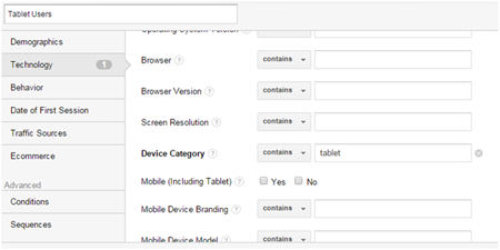
A clickstream tool can be used to determine not just the total volume of tablet users, but what pieces of content tablet users engage with the most. For Google Analytics, your filter will look something like this:
Once you have the filter ready, you need to check which pages and sections get used. The idea is to figure out which tasks get done via tablets, and optimize those first.
If you have a survey tool, you can figure out not just the tasks, but the success rates — i.e., the tasks that users do often but fail a lot need to be prioritized.
Large Enough to Read, Not Large Enough to Tap
Once you get over the data hump, you should be able to tailor experiences for the key tasks that users perform.
One of the main issues you have to deal with is font sizes for buttons. For tablets, things that are readable may not necessarily be large enough to tap with precision. This is a problem if you have a lot of calls to action and you can’t provide enough space for the hot spots to be usable.
If you have the data, you can limit hot spots to just what people need. By keeping the number of items down to just what users need, you’ll solve not just the cognitive load problems, but readability vs. tappability issues as well.
Good Tablet Experiences
Usability is tough to solve for across multiple devices. There are companies whose tablet problems may not be worth investing in solving yet. The key is to use data both when determining whether a problem is worth fixing and when getting ideas for fixes. Tablet usability may be tough to solve for, but it’s tough for everyone. If you and your competitors all need to beef up on tablet usability, you need to get started at getting good with reading the data and processing what the data suggests for usability.
This article originally appeared in Tim’s Retail Online Integration column December 1, 2014

