We’re still irrational beings whose behaviors are mainly controlled by our subconscious brains.
Bart Schutz, Co-founder of Online Dialogue, stresses that learning what persuades the subconscious brain should be the first order of business for those in marketing and sales.
In an episode of Landing Page Optimization, Bart and SiteTuners CEO Tim Ash share psychological insights you can apply in your tests.
1. Directing Attention
There are certain things that people can’t help but look at. Used correctly, you can use them to draw attention to your call-to-action (CTA).
Tread lightly though, because used gratuitously, they can distract from user tasks.
Faces
As social creatures, we look at cues from other people. And faces are a powerful visual cue.
We tend to follow the gaze of others around us to see what they’re looking at because there might be something interesting or dangerous in that direction.
So, with photos of people on your site, make sure to direct the eyes towards where you want people to look (i.e. your CTA).
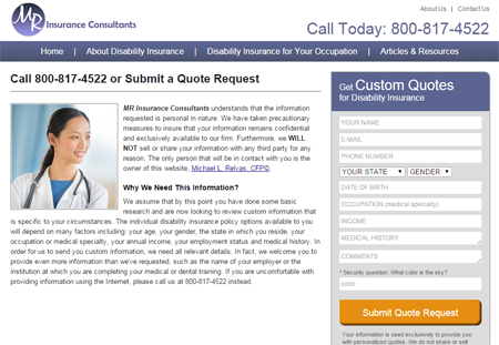
The photo of the woman looking towards the form directs the audience’s attention to the call-to-action.
Motion and Animation
Humans are pre-conditioned to look at motion for survival reasons. Movement will get our attention every time.
So if you want your visitor’s attention constantly reset by the banner at the top of your page, make it rotate.
But you probably don’t want that. You want people to focus on the navigation elements, so they can carry on with their task and find what they need.
Another trend you’d want to steer clear of are parallax videos or moving video backgrounds.
Remember to use motion sparingly – use it only to illustrate complicated concepts.
If you’re advertising on another platform, that’s a whole new ball game. If they allow you to put banners on there, then it’s okay to use motion so you draw attention.
2. Depleting Consciousness
Consider this study that Bart cites in the podcast:
In Israel, the number of parole granted decreases as the hours of the day go by.
At the start of the day, the judges grant about 70% of the applications. However, as the day wears on, that number drops to about 10 to 20%. It goes up after breaks and then drops again, eventually reaching 0% in the evening.
Bart observes that this happens because of the judges’ consciousness depleting.
They have to make the critical decision of whether to let people go or not – to actively think about the consequences of granting a person parole.
And that’s taxing to the conscious brain.
Our consciousness has limited mental energy that depletes in a matter of a few seconds.
And this also happens online, especially when people are on mobile, where there are a lot of distractions around the screen.
So, don’t think of your user as someone giving 100% attention to your web site.
Bart notes, though, that there are instances when a tired conscious brain will work for you.
- If you have the best offer, and you want customers to logically compare you against competitors, then make sure not to deplete their rationality.
- If you don’t have the best offer, and you want to persuade people emotionally, then adding a little friction on your site to exhaust the logical brain can work to your advantage.
Bart shares that they try adding pop-ups for the sole purpose of depleting the user’s conscious mental energy. They add small links, not because they want people to click on the other option, but because they want users to think about this other option, so their rational brain is exhausted.
If you don’t have the best offer, the goal is for the sub-conscious brain to dominate so customers make an emotional decision, rather than a logical one.
So, think about the 2 systems in the brain:
- the pre-conscious, emotionally-intuitive, automated brain
- the conscious, rational brain
And consider which one’s in favor of you, so you can skew your site experience towards the outcome you want.
3. Making the experience memorable
In an ideal world, people will convert in the same session or visit. The reality, though, is sites are often dependent on people revisiting the site.
Bart points out that we’re essentially depending on the visitors’ memory.
And memory is all about the peak-end rule.
How people remember visiting your web site, using your app, or visiting your social profile is mostly about the peak and the end of the experience.
The best way to make people remember you is by combining the peak and the end. That means making the ending also the best part of the session.
A good place to start testing how you can make the experience memorable is your Thank you page.
Putting It All Together
Technology changes rapidly, but the opposite is true for what we’re mapping it on, the human brain.
We can leverage what we know about the brain to make people pay attention to what matters most, make the interaction with the site memorable, and persuade visitors to take action.


