Your website looks professional. Modern design. Clean layout. Everything seems fine.
But visitors aren’t converting.
Sound familiar?
This exact scenario played out during a recent client consultation we had with Renewd.net.
What we discovered reveals some of the most common conversion barriers destroying otherwise solid websites.
The Client: A Membership Community for Subscription Founders
This was a business membership platform serving subscription and membership entrepreneurs.
The site appeared polished on the surface, but massive conversion issues lurked beneath.
Here’s what we found and how we fixed it.
Conversion Killer #1: Confusing Value Proposition
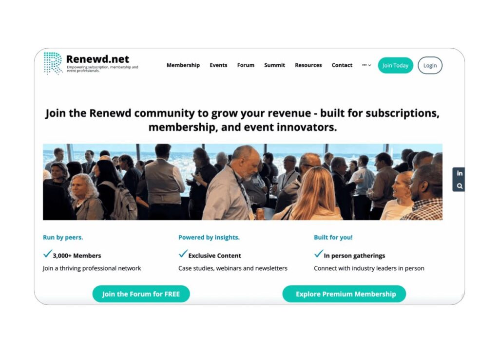
The Problem: Their homepage headline read: “Grow your revenue with a network built for subscriptions, memberships, and event innovators.”
We don’t like to be rude on these calls; however, we bluntly told the client that we had absolutely no idea what they did, despite reading it several times.
“So you build networks for subscriptions?” we asked.
The client clarified: “No, we ARE a network. We’re like a membership body.”
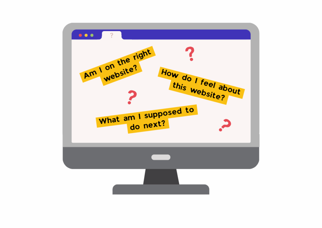
The Analysis: This headline fails a fundamental conversion rate optimization principle: answer the user’s first question – “Am I in the right place?” When users land on your website, they ask themselves three critical questions:
- Am I on the right website?
- How do I feel about this website?
- What am I supposed to do next?
The original headline attempted to be comprehensive but became incomprehensible.
It tried to describe WHO they serve (“subscriptions, memberships, and event innovators”) and WHAT they provide (“grow your revenue”), but completely missed WHAT they actually are.
The Fix: We restructured the message using the “Identity + Benefit + Audience” formula:
- Identity: “Join the Renewed community” (immediately clarifies what they are)
- Benefit: “to grow your revenue” (clear value proposition)
- Audience: Implied through “subscription revenue” (targets the right people)
Alternative suggested: “Join the community to grow your subscription revenue – built for subscriptions, membership, and event innovators”
The Psychology Behind This: Users process information in hierarchy:
- First, they need to understand WHAT you are
- Then, they consider WHY they should care
- Finally, they decide IF they should act
The original headline jumped straight to benefits without establishing identity, creating cognitive load and confusion.
Conversion Impact: Clear value propositions can increase conversion rates by 20-30% because they reduce the mental effort required to understand your offering. When users have to work to understand what you do, most simply leave.
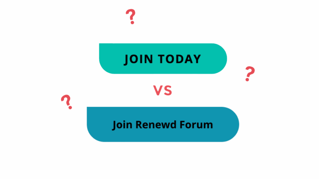
Conversion Killer #2: Navigation Decision Loops
The Problem: The user journey created unnecessary friction. It was a complete maze.
- Homepage: Click “Join Today for Free”
- Next page: Choose between forum membership or premium membership AGAIN
- Another page: More decisions before actual signup
During analysis, we noted that if you clicked “Join Today for Free,” you then needed to decide, once again, if you were going to join the forum or join the premium membership.
The Problem: This represents another classic conversion optimization dilemma – trying to solve one problem (lack of premium visibility) while creating another (decision fatigue).
The client was attempting to honor two competing priorities:
- Capture free members (primary goal)
- Showcase premium options (revenue goal)
But they solved it by forcing ALL users through the same decision point, regardless of their original intent.
The Fix:
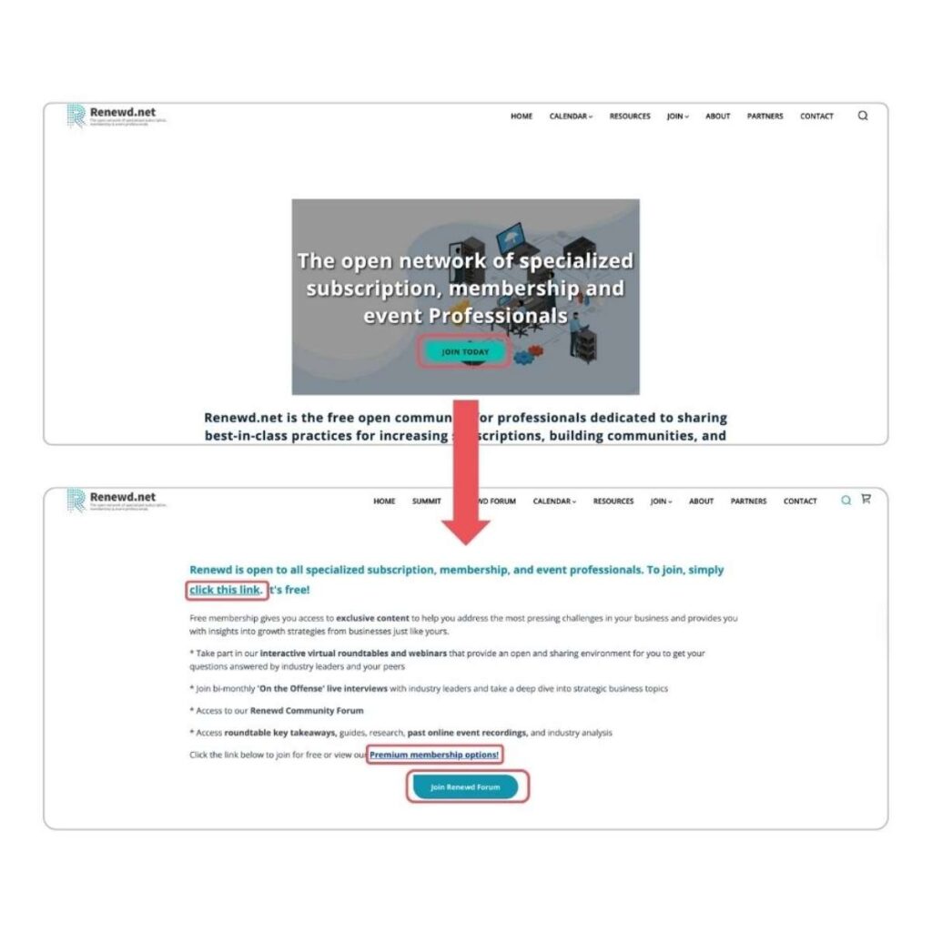
Instead of one confusing landing page, we recommended a fork-in-the-road approach:
Homepage Changes:
- “Join the Free Forum” (direct path to Circle platform signup)
- “Explore Premium Membership” (dedicated premium information journey)
Free Forum Path:
- Dedicated landing page: “Welcome to the Renewed Forum”
- Single signup form embedded or linked to Circle
- Secondary mention of premium options (soft upsell)
Premium Path:
- Comprehensive membership benefits page
- Pricing comparison table
- Direct application process
The Psychology of Decision Fatigue: Research shows that each additional decision point reduces conversion rates by 5-15%. When users make a choice, their mental energy decreases. Forcing them to choose again creates:
- Cognitive overload
- Decision paralysis
- Increased bounce rates – loss of interest? To continue in the psychology aspect
- Loss of momentum decreases motivation to proceed?
Implementation Strategy: We suggested creating the landing page to look like: “Join the free forum today OR explore premium membership,” but with a clear visual hierarchy showing the free option as primary and the premium as secondary.
User Flow Logic: The conversation should be: “You’re in the right place → You can trust us → You should join because this is what you’ll get → Here’s how to join”
Not: “You’re in the right place → Choose your adventure → Choose again → Maybe now you can join”
Conversion Killer #3: Visual Hierarchy Disasters
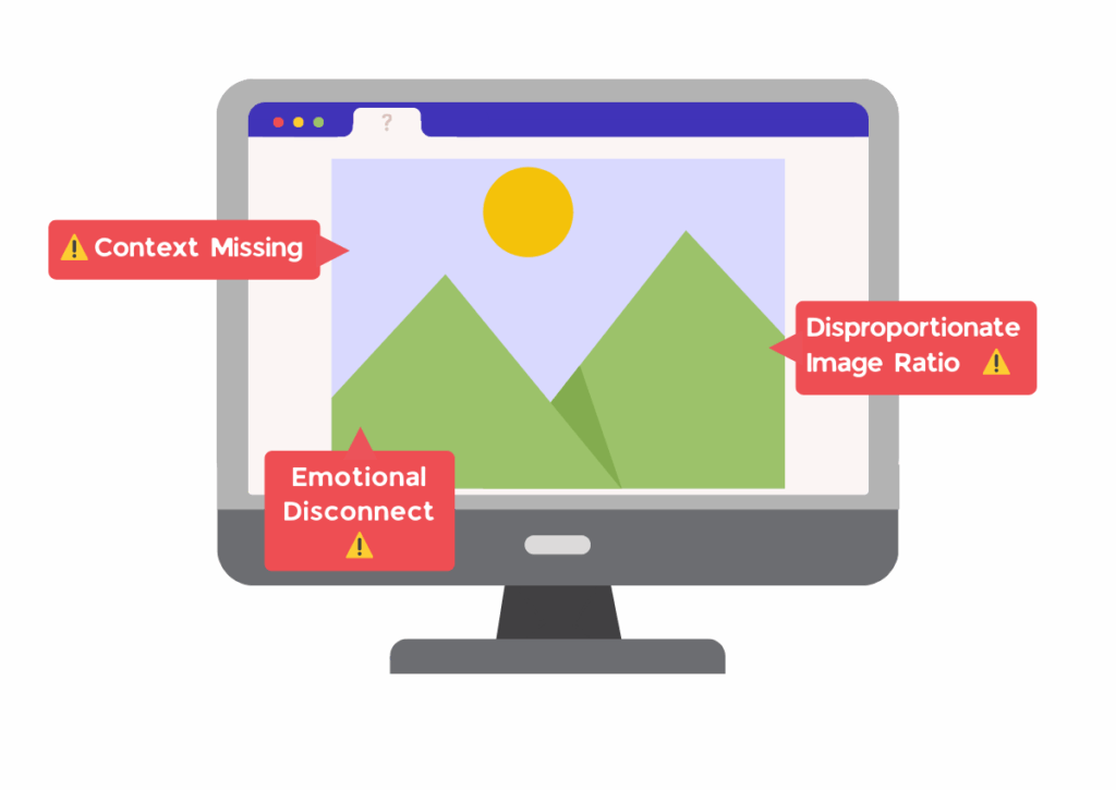
The Problem: The homepage hero image dominated 50% of the viewport but added no value. When asked about the most important element, the client correctly identified “the picture.”
The Issue – Image Quality vs. Authenticity Dilemma: The client faced a common issue in that they had limited original pictures to choose from, as they are a not-for-profit. They couldn’t afford a professional photographer, so all the pictures used were taken by team members on their phones.
They were torn between using authentic photos (which showed recognizable industry people) versus stock photos (which looked bland and soulless).
The Analysis: We identified several problems with their visual approach:
- Disproportionate Image Ratio: 50% of prime homepage real estate devoted to unclear imagery
- Emotional Disconnect: The image conveyed serious contemplation rather than community and success
- Context Missing: Viewers couldn’t understand the setting or purpose
The Detailed Solution:
Image Positioning Strategy:
- Reduce the hero image to 30% of the viewport
- Position image left, content right
- Create a clear visual balance between imagery and text
Image Content Guidelines:
- Show people actively networking, not thinking
- Capture wider venue shots showing community scale
- Avoid close-ups that focus on individual expressions
Authenticity vs. Quality Balance: We told them, “Use real pictures. Maybe we can crop the picture. Maybe we push the picture to the left, and then we have this section here for all your titles.”
Why Cropping Works:
- Removes unflattering elements while keeping authentic people
- Allows focus on positive interactions
- Maintains industry recognition value
- Improves visual hierarchy
The Recognition Factor: The client made an excellent point: “The thing I love about using our own pictures is that people in the sector recognize people. So that’s my reasoning.”
This is powerful social proof – but only if the images convey the right emotions and context.
Implementation Recommendation: We suggested keeping authentic photos but improving their presentation:
- Crop to show positive interactions
- Use multiple smaller images rather than one dominant image
- Position strategically to support, not dominate, the message
Conversion Killer #4: Inconsistent Action Colors
The Problem: The site used both blue and green for clickable elements, creating user confusion about what was actionable.
We didn’t know the action color. Was it green or blue? We needed to decide because we train users through colors.
The client agreed: “I think it probably needs to be green.”
The Color Psychology Science: Color consistency in web design isn’t arbitrary – it’s based on user behavior research:
- Users form color associations within 50 milliseconds of landing on a page
- Consistent action colors reduce cognitive load by 23%
- Mixed color signals increase hesitation time by an average of 2.3 seconds
- Primary action colors should appear 3-5 times maximum per page
The Analysis: Their current color system was:
- Green buttons: Some CTAs
- Blue buttons: Other CTAs
- Blue text links: Navigation
- Green text links: Some actions
This created four different “clickable” signals, forcing users to interpret rather than intuitively act.
The Color Framework:
Primary Green (Action Color):
- Main CTAs: “Join the Free Forum”
- Secondary CTAs: “Explore Premium Membership”
- Form submit buttons
- Key conversion points
Blue (Navigation/Information):
- Header navigation links
- Footer links
- “Learn more” informational links
- Breadcrumb navigation
The Implementation Details: We recommended a systematic approach:
- Audit every clickable element on the homepage
- Categorize by intent (conversion vs. navigation)
- Apply color hierarchy consistently
- Test the new system with a small user group
Why This Creates Conversion Lift: When users know exactly what’s clickable and what leads to action, they:
- Spend less time interpreting the interface
- Feel more confident clicking
- Experience less decision fatigue
- Convert at higher rates
The Trust Factor: Consistent design signals professionalism and attention to detail, which builds subconscious trust. Users may not consciously notice color inconsistency, but they feel something is “off” about the experience.
Conversion Killer #5: Overwhelming Contact Forms and Trust Signal Misplacement
The Contact Form Problem: Their contact form included:
- Email address (oversized field)
- Full name
- Company name
- Message field
- Recaptcha
For what they called a “simple note.”
It didn’t feel like a simple note. It was a lot of work for someone to contact them.
The Form Psychology: The disconnect between “simple note” messaging and complex form requirements creates immediate friction.
Users expect form complexity to match the promised effort level.
For every additional field on a sign-up form, conversions decrease by 10%.
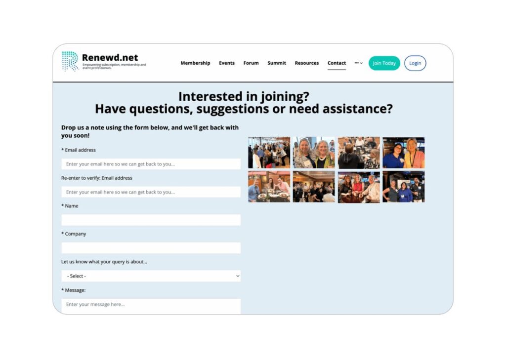
The Form Optimization: We recommended reducing to essentials:
- Email address (properly sized field)
- Brief message
- Optional company name (collected later in the process)
Why Field Reduction Works:
- Each form field reduces completion by approximately 10%
- Users abandon forms that feel longer than expected
- “Simple” promises must match simple execution
- Progressive disclosure works better than front-loading requirements
Conversion Killer #6: Trust Signal Misplacement
Trust Signal Positioning Problems:
During our review, we identified several trust signal issues:
Partner/Sponsor Logo Placement: The client explained, “They’re like sponsors, though. They work with us. They speak at our conferences.”
These logos were buried below the fold, but represented significant credibility indicators, including recognizable industry leaders.
The Trust Signal Strategy: We recommended moving these logos above the fold because:
- Users don’t distinguish between “partners” and “clients” for trust purposes
- Industry-specific logos carry more weight than generic trust badges
- Early trust signals improve scroll depth and engagement
Testimonial Optimization Issues: The testimonials section had multiple problems:
- Images were “really big” and “distorted”
- Positioned at the bottom of the page
- Poor visual presentation reduced credibility
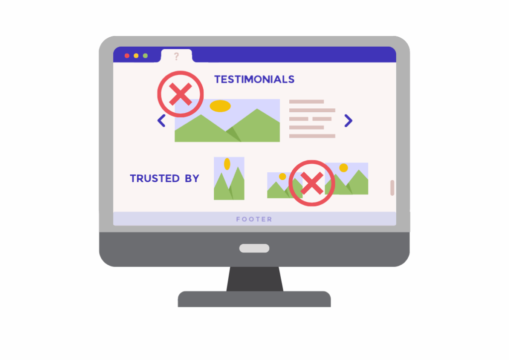
The Testimonial Fix Strategy: We suggested using half of the person’s picture and then a little bit of copy on the right in a container.
This approach:
- Maintains personal connection while improving visual balance
- Creates scannable testimonial blocks
- Positions social proof where users are making decisions
Content Block Optimization: We identified “a lot of blocks of copy” that were difficult to process.
The font and formatting issues meant text was difficult to read and hard to focus on every sentence.
The Content Restructuring Strategy: Instead of paragraph blocks, we recommended:
- Bullet point format for key benefits
- Reduced font size from 20px to 18px for better readability
- Shorter line lengths for improved scanning
- White space optimization for visual breathing room
The Psychology of Scannable Content: Users don’t read websites – they scan them. Block text creates “visual walls” that users instinctively avoid. Breaking content into digestible chunks:
- Increases information retention by 40%
- Reduces cognitive load
- Improves mobile readability
- Encourages deeper page engagement
Phone Number for Credibility: We discussed adding a phone number for trust, even though they didn’t have one:
Whenever we add a phone number to a website, users all of a sudden feel more secure, more confident.
They feel like it is a real company. “They have a phone number. Therefore, there must be someone in the office.”
The client was concerned: “So if they get through to voicemail, it’s not the end of the world, is it?”
Our recommendation: “Nobody’s going to call you, and if they call you, you can return the call. The voicemail could say something like: ‘Unfortunately, all our people are busy. Give us your phone and name, and we will call you back.'”
Worst-case scenario, you get a lead out of a phone call that goes to voicemail.
Why Phone Numbers Build Trust:
- Signals business legitimacy and stability
- Provides alternative contact method for hesitant users
- Psychological safety net even if rarely used
- Differentiates from online-only competitors
The Approach That Works
Instead of recommending a complete redesign of this website, we focused on systematic improvements based on user psychology and conversion principles.
The User Journey Psychology Framework
We structured recommendations around the fundamental user questions:
Question 1: “Am I in the right place?” This relates to the value proposition message. We told the client, “If we tell your users to grow your revenue with a network built for subscriptions, memberships, and event innovators, do you think we are telling the user what your unique value proposition is, and we are telling them yes, you’re in the right place?”
Question 2: “How do I feel about this website?” This connects to trust signals and visual presentation. We addressed:
- Partner logo positioning for immediate credibility
- Professional image presentation
- Consistent design elements that signal quality
Question 3: “What am I supposed to do next?” This question addresses the critical moment where user intent meets action. After visitors confirm they’re in the right place and feel good about your offering, they need crystal-clear direction on their next step. This is where most websites fail by creating decision paralysis. Successful conversions happen when you eliminate friction through singular focus – whether that’s “See it in Action,” “Get Your Free Review,” or “Start Your Trial.” Every element on your page should guide toward this single, clear next step.
The Logical Website Conversation Framework
We restructured their homepage to follow this conversation flow:
Step 1: Identity and Relevance “You’re in the right place. We’re a community for subscription business founders.”
Step 2: Trust Building
“You can trust us. Here are the industry leaders who work with us and speak at our conferences.”
Step 3: Value Demonstration “You should join because this is what you’re going to get: [benefits list]”
Step 4: Social Proof “These people have joined us and they’re really happy.”
Step 5: Clear Action “Here’s exactly how to join.”
Content Structure Optimization
The Block Text Problem: We identified that “whenever we have a lot of sentences all together, it becomes a block and users tend to ignore blocks. They just don’t read through.”
The Solution: Transform paragraph content into scannable bullet points:
- “3,000+ members”
- “Exclusive content”
- “In-person gatherings”
Visual Processing Psychology: The human brain processes bullet points 40% faster than paragraph text because:
- Each point represents a complete thought
- Visual separation reduces cognitive load
- Parallel structure aids comprehension
- Users can selectively read relevant points
Comparison Table Strategy
Current Problem: Their membership comparison table was difficult to understand because users couldn’t directly compare what was included versus excluded.
The Strategic Fix: We recommended the standard comparison table approach:
- Left column: Free membership features
- Right column: “Everything included in basic membership PLUS” additional premium features
- Visual indicators (checkmarks vs. dashes) for easy scanning
The Psychology of Comparison: Users are trained to understand comparison tables through years of SaaS and service websites. Fighting this established pattern creates unnecessary cognitive work.
Mobile-First Considerations
The Mobile Traffic Assumption: The client noted, “I just assume mobile traffic is more because of my background. So I just assume that there’s more mobile traffic.”
But they hadn’t verified this with analytics, highlighting a common optimization blind spot.
The Mobile Optimization Impact:
- 60% of B2B research now happens on mobile devices
- Mobile users have even less patience for confusing navigation
- Form optimization becomes critical on smaller screens
- Visual hierarchy problems amplify on mobile
Our Mobile Strategy:
- Prioritize single-column layouts for key sections
- Ensure touch-friendly button sizes (minimum 44px)
- Reduce text density for mobile scanning
- Test all user flows on actual devices
Implementation Strategy for Small Teams
Being a not-for-profit organization, this client operated with just three part-time people, with the marketing lead working only 10 hours per week.
This constraint shaped our entire optimization approach.
Platform Limitations: Being a non-for-profit they used an off-the-shelf customizable website platform designed for events:
- “Very simple setup, but we’re quite limited in what we can do”
- “It really is very valuable that we have the ability to make edits ourselves without technical involvement”
- Some changes require a developer’s involvement
- The platform sponsor relationship affects customization options
The Wireframe-First Strategy
Given these constraints, we recommended starting with wireframes before implementation:
Why Wireframes Work for Small Teams:
- Prevents wasted development time on wrong solutions
- Allows strategic thinking before tactical execution
- Enables stakeholder buy-in before resource investment
- Identifies platform limitations before implementation begins
The Collaboration
Team Coordination: We established clear roles for implementation:
- SiteTuners: Wireframe creation and strategy
- Client team: Platform capability assessment
- Website provider: Technical implementation support
- All parties: Design approval and testing
Communication Strategy:
- Weekly check-ins during wireframe development
- Recorded calls for team reference
- Action items documentation
- Clear next steps for each meeting
Key Takeaways for Membership Sites
Membership communities face unique conversion challenges:
- Trust barriers are higher – people are joining a community, not just buying a product
- Free vs. paid pathways must be crystal clear – confusion kills conversions
- Social proof is critical – show member companies and testimonials prominently
- Navigation complexity grows with offering complexity – simplify ruthlessly
Why Most Website “Improvements” Fail
Many businesses focus on:
- Adding more features
- Creating more content
- Redesigning aesthetics
But conversion optimization requires:
- Removing friction
- Clarifying messaging
- Streamlining user paths
- Strategic element positioning