Blue Bungalow Tactical Changes Lead to 31% Increase
Blue Bungalow tactical changes lead to 31% increase in new visitor conversion rate
Blue Bungalow is an Australian apparel & accessories retailer founded in 2012 who specialize in flattering, affordable and approachable fashion.
SiteTuners recommended changes to Blue Bungalow’s website to direct visitor attention to critical elements and to use real estate in a more deliberate manner.
Company
Type of project
Content strategy
Results
31% increase in new visitor conversion rate
Overview
When optimizing webpages, you can use multiple frameworks to come up with core areas to test and improve. You can use things like theories about user intent to try and move elements around to match what a user is trying to do. You can look for things that websites are missing, like social proof elements or logos that convey authority and trust.
One framework you shouldn’t overlook is the deliberate use of elements to drive attention.
You can use the visual hierarchy of a page to increase your conversion rate, but only if you have a very disciplined approach about where and how elements get displayed.
There are tactical ways you can subtly, and not so subtly, direct user attention to the things that you want them to notice, but you need to manage levers such as:
Fine Tuning Blue Bungalow’s Website
SiteTuners recommended changes to Blue Bungalow’s website to direct visitor attention to critical elements and to use real estate in a more deliberate manner.
After the changes, there were improvements to the following:
Global and Homepage Elements – Increasing trust through visual attention
Two of the most important things a website needs to make a visitor feel when they land on a page are that …
There are a few elements that you can make more visually prominent to immediately convey that the visitor is in the right place and that the website is safe to use:
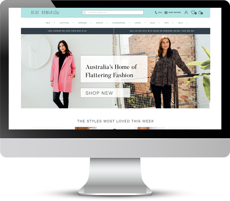
In the case of Blue Bungalow, a call icon and a shop instore icon were added to the header. These help establish immediate credibility and trust – they tell website visitors that the brand is legitimate with a physical location and a phone number that shoppers can contact the company if needed.
Blue Bungalow’s value proposition was also added in the homepage banner. Visually emphasizing who the company is and what it does in the above-the-fold real estate immediately communicates to potential customers why the website is the right place for what they need.
These changes resulted in a 31% increase in conversion rate for new visitors for Blue Bungalow.
On-site Search – Boosting conversions through visual emphasis
Small tweaks to the visual emphasis on a page can make a difference if you’re testing theories when you’ve done your homework (e.g. checking the analytics data).
Case in point, Blue Bungalow website visitors who use on-site search convert at double the rate than those who don’t. That means that by giving visual priority to on-site search through size and position, a fraction of the visitors can be influenced to use the internal search bar and convert better.
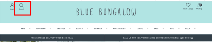
The old header for the site needed visitors to activate a search icon in the upper-left to then start a search:
The new header exposes the search bar by default, driving more attention to on-site search:
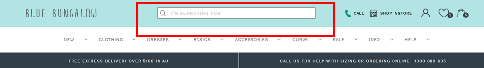
This raised the percentage of users who used on-site search from about 17% to about 19%. This represents a significant lift to revenue, given that on-site search users tend to have double the conversion rate of users who do not use the search bar.
Product Detail Page – Increasing Add to Cart clicks by using contrast
Attention isn’t all about the use of space, size, and position; sometimes, it’s also the use of color and contrast. You can make elements stand out by making them be darker on a light layout, or lighter on a dark layout.
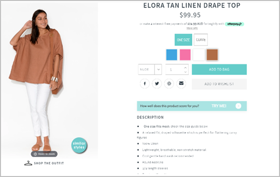
The old Blue Bungalow product detail page (PDP) had a great design and visitors were sure to understand how to interact with the page, but there were a couple of issues:
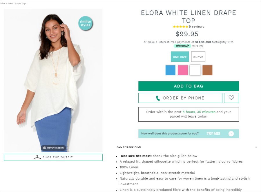
In comparison, the new PDP has a clear visual hierarchy with a dedicated color used on the “Add to Bag” button that contrasts with the theme. The secondary CTAs are either subdued or demoted to ghost buttons.
The social media sharing buttons were removed. Instead, an “Order by Phone” secondary CTA was added to establish subliminal trust.
Given the changes, Blue Bungalow sessions with add to cart jumped by nearly 20% for new visitors.
Store Location Page and About Us Page – Conveying brand personality through deliberate use of pages and layouts
Making good use of real estate doesn’t just apply to things like button colors or the amount of real estate dedicated to on-site search bars. That same discipline can be used to make content pages friendlier and easier for visitors to engage with.
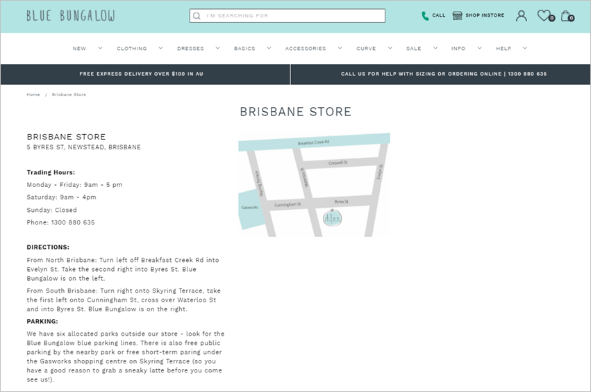
Blue Bungalow’s old Store Location page was a perfectly reasonable page , except that no elements were focused on driving home the brand’s personality while providing information. It appeared bland and transactional.
In contrast, the company’s new store location page looks more appealing with the use of actual store images and creative copy that sounds friendlier and more engaging.
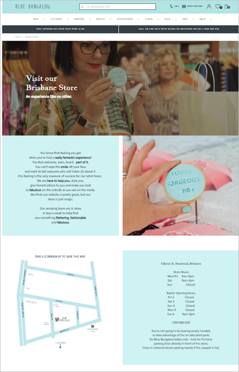
These improvements have increased average time on page by about 20% and reduced bounce rate by 10%.
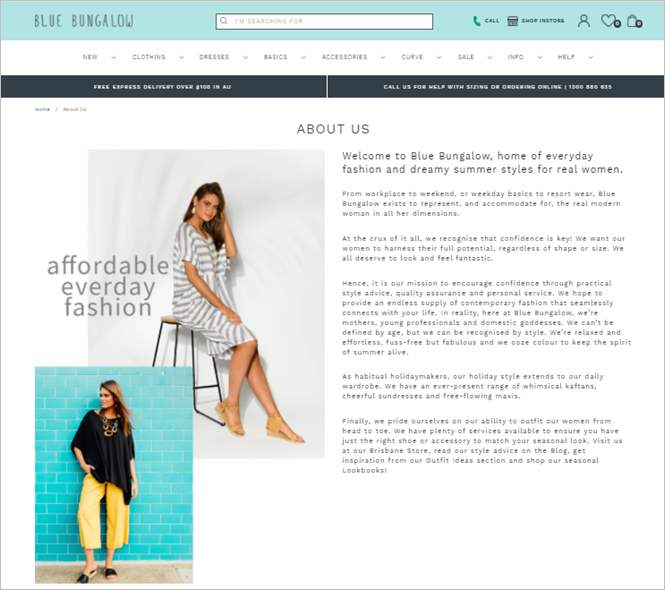
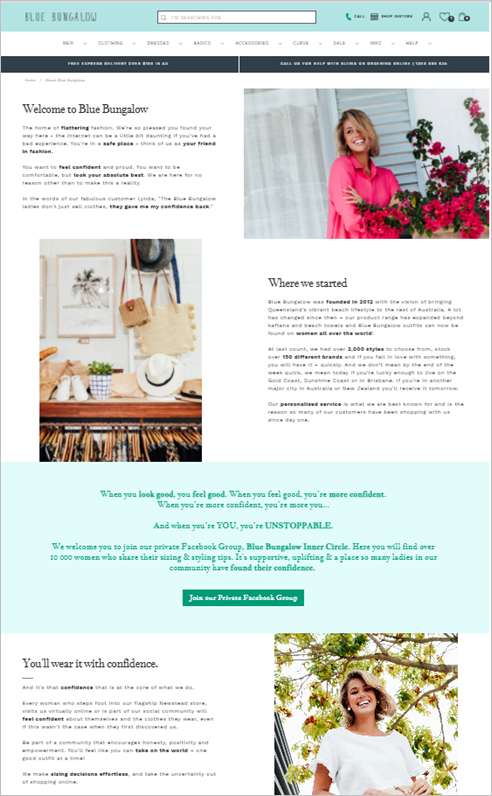
Similar changes to the website’s About Us page has also resulted to engagement lifts.
The old About Us page was text-heavy, making the content difficult to digest.
The new page uses real estate better with creative imagery and layout that supports web users’ scanning behavior. The text is chunked into sections with headings, so it’s immediately clear what each section is about. Important information is also presented in bold, which makes the copy easier to consume.
As a result, the average time on page is 76% higher.
Results
Simple changes rooted in driving attention to the right places on the page, supporting web users’ scanning behavior, and using appealing images can increase both engagement and conversions.
For Blue Bungalow, the changes resulted to the following:
Conclusion – Direct Attention and Use Web Real Estate Deliberately for Conversion Gains
Visually highlighting the right elements can not only increase your conversions, but also improve site engagement.
If you …
… you’ll be in a good position to do better than the competition.