Summary – Learn the important rules to gain your visitors’ trust and which landing page elements to prioritize in order to skyrocket your website conversion rates.
SiteTuners select, review, and recommend products/services independently. If you buy through affiliate links, we may earn commissions. Learn more.
The first question that your customers subconsciously ask themselves when stumbling upon your landing page is “Am I in the right place?”. This is just one of the questions that visitors ask themselves when they land on your website.
Need Help designing your landing pages?
We all know how overwhelming it gets to search for a product or service online. With thousands of offers waving to get our attention, increased website conversion rates start with letting the visitor know they are in the right place.
Yes, you read that right! Just let them know they have landed on the right page by enforcing what they are searching for. How? It’s simple. If they’re searching for black training shoes, make sure your landing page directs them to black training shoes! We’ve rounded up the best landing page elements that will help increase your website conversion rates.
What to Prioritize to Increase Your Website Conversion Rates
Your website should give a path to your visitors for the key pages you want them to browse. The following bullets are the minimum you should do to get your visitors to act. If you follow these rules, you are sure to increase your website conversion rates.
- Use a clear hierarchy of content and pages. Limit the number of clicks before they get to the goal you want them to take. 3 clicks are about as deep as you should go.
- Use 5 or fewer links per page. You want the visitor to click on the main CTA so it should be prominent on the page.
- The CTAs should have descriptive key words in the anchor texts, so they know what they are getting when they click on it.
- Limit horizontal scrolling, keep the page vertical with the main content being above the fold.
- Limit distractions on the page, you want the visitor to know what they need to do next.
Prioritize your customers’ point of view. Your visitors are entirely interested in what you can do for them.
Key Landing Page Elements to Improve Your Website Conversion Rates
So, what will it take for your page to stand out?
Give the User Your Value Proposition
There are thousands of other options that your visitors can choose so make sure they know why you stand out amongst your competitors. Clearly communicate the benefit you’ll deliver.
Display Trust
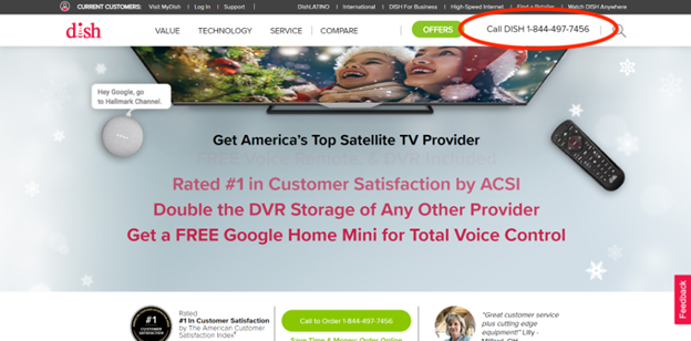
Showcase your phone number in the top right corner of your page so they know you are a phone call away and a real company. Let the visitor know how long you’ve been in business, how many clients you have, give them a reason to trust you and to do business with you. Want to learn more about building a trustworthy website, check out 5 Trust Factors to Increase Conversion on Your Website
Clear Call to Action (CTA)
Give the visitor one clear call to action. Don’t make the visitor think, guide them through the process. Make sure the CTA is clear and has a specific goal. If you are in the e-commerce world, you might find 9 Ways to Make Your E-commerce Call to Action Irresistible
Simplify Your Page
Don’t go overboard and crowd your landing page with lengthy pieces of content. Simply highlight your best accomplishments and get down to business.
Increase Your Website Conversion Rates with Trust
Use Your Telephone Number
Most people don’t trust websites they come across, especially when it involves money and personal information. It’s wise to display your telephone number as a huge trust symbol for visitors. It shows them that they are dealing with real people.
Here is a good example:
Build Trust with Social Proof
Using customer testimonials is a great way to build trust with your visitors. Through this, new visitors will find a sense of security that there are other buyers like them who have spent money or benefitted from your website offers. This will encourage trustworthiness and increase website credibility by verifying your claims.
8 Customer Reviews Best Practices to Optimize Conversion Rates
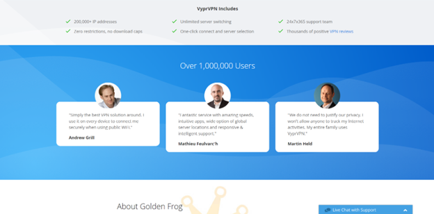
The webpage of goldenfrog.com is a perfect example of trust. The simple design quickly draws the eye to the fact that the website has provided its VPN services to over a million users. A few testimonials from existing customers builds trust even further.
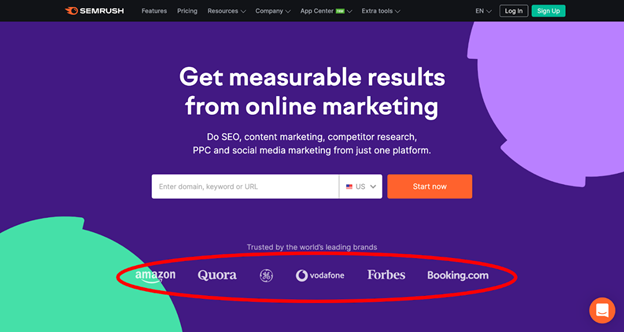
SEMRUSH landing page also does a great job at showcasing their prominent clients. Your visitors love to see that you have worked with other top name customers.
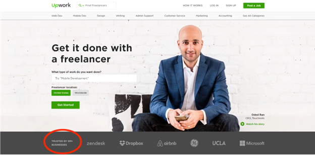
Just seeing Upwork’s statement of “Trusted by 5M+ businesses” along with their badge of top clients is a foolproof way of garnering more sign-ups, don’t you think? Maximizing your strengths on the landing page is key.
Make Them Familiar with Your Business
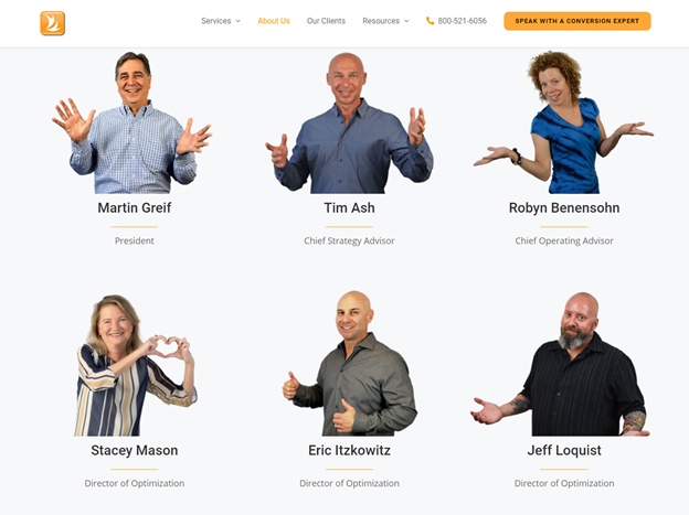
Newsflash: People check your “About Us” page more than you think they do!
Use it wisely and don’t just put boring routine details. This is your chance to show your creativity and brand personality. Your content must portray your passion for the business and driving force behind it.

Making Web Visitors Feel Good: 6 Things to Consider to Build Trust Online
Tell them your story. Make this section your bridge towards a good customer connection. If they feel they know you, trust comes more easily. We at SiteTuners share fun images of our employees and give a technical background for each but we also share a more personal side as well.
Test Your Landing Page Elements to Increase Website Conversion Rates
A/B Testing or Split Testing compares two options of an element on your landing page to determine which one produces positive results. For example, testing which CTA words lead to more conversions. You will look at how many click throughs each CTA word receives and choose one that will ultimately lead to more website conversion rates.
When doing a/b testing, it’s critical to decide what landing page element you want to test. Some of the more common tests are headlines, CTA button words, colors or shapes, and form lengths.
Below are some popular A/B testing software options:
- Google Analytics (Optimize) (free)
- Inspectlet
- Visual Website Optimizer
- Unbounce
- Optimizely
- Kissmetrics
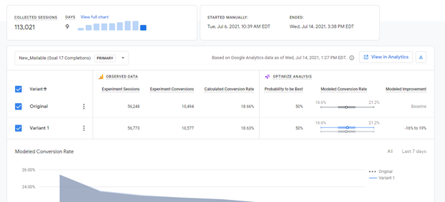
Here’s an example of the Google Optimize product which is free. It shows when the test was started and ended with the total number of sessions and conversions for the Control and the Variant, so you know which landing page element performed best.
The entire process of doing business with your website should be easy, appealing, trustworthy, desirable and fun. It’s human nature to avoid pain and seek pleasure. Most everyone wants to avoid effort and discomfort and would rather seek fun and comfortable experiences.
Increasing your website conversion rates is all about being organized, friendly and professional. You need to explain to the visitor what’s in it for them by clearly stating that what you offer will benefit them and make their life easier.
Subscribe to the SiteTuners Weekly Email
Grow Your Business
Exponentially with Proven
Conversion Rate
Optimization Expertise.
