[Editor’s note: This post was originally published on May 5, 2014 and has been updated to include a discussion on Kahneman’s system 1 and system 2, and more tips to reduce website visitor load.]
We often emphasize that websites need to avoid adding cognitive load on users to make it easier for them to convert. In this post, we talk about the two operating modes of the brain according to Daniel Kahneman and the different types of user load (and how to minimize them).
To oversimplify a point made by Nobel Prize-winning psychologist Daniel Kahneman, all of our brains have two operating modes.
There’s the system that is active when we’re brushing our teeth, eating our cereal, or getting on a train. That system is fast, unconscious, and automatic. It’s very useful, and it’s part of the reason we as a species have survived as long as we have. It’s the mode that told our ancestors to run or hide when they heard suspicious sounds and thought a predator was nearby. A slow, careful, deliberate thinking process would have gotten them eaten.
That is system 1.
There’s also the system that is active when we’re trying to divide 328 by 17, writing a 10-page essay about Moby Dick, or to use an online marketing example, writing a regular expression that will keep internal visits out of Google Analytics. That system is slow, conscious, and heavily reliant on effort. Like system 1, it is also very useful – we just can’t use it all the time.
That is system 2.
How our brains often fail is when it tries to use system 1 for complex tasks, or system 2 for things that require immediate action.
A quirk of the modes is that for everyday tasks, our brains “prefer” system 1. If you give a brain a choice between a system 1 task and a system 2 task for day-to-day activities, it’ll usually default to system 1.
For an online marketer, system 2 is death. Visitors have the option of switching to another website instead of transacting with you. If using your site feels closer to dividing 328 by 17 rather than eating cereal, visitors will likely move to a site that feels more like eating cereal.
Making Things Easy to Use is Complicated
Your job as a marketer is to help your users accomplish their tasks. You need to make it as quick and as easy as possible for your visitors to get to what they need.
That sounds like a simple thing, but in practice, it can get rather complicated.
You can make it simpler for yourself by understanding the different types of things that can add strain to the user:
- Visual load pertains to your design. How much strain are you putting on the user to visually understand your pages?
- Motor load is about movement. How much strain are you putting on your users to use the mouse/pointer and keyboard/keypad to get something done?
- Cognitive load is about the amount of mental processing required to make sense of a page. How much intellectual burden are you imposing on your visitors to understand what you’re trying to say?
- Memory load pertains to the amount of work users have to perform when recollecting something in order to use your site. How much strain on the user’s memory does it take to use your site?
Let’s tackle those load types.
Visual load
Visual is the cheapest among all load types because humans have several machineries for visual processing. That said, you still need to make sure that you don’t stress your visitors out. To minimize visual load, you need to think about a couple of things:
Affordance
It should be immediately obvious which elements on the page are interactive and which aren’t. So, buttons should look like they can be clicked. Generally, interactive elements should pop out, and elements that can just be read should be subdued.
Legibility
Make your site easy to read.
- Establish a clear visual hierarchy by using larger font sizes for subheadings and headings.
- Support web user’s scanning behavior by presenting information in bullet points, rather than in paragraphs.
- Ensure font styles are consistent, and avoid those that are too ornate. Font styles that are overly creative can get in the way of legibility.
- Make font sizes large enough for your target demographic (i.e. using bigger fonts for older audiences).
Too Much Visual Load Example
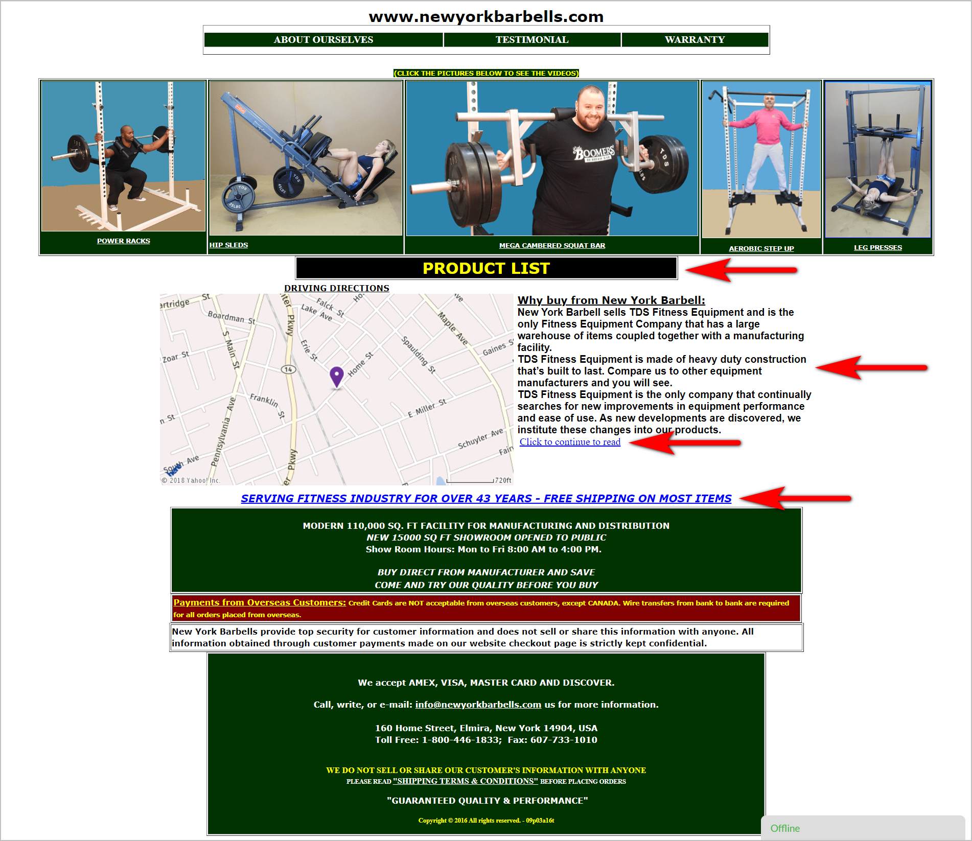
The homepage of NewYorkBarbells.com, for instance, is bound to overwhelm users visually (red arrows added for emphasis):
- The page needs to be more disciplined with color and font use. It uses different colors and font types and fails to establish a clear visual hierarchy.
- It’s not immediately obvious which elements are interactive and which aren’t:
- “Product List”, a clickable element, lacks affordance signifiers and doesn’t look like a button.
- “Click to continue to read” in blue underlined text is clickable, but “Serving Fitness Industry …”, which is also blue underlined text, is not clickable.
- The page is text-heavy and does not support web users’ scanning behavior.
Keep in mind that the easier it is for users to scan and immediately make sense of your page, the lighter the visual load you impose on visitors.
Motor Load
When thinking about how to minimize motor load, keep Fitts’s Law in mind. It states that the time it takes someone to get to what they’re trying to interact with is a function of the size of the target and the distance to the target.
The target could be a button that the user is trying to click or tap, a form field they’re trying to click into, or an accordion menu they’re trying to expand.
Distance, on the other hand, pertains to how far the target is from where the user’s pointer (e.g. mouse cursor, finger) starts out.
So, large targets which are close to the pointer will require the least effort, while small targets that are far away will impose greater motor load.
Here are a couple of things you can do to reduce the physical effort required of users:
- Group related tasks together. This way, it doesn’t take a lot of work to switch between the things required for one set of related tasks.
- Increase the size of the buttons required for key tasks. This way, the distance the pointer needs to travel is compensated for by the size of the call to action (CTA).
Conserving Motor Load Example
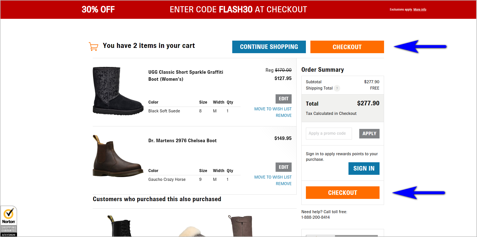
Shoes.com’s shopping cart makes the “Checkout” button visually prominent and reduces motor load by making the button repetitive. Whether the pointer starts out at the top of the page or towards the bottom of the page (presumably after the user reviews the items in the cart), the pointer is never too far from the CTA button.
Keep in mind that the distance required for users to accomplish their tasks deters from task completion. Users will only tolerate a set amount of space before giving up. So, minimize motor load whenever possible.
Don’t make it difficult for users to find what they need on your website.Read “5 Web Navigation Mistakes That Are Costing You Conversions” |
Cognitive Load
Cognitive load is the amount of mental processing required to make sense of a page. When you have multiple alignment points or inconsistent locations for interactive tasks, cognitive load takes a hit. You generally need to consider the following:
Availability
This refers to discoverability of information when users need it. The idea is to make it easy for visitors to spot what they need on a page. This could mean giving elements that are more commonly used by visitors more real estate or visual emphasis on a page.
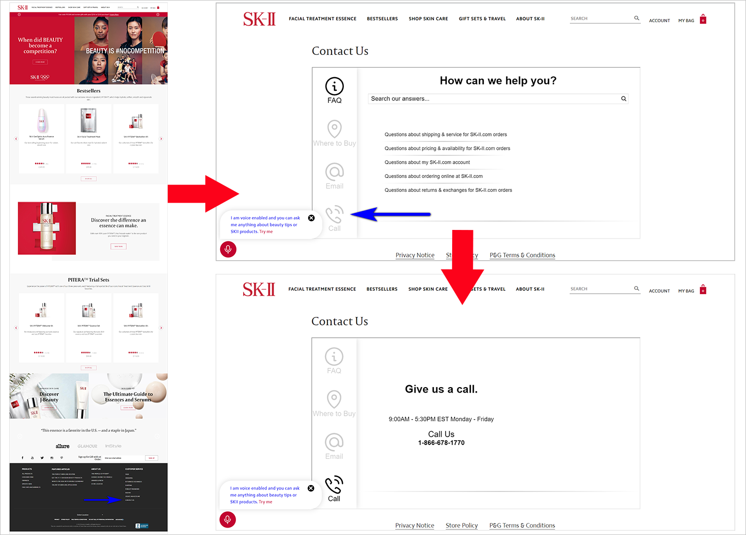
For instance, the phone number on SK-II.com could be challenging to find. The user will have to scroll all the way down to the footer of the page, click on “Contact Us”, then click the “Call” icon (which also lacks affordance signifiers):
Another example of an availability or discoverability issue is when the user wonders what they’re supposed to do on the page because the call to action is unclear or inconspicuous. So, ensure that navigational elements are visually prominent. Remember, if the user can’t find something, then it might as well not exist.
Alignment Points
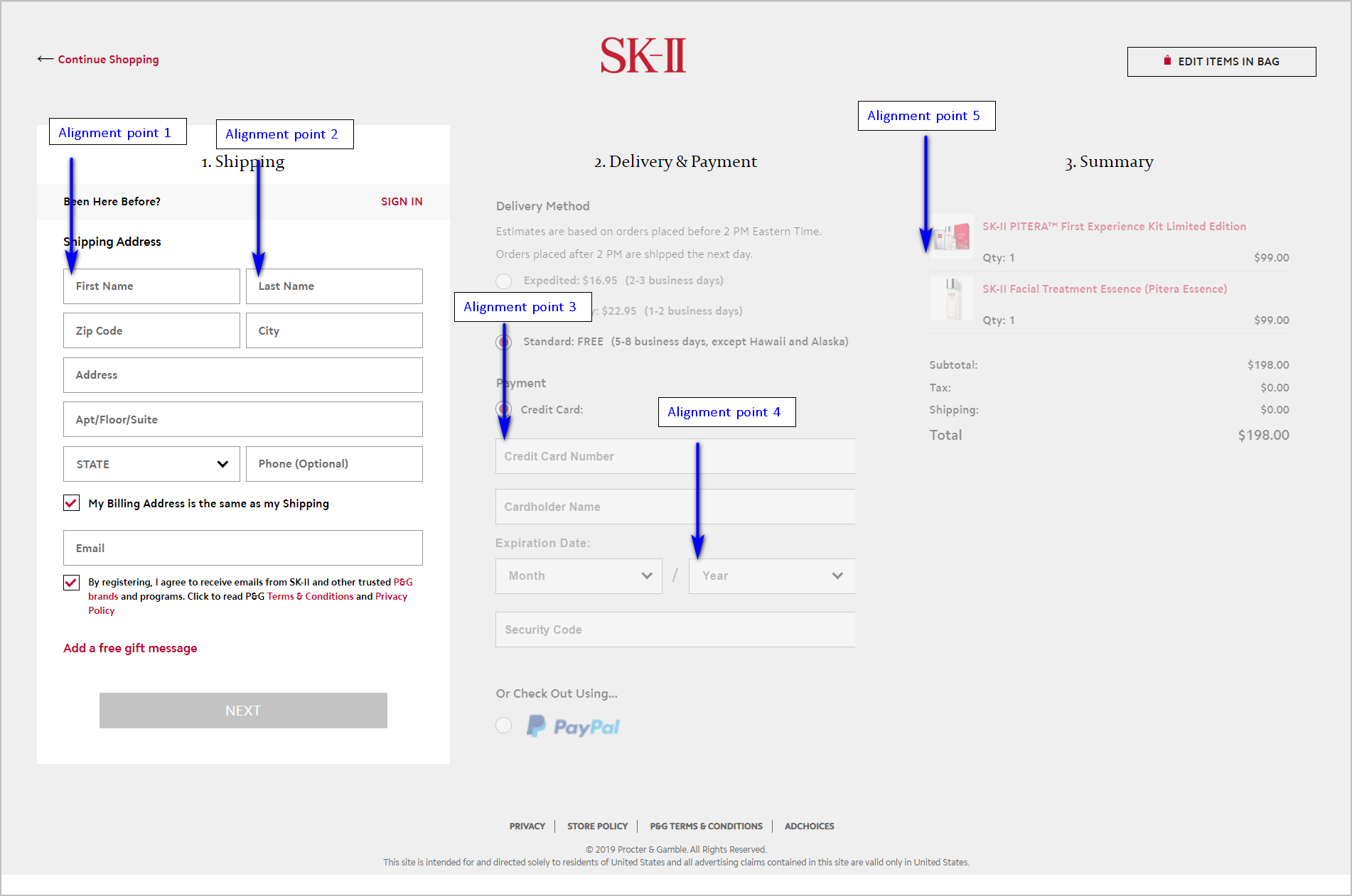
Web pages look more intimidating if there are more alignment points, so stick to a few. This is especially important on forms. When two forms have the same number of fields, the one with more alignment points has the heavier cognitive load.
SK-II.com’s checkout form, for example, has several alignment points. However, the site avoids unnecessary cognitive load by disabling other sections of the page until the user has completed the first step. Otherwise, the page would appear too cumbersome:
Consistency and Organization
Moving the same functions to different places makes the user stop and think. Providing highly used functions in obscure, tough to see areas makes the user stop and think. You can follow web conventions and avoid the pitfalls.
Unnecessary Cognitive Load Example
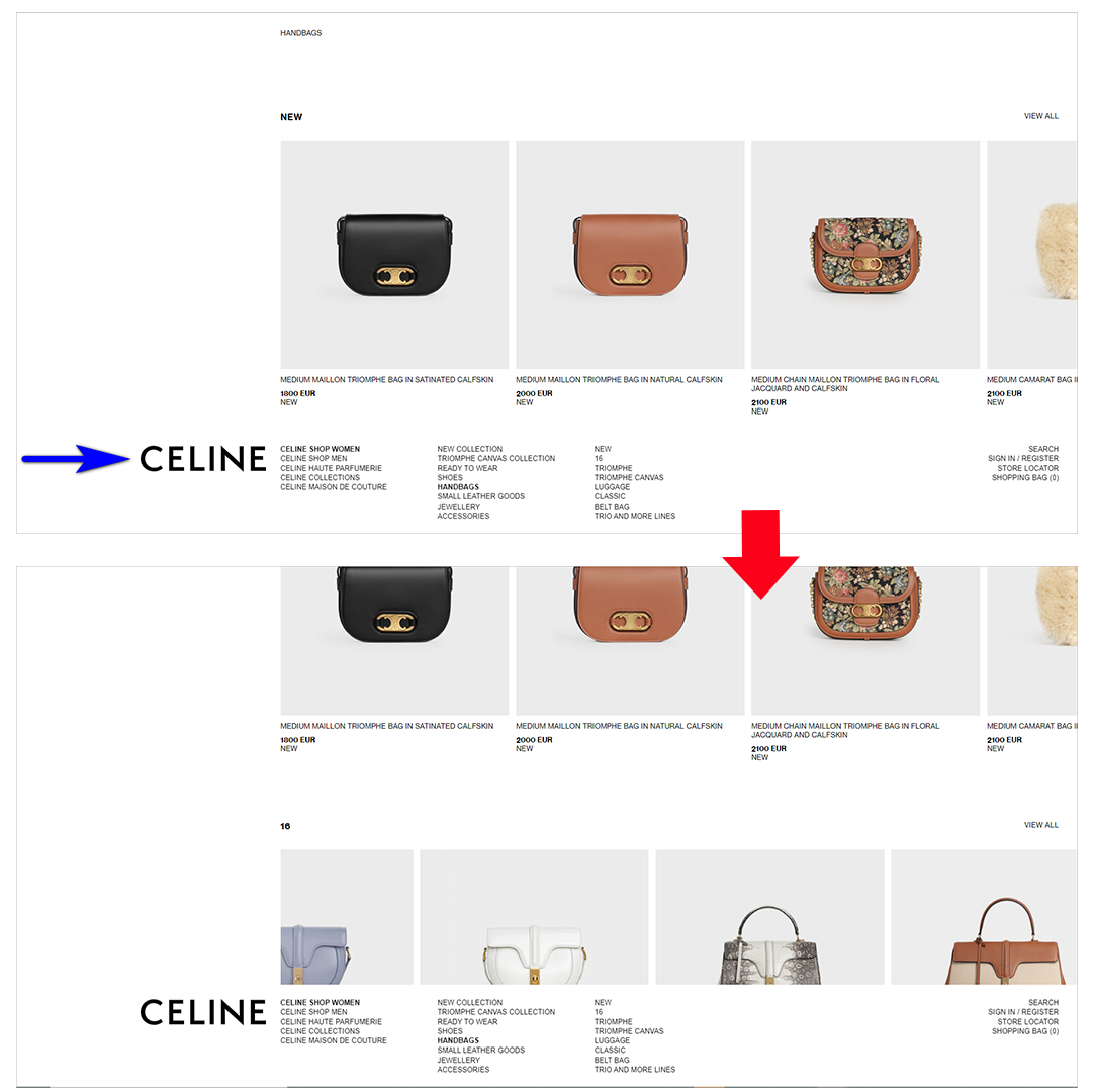
Celine.com, for example, asks their visitors to learn their system by deviating greatly from web conventions:
- The company name/ logo, which is typically found in the upper-left corner of the page (or in the middle at the top of the page for fashion sites), is in the lower-left corner.
- The navigation items are located at the bottom. This unconventional placement of the navigation elements also causes a false bottom problem. It’s not immediately obvious that users can scroll down to see more content below the fold.
Feedback
When users interact with something on the page, or when an error occurs, the page should provide mechanisms to show what has taken place.
Ensure that the feedback is visually prominent, so the user doesn’t have to hunt for it and wonder if the website recognized the action they’ve just taken.
AntonsFloristNJ.com’s product detail page, for example, doesn’t really give the user any feedback if they type in a zip code the company doesn’t cater to. After the user clicks “Add to Cart”, the message “Error: Unkown zip code” appears above the breadcrumbs. This is bound to be missed by users as the message is far from the action block – it appears unrelated to the action the user just took. The error message also looks more like internal scripts rather than public-facing content:
When designing your pages, remember the title of Steve Krug’s book: Don’t Make Me Think. Make your pages intuitive and usable, so you require the least amount of mental effort from users.
Memory Load
Memory load is strain caused by having to recall things to make something work.
On websites, a lot of this can be avoided by making information available when it is needed.
When visitors need to follow instructions to fill out a form, those instructions should not be on a different page – they should be on the form itself. When you have a wizard with a set of steps, those steps should be displayed as the user takes them – the visitor shouldn’t have to memorize steps from another page.
If you have the technical chops to make form auto-fill work, you can save the users some memory load. Assist them with form fields when they begin to type in information that they tend to use on multiple sites. Just be careful to test that, so you don’t cross a creepy factor threshold while trying to conserve memory load.
Conserving Memory Load Example
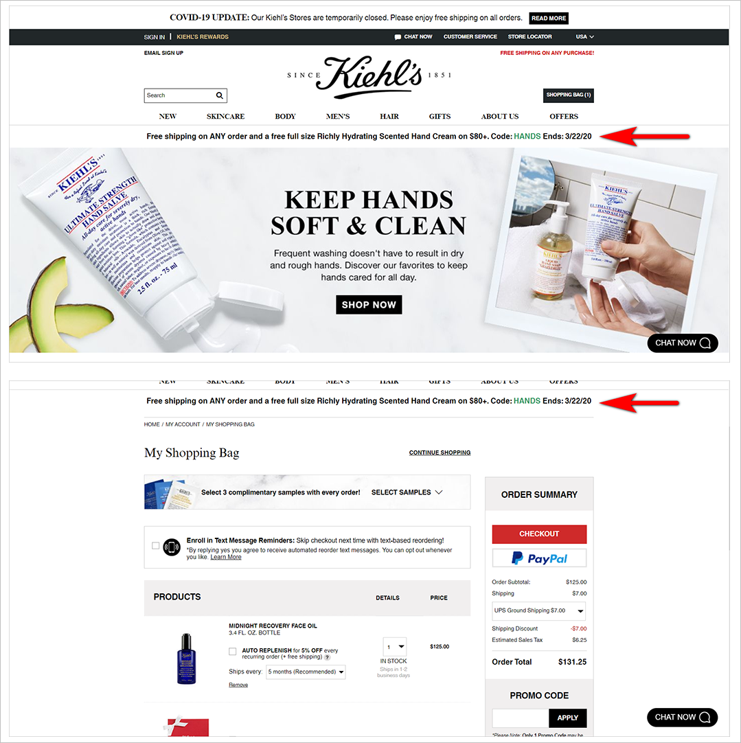
Showing the available promo code on the page where the user has to type it in is one way of conserving memory load online. Kiehls.com, for instance, keeps the promo code banner from the homepage to the shopping cart. This way, the user doesn’t have to memorize the code or to go back to the homepage when they’ve reached the shopping cart page:
The goal is always to minimize the work the user has to do on your site. This includes not asking them to recall too many things to work with your interface.
Avoid System 2 Whenever Possible
Remember: system 2 is where your conversions go to die.
If you make visitors think too hard in order to use your site, users will leave and work with sites that are easier to use.
Often, just reducing the number of elements on your pages can do wonders for the four types of visitor load. Try and follow these tips:
- Reduce the text on the page as much as possible.
- Get rid of visual distractions, especially motion.
- Minimize the number of choices available. Present the 3 or 4 simple choices that a visitor can easily process.
- Follow web conventions, and avoid making users learn your system.
To go further and ensure that the visitor load is as low as possible, though, you need to evaluate your most used pages in terms of visual, motor, memory, and cognitive load. You can’t make the experience frictionless for all four load types, but you can make very deliberate decisions when you understand the trade-offs involved.
