And that’s okay.
But that doesn’t mean that you shouldn’t be taking measures to …
- persuade visitors to act sooner rather than later,
- alleviate anxieties,
- leverage psychological momentum, and
- ensure that you don’t make customers jump through hoops to check out.
Here are some tips on doing those:
1. Show Scarcity
The human brain is wired to treat messages of scarcity with urgency.
Scarcity increases perceived value from customers’ perspective, especially for things they badly need or want. Presenting something as a scarce commodity triggers the fear of missing out.
When customers learn that an item they want is in limited supply, they’re more likely to move quickly to make sure they get it. This is why time-sensitive offers are very effective at persuading customers, most of whom are prone to procrastinate, to take immediate action.
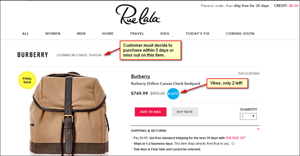
Flash sale sites, like Rue La La, rely heavily on the effect of scarcity to get customers to decide swiftly. A countdown clock informs customers of how much (or how little) time they have to act before they miss the opportunity to buy.
The stock indicator (which shows the number of items left before the product sells out) then reinforces the need for customers to act soon by further limiting their opportunity to purchase.
2. Leverage Customer Reviews
As social animals, people use social proof as a shortcut to decision-making.
And in e-commerce, where experiential and sensory details are missing, customer reviews are a major influencer. This is especially true for physical and non-uniform items.
For clothing products for instance, customers rely heavily on reviews to identify if a product is true to size, and to know what others, whom they identify with, are saying about the product.
Tread lightly – ratings could easily turn into negative social proof as well.
BuyCostumes.com’s category page, for instance, can be improved by having ‘Be the first to review this product’ for items without ratings. This tells the customer that it’s NOT that other customers weren’t satisfied with these products – these products just haven’t been reviewed yet.
Additionally, consider not displaying average ratings for a product until you have enough reviews. Set a threshold and display averages only when you reach that threshold. Customers might not realize that the one star rating for an item is only based on one review.
3. Show that the Site is Secure
If you expect people to put in their information on your site, you need to assure them that you take measures to protect their data.
Alleviate customer anxiety by making security symbols, like Symantec or McAfee, prominent on the site. Trust elements cannot be relegated to the footer – if users have to scroll a few screens down to see them, they might as well not exist.
These elements are especially critical in the checkout process when personal information is involved.
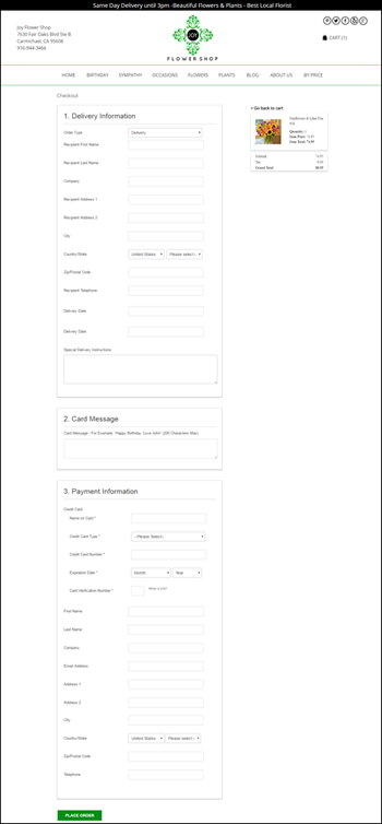
For example, Joy Flower Shop’s s checkout page could benefit from trust and security symbols. There’s nothing on the page that tells the customer that if they put their information here, it won’t be compromised.
Also, consider putting your privacy policy link below the email address field. If you don’t want to do that, you can address the customer’s hesitation to give up their e-mail by telling them that it will only be used for sending order confirmation and for access to their account.
4. Make Promo Code Field Less Prominent
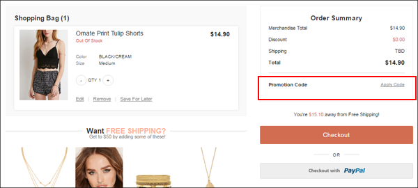
A big promo code box or prominent ‘Add Coupon Code’ button during checkout tells the customer that they’re not getting the best deal. This will cause them to leave your site to look for a code elsewhere.
Consider demoting it to a text link similar to how Forever 21 does it.
This way you’re not distracting from ‘Checkout’, which is what you actually want the customer to click on.
5. Offer Guest Checkout
Compulsory account registration kills conversions fast.
The last thing your customers wish to see when they’re trying to breeze through checkout is a form asking them to create an account, an activity seen as cumbersome by most.
Mandatory account registration defeats the purpose of building highly persuasive pages. For instance, when you’ve emphasized scarcity on your product pages, your site should be able to provide the easiest and fastest checkout experience for customers.
Giving them the option to check out as a guest assures them that there won’t be any delay in their journey that can cause them to miss out on buying their desired item. When your customers are ready to complete their purchase, the best you can do is get out of their way.
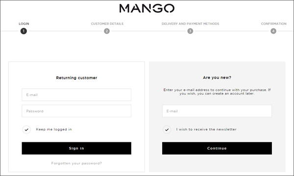
Mango.com, for instance, allows customers to checkout without creating an account. And they do it quite well.
They …
- Say ‘Returning customer’ for those who have an account. This creates the impression among new customers that others buy here over and over.
- Indicate that new customers just need to put their e-mail address, and that creating an account is optional.
- Avoid using the word ‘registration’ which has negative connotations.
Putting It All Together
In e-commerce, having the product a customer wants is not enough. If you want your site to convert better, you need to nudge visitors towards certain actions and alleviate particular visitor fears.
If you use scarcity well, present customer reviews effectively, display trust symbols, de-emphasize promo code fields, and offer checkouts without requiring visitors to log in, you’ll persuade more of your visitors to transact with you.


