Summary: Heatmaps are an absolute game-changer, and it’s time you made them your best friend in the world of analytics. With this Marketer’s Guide to Heatmaps, you can visualize where users click, tap, hover, scroll, and interact on a page. This provides unparalleled insight into how users actually experience your site or app.
Let’s demystify everything about heatmaps, from their fundamentals to actionable tips for maximizing your heatmap data. Whether you’re taking your first steps into the world of heatmaps or you’re a seasoned pro looking to elevate your game, you’re in for a treat.
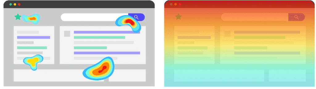
How Heatmaps Work:
Have you ever wondered how heatmaps do their magic? It’s all about using colorful language to convey user activity. Red areas indicate high activity, while green and blue show diminishing activity levels. Heatmaps make interaction patterns easy to see at a glance by visualizing these activity levels.
Heatmaps are generated by collecting click, tap, scroll, hover, and other user interaction data on a page. This data is then visualized by assigning a color gradient to areas based on the frequency of interactions. The more action happening in a spot, the hotter the colors it gets.
Some key technical elements that enable heatmap creation include:
- Tracking user interactions with JavaScript
- Recording screen positions and time stamps of interactions
- Overlaying aggregated interaction data on a screen render of the page
- Applying color gradients based on interaction frequency
With this technical foundation, heatmaps provide a powerful visualization of where and how people engage with your site or app.

Why You Need to Mix Quantitative and Qualitative to Get Reliable Data
Tips for Interpreting Heatmaps:
Now that you know how heatmaps work, let’s look at some tips for analyzing and interpreting them like a pro:
- Identify hot and cold spots: The bright red areas immediately draw attention to pages/screens with high user interaction. Be sure to also look for dark blue cold spots, which may indicate low engagement.
- Look for patterns: Are users following a consistent cursor movement or click flow path? What do the ways tell you about how they interact with the page?
- Compare changes over time: Use heatmaps to see how user behavior shifts overtime on the same page. This can reveal the impact of changes.
- Segment your data: Break down heatmaps by various user segments to uncover differences in behavior across your audience.
- Combine with other data: Heatmaps show where users interact, but not why. Combine them with surveys, session recordings, etc., to better understand motivations.
Acting on Heatmap Findings:
The real value of heatmaps comes from taking action on what you learn from them. Here are some ways to turn heatmap insights into positive changes:
- Eliminate friction: When you spot those congestion points on your heatmap, take action! Think about how you can simplify the user experience. This might mean making navigation smoother, shortening forms, or breaking long pages into more digestible sections. The aim is to eliminate any roadblocks and make the user journey easier.
- Guide users: Identify the hot spots where users are most engaged on your heatmap. Use them strategically to place signposts, links, UI prompts, or design elements that lead users to essential workflows. You’re following the user’s natural path and gently nudging them in the right direction.
- Direct attention: Look at both the hot and cold spots on your heatmap. This can reveal opportunities to redistribute page elements to capture better user attention where you want it. If key sections are cold, find ways to reposition or redesign them based on what is resonating with users.
- Retest changes: Trust but verify! After making tweaks based on your heatmap insights, generate a fresh heatmap to confirm if your changes hit the mark. Give them time to take effect, then compare the before and after heatmaps. Look for shifts in hotspots, smoother user flows, and increased engagement with the revamped elements.
- Identify weaknesses: Heatmaps don’t lie – if certain pages, features, or content fail to engage users, the cold blue colors will reveal it. Use these cold spots as alerts to rework, improve, or remove underperforming elements altogether. Getting user attention is ultra-competitive, so stay laser-focused on what attracts it to your site.

Tools for Creating Your Own Heatmaps
Now that you’re inspired to use heatmaps, here are some tool options to start capturing and visualizing your own interaction data:
- Google Analytics: Offers basic heatmap functionality in its paid plans. Great if you already use GA, but capabilities are limited compared to dedicated tools.
- Hotjar: One of the most full-featured heatmap and session replay tools. Free plan with 3,000 pageviews per day. Paid plans add features like funnels, surveys, and customer feedback.
- Inspectlet: Offers heatmaps, session replays, funnel visualization, and form analytics. The free plan allows 100 sessions per month. Paid plans add features like filters and custom tagging.
- Mouseflow: Combines heatmaps with scrollmaps, clickmaps, and session replays – a free plan with 100 monthly sessions. Paid plans provide more features and customization.
The capabilities and pricing vary across tools, so choose the best that fits your needs. Most offer free trials so you can test drive before committing.
Conclusion
At this point, you can likely envision the game-changing insights heatmaps could bring to your business. But transforming those insights into tangible results takes skill and know-how. That’s where our team of customer analytics experts can help. Don’t go it alone – partner with the leading pros to implement heatmaps tailored to your business needs. From identifying the right tools and metrics to extracting strategic insights, we’ll unleash the full capability of heatmaps for your organization.