It’s spooky season. This time of year might be about running campaigns and promotions for some marketers. But Halloween might also be a good time for marketers to reflect on things to be wary of as they prepare for the holidays ahead.
One of the things to be cautious about is getting on the web design bandwagon.
Sure, design trends can give your website a modern look and feel, which in turn can help your site build trust among visitors. However, some web design fads can also get in the way of users accomplishing what they set out to do.
Here are some things to watch out for:
1. Phantom Elements
Minimalism has its merits. On a web page, it’s easier to direct the user’s visual attention if there are fewer elements. So, it definitely helps if you limit the objects on your site to those that are absolutely necessary.
That said, you need to be deliberate about how you declutter your pages. Ensure not to lose elements that actually make it possible for visitors to tell …
- what your website is for,
- that they can trust the website, and
- what they’re supposed to do to move forward.
Below are some critical elements that are often absent from websites:
Missing tagline or USP
Take a stab at identifying what this website is for:

The description in the search engine results page says “Specialists in exceptional home goods and kitchenwares from abroad”.

Visitors who land on the homepage, however, are not likely to immediately understand what the site is for because its above-the-fold real estate lacks messaging around what the company does.
Unless you’re a big brand that needs no introduction, think about how you can succinctly describe who you are as a company and what sets you apart from your competitors. Make that visually prominent in your website as your tagline or headline, so visitors know right away that they’ve landed in the right place.
Buried phone numbers
The phone number is the biggest trust symbol online. It tells web visitors that there’s a real company behind a site. Yet this important trust element is often nowhere to be found on webpages.
Placing your phone number in the standard location — the upper right corner of the page — will help build instant trust. If manning the phones is an issue, you can put your hours of availability under the phone number to address that.
Petite Studio’s phone number, for instance, is missing from the top of the page and is not easy to find. Visitors will have to scroll all the way to the footer and click through to the “Contact us” page to see the phone number and when customer service is available to take calls:

Invisible navigation on desktop
On mobile devices, where there’s very limited real estate, it makes sense to put navigation items under the hamburger menu.
That’s not the case for bigger screens, however. On desktop and laptop screens, you want to take advantage of the space and make the navigation elements visible to users rights away. There’s ample space for a top navigation bar, so that’s where your primary navigation elements should go.
Lingokids, for example, hides primary navigation elements in a hamburger menu even on desktops:

This may be a response to a mobile-first world, but that’s a compromise that nobody needs to make. The desktop presence can show the navigation elements, while the mobile presence keeps them hidden.
Get out of the users’ way. Learn other web navigation mistakes to avoid.Read “5 Web Navigation Mistakes That Are Costing You Conversions” |
Unclear call to action
Sometimes, users get confused about what they’re supposed to do on the page when they land because the above-the-fold real estate has virtually no content on first load. Hobonichi Techo’s landing page, for instance, has nothing aside from an arrow that serves as a directional cue. That’s a massive waste of real estate:

Other times, users find it hard to tell how they’re supposed to proceed because they can’t spot the call-to-action (CTA) button. This could either be because the button doesn’t look like a button or the button blends with the rest of the page.
Huru, for example, uses a trendy black-and-white palette. However, because the CTA button is also black, it fails to pop off the page:

Black-and-white palettes per se are not evil. You can actually capitalize on the lack colors to make important elements immediately noticeable by using a color that contrasts with the sea of monochrome.
2. Monstrous Images
Think hard about utilizing a huge background image, as it can be the bane to your website’s usability.
- Large images are often the culprit in false bottom issues. They make it difficult for users to immediately identify that there’s more content below the fold.
- Gigantic images take up a lot of prime real estate, pushing important navigation and trust elements further down the page.
- These images also often cause legibility problems, as text set against the colors of the photo tends to be hard to read.
- On top of all these, the larger file sizes can lead to slower page load times.
These problems can be observed on Doops Designs homepage:
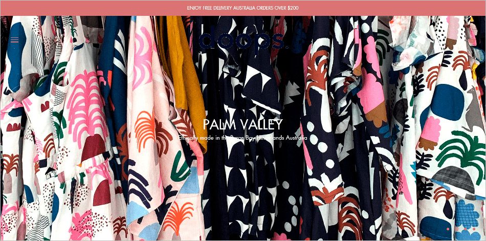
- Visitors won’t even see the logo, unless they’re aware it’s in there to begin with.
- The description is barely readable.
- Users won’t know what they’re supposed to do here, as top-level navigation options are hidden in a hamburger menu (that’s also barely visible), and other navigation elements are pushed down below the fold.
- It’s hard to tell there’s more information below.
You can avoid most of these issues by managing the size of images and generally, prioritizing function over form.
3. Lost Items
Keep the title of Steve Krug’s book in mind when designing your web pages: Don’t Make Me Think.
Stick to web conventions as much possible. This way, you don’t put unnecessary cognitive load on your visitors by making them learn things that are specific to your site. You’ll do well to put elements where users expect them to be, so they don’t have to actively figure out where things are on the page.
Patagonia’s product detail page, for example, deviates from web standards by putting the action block on the left and the product image on the right. This is bound to disorient users who have been trained to look at the product image first and then make a selection and click on the CTA button on the right side of the page:

Chileda, on the other hand, deviates from web conventions by putting the company logo in the page body:

- This is a problem because web users have learned over the years to look for the logo in the upper left corner of the page.
- People also rely on the logo at the top to take them back to the homepage when they’re deep in the site.
HidrateSpark has a similar problem of items not being where users would expect them to be. Instead of the typical cart icon on the upper right corner, HidrateSpark.com has a persistent bar at the bottom of the screen that indicates the number of items in the user’s cart. Again, this might be a case of a mobile approach bleeding into the desktop experience:

Be deliberate about where you position items on your webpage to make them easily discoverable. Remember that if users can’t find something on your site, then it might as well not exist.
Don’t Let Trendy Web Design Spook Your Users
You can chase your visitors away fairly easily by …
- not visually prioritizing elements that allow users to identify that they’re in the right place and that they can trust the website,
- using monstrously large images that get in the way of usability, and
- surprising the users by deviating from web conventions and not placing elements where visitors expect them to be.
If you avoid these pitfalls, you’ll stand a better chance of not scaring away your hard-earned visitors.