Featured products on the homepage. Rotating banners. Backgrounds that add “personality.”
Most of those in the online marketing field understand why these are used by a ton of sites, and some of us know why these aren’t helpful when you put on your usability glasses.
But they’re there, even if you’re seeing slightly fewer of them now.
Here are the 7 things we hope to see less of in eCommerce sites 2016.
Page Background Distractions
When designing your ecommerce website, keep in mind that visitors will look at areas where there seem to be meaningful information. Our eyes can’t help but be drawn to:
- texture
- color
- contrast
- details
Visual variations on the side of the page will engage the eye, and consequently take attention away from the body of the page.
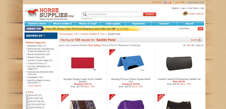
HorseSupplies.com, for instance, is right in making the periphery darker, but the photo-realistic picture of boards distracts from the middle of the page.
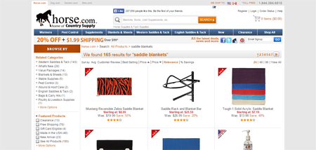
Horse.com, on the other hand, gets the background right.
The inside of the page is white and high-contrast, while the outside is dull gray. So, the eyes automatically go to the body of the page.
You don’t want the background to be the center of your visitors’ vision, so keep it boring. Keep it free from …
- patterns
- color changes
- pictures of people (especially this one)
Sure, you might be going for a specific look to attract your audience, but the place to embellish is not outside the boundaries of the page.
Products on the Homepage
Having individual products on the homepage is you guessing what the visitor wants – hopefully with an educated guess based on data.
However, even if those items represent your bestsellers, they’re probably just a tiny fraction of your overall inventory. And the chances that they’re what the visitors are looking for are very slim.
Remember that your homepage exists for 2 reasons (and selling is not one of them):
- To establish credibility and trust
- To get people off the homepage and closer to their goal
The function of the homepage is to get visitors to the set of products they’re interested in.
That is unless you’re Apple.
When Apple releases a new item, it’s probably a billion-dollar launch worldwide, so it’s okay for that product to take over the whole experience.
That’s not the case for most ecommerce sites.
Most carry larger product lines, don’t have that brand affinity, and don’t have major launch events happening typically.
So remove individual products on your homepage. Instead, show visitors the breadth of products you carry by …
- having category-level navigation above the visual fold
- representing each category with a photo collage that shows the range of items available in that category
Make sure category images are composites, or are visually different from how you represent individual items, so customers don’t get confused.
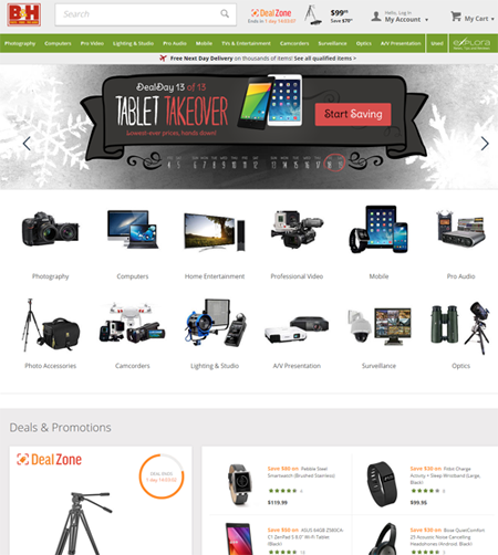
For example, B&H Photo Video’s homepage (though less than ideal because of the rotating banner that pushes down the categories) has the composite images down pat. (They sort of cheat, though, by putting featured products further down.)
Too Many Choices
We know, we know. Every eCommerce site dreams of becoming Amazon when they grow up.
So you might be following their footsteps by presenting your customers with tons of product choices.
Consider this, though:
In a Columbia University study, 2 jam tasting booths were set up in a store to find out if the number of choices has an impact on purchasing decision.
It turned out that it does :
- 30% of those who visited the booth with only 6 types of jam ended up buying
- only 3% of those who visited the booth with 24 types of jam made a purchase
So, don’t overwhelm customers with too much choice as that leads to decision avoidance.
Also, don’t rely on visitors finding what they want by using the filtering system on the left-hand side because …
- Only advanced users typically use it. Most visitors will not invest time and effort in learning the interface of your filtering system. (Check your analytics if the number of people using your filtering is worth the real estate you’re allotting to it.)
- Even if customers use it, chances are the filter will still pull up too many results.
On Wayfair.com, for instance, if you filter to show only ‘rectangle’ ‘5 X 8’ area rugs, it will yield over 900 pages of search results with 48 products on each page.
You can’t expect customers to wade through the results endlessly until they stumble upon the item they really want.
Scrolling only works for quick visual scanning of physical items that are substantially different (like in Pinterest). But in an ecommerce setting, where you have a long list of images which are visually similar, scrolling is not the way to go.
Keep these in mind when presenting choices:
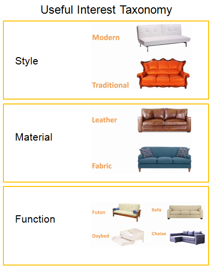
- Guide customers towards the right products (similar to how you’d do it at a physical store). Take the same filtering on the left-hand side and turn that into a step-by-step wizard. Put the same choices into a series of questions with useful interest taxonomy in pop-over windows.
- Go deep and narrow when creating information architecture for catalog navigation. Have only 3 or 4 top level categories with each one having 4 to 6 sub-categories. Show a set of items that matches the user’s needs only after 3 or 4 clicks.
Similar Looking Choices
If you’re a specialty store, chances are you sell a lot of products that are not visually distinct from each other. ‘Problem is, if you present them as similar-looking items, customers won’t have anything to base their decision on.
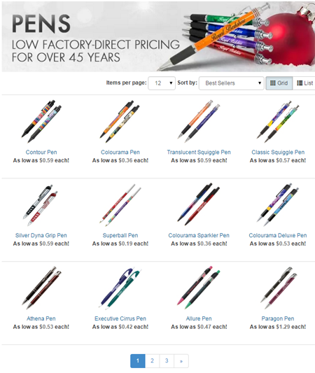
For instance, if you’re selling pens and you show them as tiny thumbnails, as in the picture below, it’s difficult to tell how one item differs from the next.
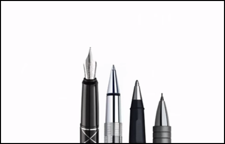
However, if you show the head-end or the tail-end of a pen, the customer will see whether it has a screw-on cap or a push-button at the back. They can tell if it’s a fountain pen, or if it has rubber grip, or if the size of the ballpoint meets their needs.
Help customers decide by using visuals to make choices clear.
Focus, enlarge, or distort important distinctions among seemingly similar products. Have a flyout or a portion of the picture that shows the uniqueness of an item.
Promotions that Dominate
Everybody in the company wants a piece of the homepage. As a result, promotions dominate and top-level navigation goes missing.
In turn, users are expected to figure out the menu with dropdowns and fly-outs on the navigation bar because the body lacks useful navigation.
But it’s not enough to just have the categories in the nav bar. If the information is important, it has to be laid out visually in the body of the homepage as well.
Remember: Users only use the nav bar if the homepage body fails.
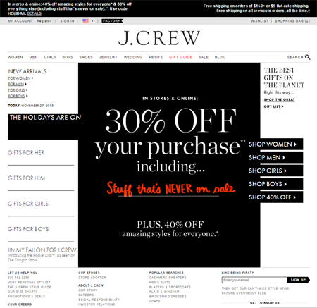
On J.Crew’s homepage, for example, the 30% off promo takes over and navigation is shoved up top.
Yes, it’s important to make customers aware of limited time sales or limited availability (the scarcity stuff that persuade people to buy), but it shouldn’t be done at the expense of permanent navigation.
Homepage Carousel
At the onset of 2013, the homepage rotating banner was one of the web design trends that we had hoped would disappear that year.
Alas, it is almost 2016, and rotating banners are still prevalent in ecommerce sites.
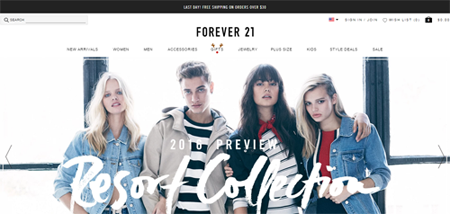
And nobody really likes commercials (except the cute, funny Superbowl ones). So those banners are bound to get ignored.
In the off-chance that a customer interacts with them, rotating banners typically end up being an annoyance. They take away the user’s sense of control over the page by moving on to the next banner even before the user is done consuming the previous one.
So free up that giant rotating banner space and use it to show …
- a clear headline
- top-level categories
- trust elements
- social proof
Gimmicky Zooming
We understand that a lot of the technological gimmicks are functions of the shopping cart you may be using. But if your cart has restrictions that jeopardize usability, then it’s time to consider switching carts.
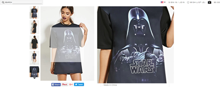
Take a look at how Forever21.com zooms in on a product, for instance.
Whatever part the user is rolling over gets highlighted on the left, and you get the zoom box on the right where you see a close-up of that part.
We see 4 problems with this:
- It covers the call-to-action area where you typically have the price, star rating, and ‘add-to-cart’ button.
- A customer will probably still want to see the whole dress – just bigger.
- Sometimes, the zoom picture is not much bigger. If the customer wants to see the drape of the dress and the thickness of the fabric, they won’t see that on a 2x image.
- Covering parts of the page with a zoom box is deadly on mobile.
For customers to appreciate the product, have a 5X image that takes over the entire screen. You need a 3000-5000 pixel-wide photo that visitors can look at on a full screen.
A full screen lightbox lets the customer see much more detail. Plus, people are used to a full page takeover on mobile as this is usually the case when we watch videos.
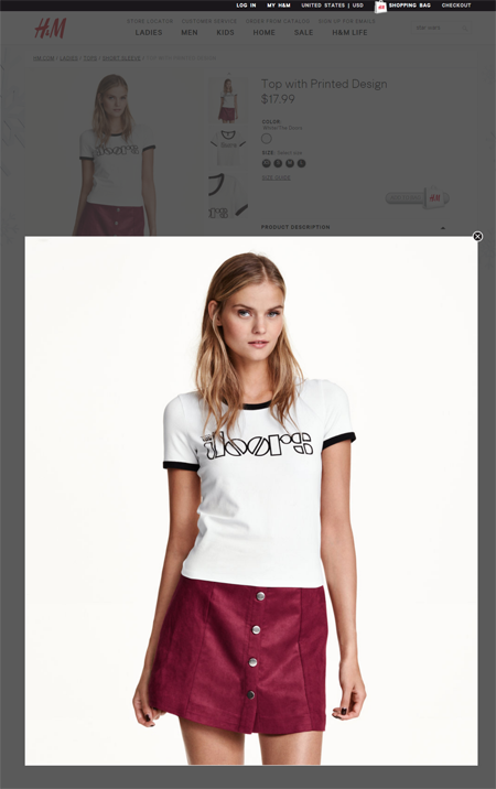
H&M, for instance, has a full screen option customers can just exit out of after viewing the item:
Conclusion
It takes discipline, willpower, and management support to get rid of these mistakes.
Some of these, marketers have control over. Others will be a tad more difficult to accomplish in a lot of companies – management support is something you’ll have to win over time, via split tests, data, and results.
Those who are up to the task, though, have a significant leg up over the competition.
