If you asked 10 companies why they have sliders despite studies from research firms saying they are horrible for usability, and conversion optimization firms like this site advising against their use, you’re likely to get a few common answers:
- Multiple departments want to feature something on the home page, and sliders allow web sites to feature multiple items
- Sliders spice up pages that are in need of a little more pizzazz
- Tons of other web sites use it
The problem is, not only are sliders bad for user experience (UX), they also take away real estate from elements used to accomplish what a home page is supposed to accomplish.
1. A headline that says what you do exactly
One of the core tasks of the home page is to introduce who the company is and what the company does. A good way to do that is to feature a headline and some static content about the company.
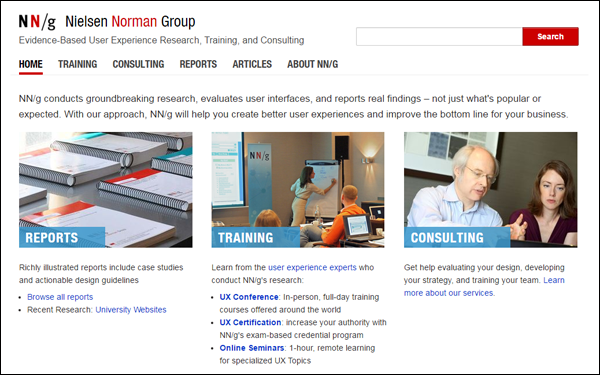
There is no question, for instance, about what the Nielsen Norman Group does because they clearly communicate that in static content on their home page:
Unfortunately, sliders typically take up the room where the company headline should be – and sliders are likely to talk about seasonal offers.
Unless you can do programmatic targeting, you don’t know what the users came for yet. Let them navigate a bit before presenting them offers. That will also save you the space you need to present a clear headline about the company.
2. Clear navigation elements
Instead of having sliders take up 30-40% of the above the fold real estate on your home page, you can use the space to present navigation elements.
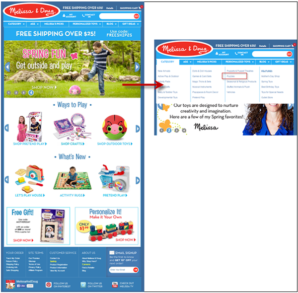
Look at the home page of Melissa & Doug, for example:
If the customer were looking for puzzles, they wouldn’t really know how to get to those, or if this store sells puzzles at all, just by looking at the home page. They’ll have to go up to the navigation bar and wade through all the text.
Don’t rely on your navigation bar too much. Visitors resorting to your nav bar, or using on-site search for generic products, means your page body is a failure.
Use above the fold space to help users find what they need. If you’re an e-commerce site, visually represent the different categories to show the range of the products you carry.
3. Social proof, trust elements, and your phone number
Putting large graphics at the top of the page also means taking away attention from elements that build your credibility.
More sites feature client logos at or near the bottom of the screen, where they are not likely to make any impact. The same goes for trust elements like certifications, media mentions, and testimonials.
What a lot of those companies miss is IF VISITORS DON’T TRUST YOU, they WILL NOT TRANSACT WITH YOU. By de-emphasizing the transaction guarantees, client logos, and other trust elements in favor of putting rotating offers or graphics, you are making it harder for users to trust your site, and making it less likely for visitors to trust you enough to buy from you.
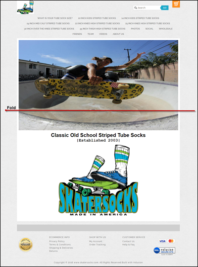
Take Skater Socks’s home page, for instance:
It assumes that …
- People who get here are familiar with them – the company name and headline are pushed down by the slider
- People will automatically trust them – their security symbols are at the bottom of the page, and the visitor will only find the company’s phone number if they click on ‘Contact Us’
Your phone number needs to be immediately visible, ideally at the top of the page – that tells the visitor that you’re a legitimate site, and that they can reach you if they need to.
4. Offer for top-mid funnel visitors
Not everyone who lands on your site is ready to buy or take the ultimate conversion action. Generally, only about 5% of your visitors are at the bottom of the sales funnel.
And you don’t want those top and middle-of-the-funnel visitors to leave and never come back. But often, everything on the home page is designed to shoo them away, especially if you have a large banner that already presents featured products you recommend they buy.
Offer something of value to visitors who aren’t ready to act today; especially if you’re offering high-ticket items that require consideration. Get them a White Paper. Get them educational PDFs on the topic. Get them SOMETHING, and make it VISIBLE.
The worst thing you can do for visitors in the research phase is only show offers for purchases. More often than not, that’s what sliders end up doing.
Putting It All Together
Instead of using up a ton of your above the fold real estate on sliders, you can use that space for things that actually help you convert.
If, on the home page, you have a clear headline, navigation elements that help visitors drill down, trust elements that alleviate user fears, and offers for those who are not ready to buy yet, you’re much more likely to perform better.
