The total number of people who get to your e-commerce checkout experience versus those who actually complete the purchase is a very important metric. Presumably, you’re no longer convincing the visitors that you have something they want. You’re only convincing them to proceed with the purchase.
Now, it’s important to note that a significant number of people who go to the cart are NOT ready to buy:
- Some of them head to the cart to check your price points with things like shipping included, to compare total costs with the price points of other sites.
- Some visitors just want the item saved in the cart, with a fraction of those visitors waiting to get enough items in for free shipping.
- Some want to know estimated shipping time and are checking to see if they should commit to the purchase.
You need to optimize your e-commerce checkout experience for both types of visitors: those who are willing to pull the trigger right away and the ones who can be convinced to check out at a later date.
To do that, you need to build trust and make the user feel at ease, make the checkout process as efficient and frictionless as possible, and learn how to employ remarketing tactics when needed.
Let’s dive in.
1. Allow guest checkout
A sure-fire way to lose sales is to make registration mandatory.
Just because someone intends to buy from you doesn’t mean they’ll necessarily be willing to register on your site.
- They might be one-time buyers with no intention of coming back.
- They might dislike setting up usernames and passwords.
- They might assume that registering means receiving e-mails from you, and they might not want that.
You can’t make users jump through additional hoops to purchase from you and expect high conversion rates. Forcing users to register means you’re adding unnecessary steps and, ultimately, increasing the chances that something will go wrong before the user can complete the purchase.
You can reduce friction by allowing guest checkout.
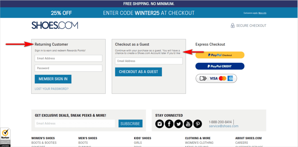
A good example of this is Shoes.com. The site allows users to checkout without registering, while communicating that if the user wants to create an account at a later time, they can do that too. The site also establishes trust and credibility by labeling the log in section as “Returning Customer”, which tells potential customers that other people buy over and over from this site:
Allowing guest checkout doesn’t mean you’ll give up on getting people to register for an account. It just means that you won’t be holding the transaction hostage.
You can still ask visitors to create an account by highlighting the benefits of having one. Ensure that you point out “What’s In It For Me? (WIIFM)” from the customer’s perspective. Get users to sign up by talking about faster checkout and ease of order tracking. Those are the types of things you need to focus on, rather than access to your newsletter and related promo materials, which users might not care so much about.
2. Limit distractions
One of the most important things you can do to optimize checkout is to get out of your user’s way. That means you’re not presenting new promos, and you have only the interaction points that the visitor absolutely needs.
Test having a checkout flow with a limited header and no footer, or at least, presenting a layout with very few menu options. Minimizing distractions can decrease cart abandonment and boost conversions – this is an important flow to test and tweak, so you don’t have a leaky bucket.
That said, the checkout look and feel should generally be the same as the main website. You can reduce the number of elements present without changing the overall design. If you stray too far away from the core website’s look, you risk making the visitor feel like they’ve been taken elsewhere. That can erode visitor trust.
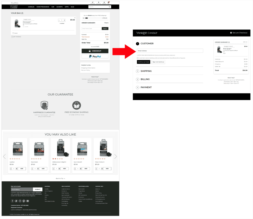
YankeeCandle.com, for example, minimizes potential distractions. The site removes the header and footer items in checkout, while maintaining the website’s look and feel:
Visual clutter and distractions are never good anywhere on a website. However, they’re especially detrimental when the user is close to the purchase. So, take extra care about what’s displayed on the checkout screens.
3. Set user expectations
Getting a checkout interface to work requires getting users to understand a few things:
- how many steps there are
- what each step is
- what clicking a button will do
You have to be very deliberate about setting user expectations.
Show a progress indicator
Showing visitors the entire set of steps, how far along they are, and how many screens are left before the purchase is complete can be as simple as having a bar at the top with numbered steps. As long as the number of steps is reasonable, letting users know what the “plan” is to get to the purchase can help make them stick around to the end.
Make labels explicit
If your button labels are clear and straightforward rather than cute and vague, you’ll avoid causing uncertainty and allow users to click through with confidence.
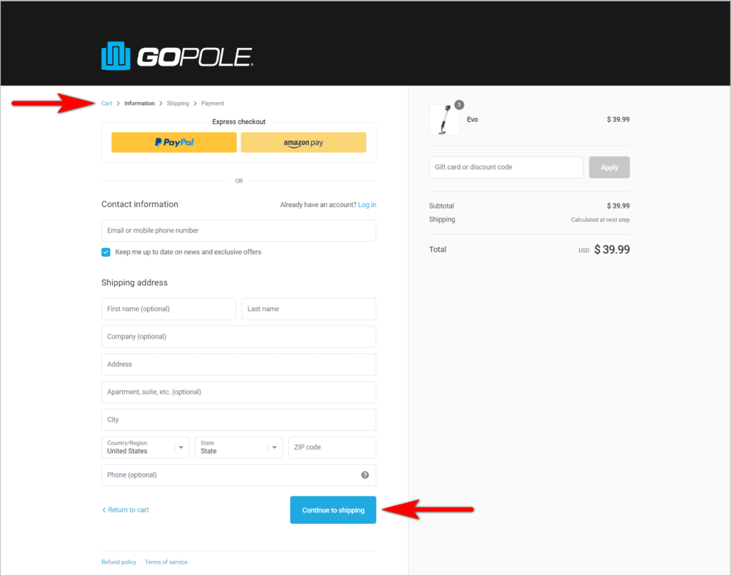
For instance, GoPole.com tries to orient customers by indicating the checkout steps at the top. This would be better, though, if the steps had more visual emphasis and if the text were more descriptive. Right now, the user is bound to wonder how “Information” is different from “Shipping”.
The site is on the right track, however, with regard to making button labels explicit (i.e. saying “Continue to shipping”, as opposed to just “Continue”):
In general, people like being oriented about the situations they’re in. They want to know where they are in the process and what they can expect next. Ensure that you communicate these things to users during checkout. That way, they can anticipate how long the process will take to complete and if they have time for it at the moment.
4. Continue being persuasive during checkout
Some sites treat getting the visitors to the cart as a license to just use transactional language. Don’t make that mistake – you can be clear while still being persuasive.
Start by making sure that the checkout experience helps alleviate users’ anxieties about online transactions. For instance, calling it “Secure Checkout”, as opposed to just “Checkout”, can go a long way in making people feel good about putting their information on your site. From there, you can ensure that your pages are as convincing as possible:
Add trust symbols
Having https in the URL bar will signal that the site is secure. However, less tech-savvy users will not know to look for this. So, you need to use trust seals that most people will recognize, like Norton and Better Business Bureau (BBB).
Use helpful error or missed field messages
If the user misses filling in a field during checkout, ensure that error messages sound friendly. Making the missed field red or adding an asterisk with some transactional message can make you come across as condescending.
If you want to help a user get back on track, you can be clear and helpful rather than dry and robotic.
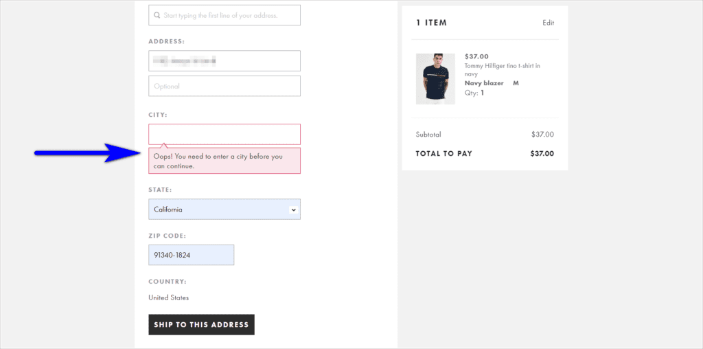
For example, ASOS.com takes a friendlier approach to missed field messages. “Oops! You need to enter a city before you can continue” sounds more personable than “City is required/ mandatory” that’s typically seen on e-commerce sites:
Remind the user what’s in the cart
Some sites just indicate the number of items in the cart, since it’s the user who selected the items on there. However, it’s good practice to indicate what visitors have added. That way, they are constantly reminded of what they’re about to purchase and are motivated to move forward.
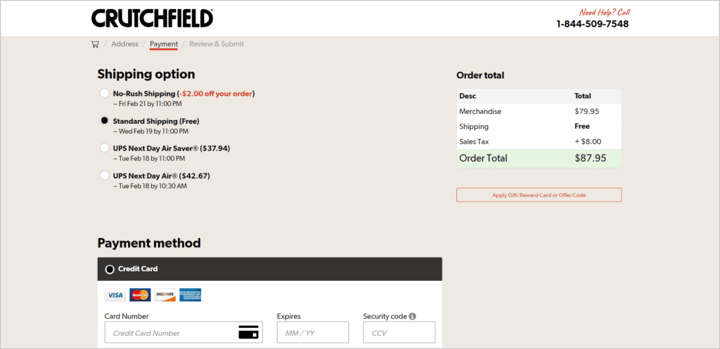
Crutchfield.com’s checkout flow, for instance, fails to leverage the user’s excitement of buying something. It shows the price, but the name and the image of the product are not displayed:
Take the time to review the language and persuasion elements used during checkout. You need to nudge users to keep moving forward, now more than ever.
5. Show additional charges as early as possible
Online shoppers have been trained to expect additional costs during the checkout. Taxes and delivery fees based on the shipping address are things visitors expect to deal with. However, you have to be upfront about the fact that there are additional costs. It’s best to show those early in the process. That way, they’re baked into the users’ expectations and they can decide at the onset if they’re willing to commit to the checkout process.
If your delivery fees are more than the standard (typically under $10) or if you have charges outside of taxes and shipping, drive extra visual attention to those. Otherwise, you’ll risk tarnishing your brand by showing it late and annoying visitors.
Failure to Show Additional Costs Early Example
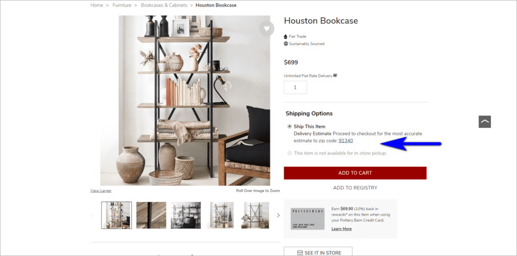
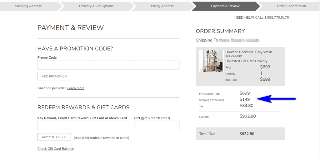
PotteryBarn.com offers “Unlimited Flat Rate Delivery” for some of their products, with the fee varying depending on the customer’s zip code. The fee, however, is not displayed on the product detail page (PDP), despite it asking for the customer’s zip code:
The customer only finds out the actual amount when they get to the “Payment & Review” page, which is the 4th of five steps in the checkout process:
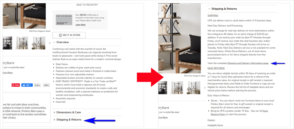
Pottery Barn users can also identify what the flat rate shipping fee for their zip code is by going to the “Shipping and Delivery Information” page. However, this is bound to be missed, as the link on the PDP is hidden under a collapsed option in an accordion:
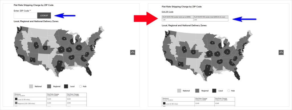
If the user does find the link, they’re asked to input their zip code on the “Shipping and Delivery Information” page. It would be better if Pottery Barn puts this functionality on the PDP. That way, users don’t have to go deep into the checkout flow or hunt for the “Shipping and Delivery Information” page just to know the shipping fee for their area:
Surprising visitors with additional charges is one of the worst things you can do when you’re trying to get people to convert. At best, unexpected cost increases can frustrate users. At worst, it’s enough to get them to leave your site, transact with some other company, and never trust your site again.
6. Capture the e-mail address early
Not all visitors who get to checkout are willing to purchase from you right away. You need a way to nudge them to come back and complete the transaction.
This is why it’s so important to capture e-mails early. If your visitor is not willing to transact yet, it gives you a way to contact them and ask them to return to the cart after some time has passed. This will be a lever you can tweak to get a fraction of people who have left the cart to convert down the line.
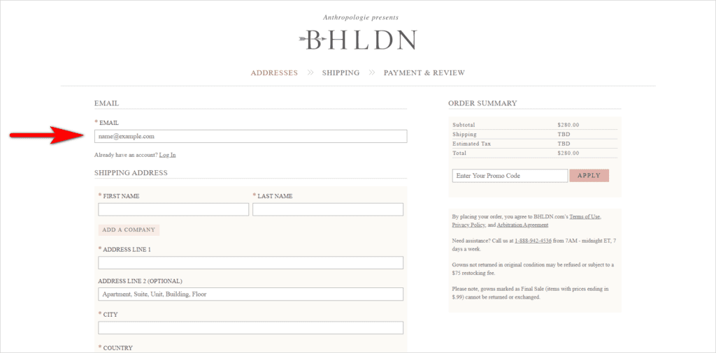
BHLDN.com, for instance, has an e-mail address as the first field the customer has to fill in when they start to checkout:
Your cart and checkout will be used by all kinds of visitors, from those who are looking to transact then and there, to the ones who want to compare total costs across a range of sites. Your site needs to be ready for both those who are willing to pull the trigger right away, and those who need more time before they convert.
7. Reduce user load as much as possible
There are concepts in web usability called visual load, motor load, and cognitive load. These essentially translate to the amount of work required to use an interface. The higher the load, the less likely it is that a user will work with your interface.
Now, you can’t make a checkout experience function without adding a little strain to the visitors’ load. They have to make some selections based on preferences and payment options available to them, and they have to remember some things to transact with you.
What you want to avoid is unnecessary visitor load. If you can make your user interface (UI) function without making the visitor work too hard, figure out how to get that done, even if it means making tweaks on the technology side.
Ask only for information that’s absolutely necessary
Make checkout forms simple by limiting fields to those that are absolutely needed for the transaction.
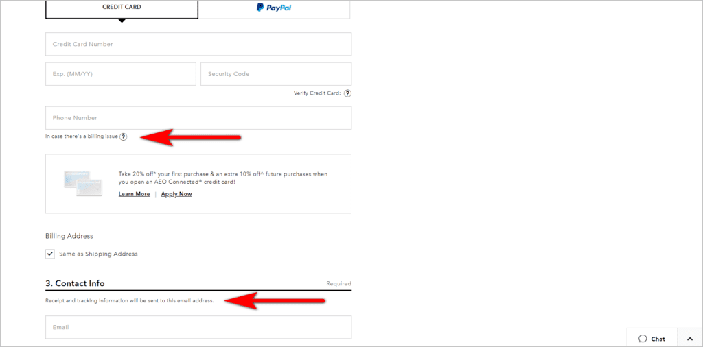
If the information is necessary, tell the users why you’re asking for it. This way, you avoid annoying the customer about the extra work you seem to be making them do. Plus, they’re bound to give you their real email address if they know it’s how you’ll send them the order receipt and tracking information, for example.
AE.com’s checkout form, for instance, lets users know why certain pieces of information are asked of them:
Use data to determine how you list options
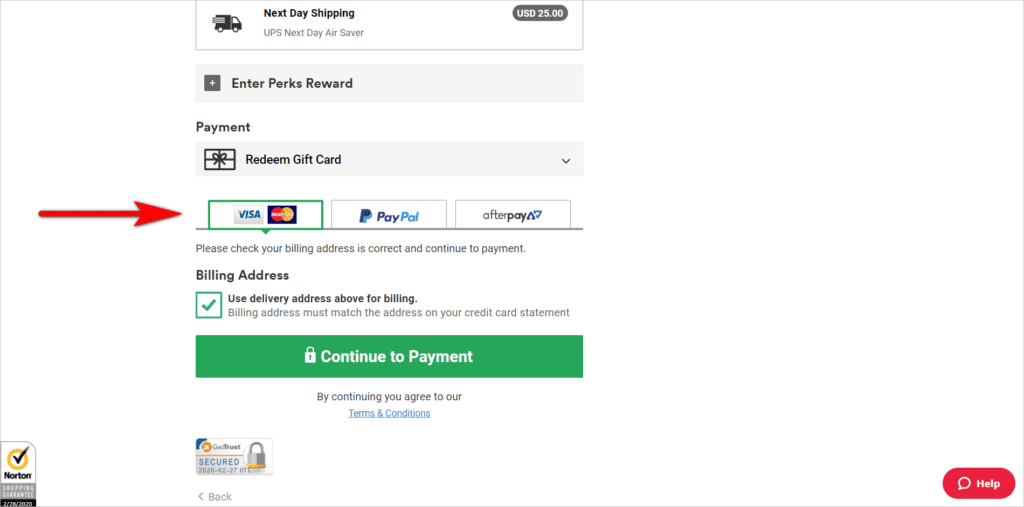
Identify which options are most commonly chosen by customers. Give those visual emphasis, so users see them right away.
For instance, list payment options in order of importance, with the most used ones listed first. In CottonOn.com’s case, it would seem that credit card is the most used by customers, given that it’s listed first and is the default payment option:
Pre-populate fields whenever you can
This requires some work on the technology side. But if you can handle it, you’ll make the visitor’s life much easier, increasing the likelihood that they’ll transact with you.
When asking for the guest’s address for instance, Hilton.com asks for the zip code first. Then, the form automatically populates the city and state instead of making the user type those in:
Adding some user strain is inevitable in a checkout process. They key is minimizing the load that the user has to bear by removing as many barriers as you can.
| Avoid making your website users work. Minimize visual, motor, and cognitive load.Read “Practical Tips to Reduce Visitor Load and Increase Conversions” |
8. Use form validation
Some sites wait for something to go wrong, like a user completing a full step within the checkout process, before notifying them that something is missing or invalid.
You can do better than this by telling the user when they leave an input field that something is wrong. That way, you can help them as they take steps to complete the checkout. For instance, the e-mail address field can notify the user if the e-mail is not in the right format. And the zip code field can say something like “Oops! Could we have your zip code please?” if the user misses the zip code field.
CottonOn.com, for example, lets the user know if an input field needs to be fixed as soon as they try to move on to the next field:
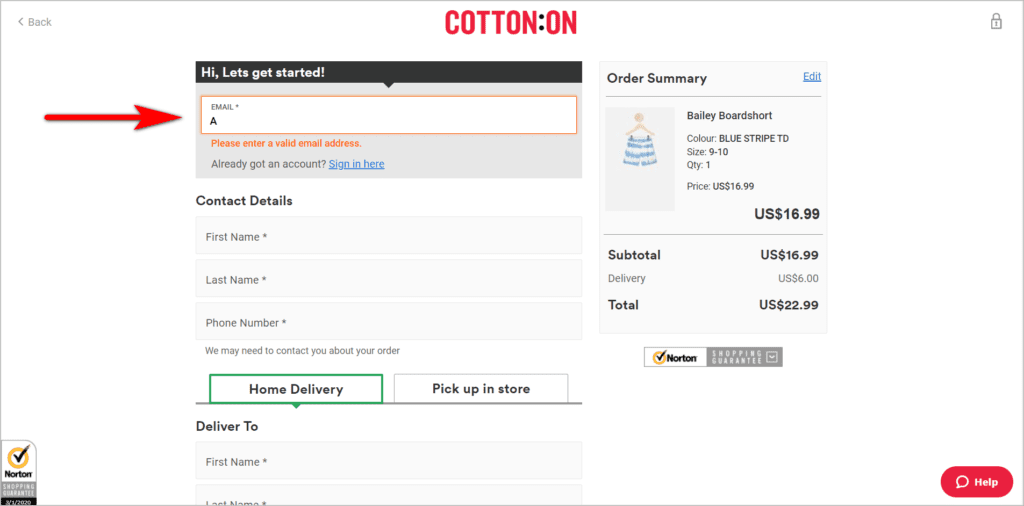
When users receive a set of errors as they try to move forward, they can get frustrated with the checkout process. This is especially true if the areas that need to be fixed are not visually emphasized. You can address this by highlighting the areas the user needs to pay attention to as the error gets made.
9. Present an exit intent popup
Just because people abandon their carts a lot doesn’t mean you shouldn’t take steps to try and get a fraction of those visitors to convert.
If they’re already leaving, and you don’t know if you can get them back later, you can present a popup as a last ditch effort to try and get them to continue with the checkout.
iRobot.com, for instance, nudges potential customers to proceed to checkout with an exit popup:
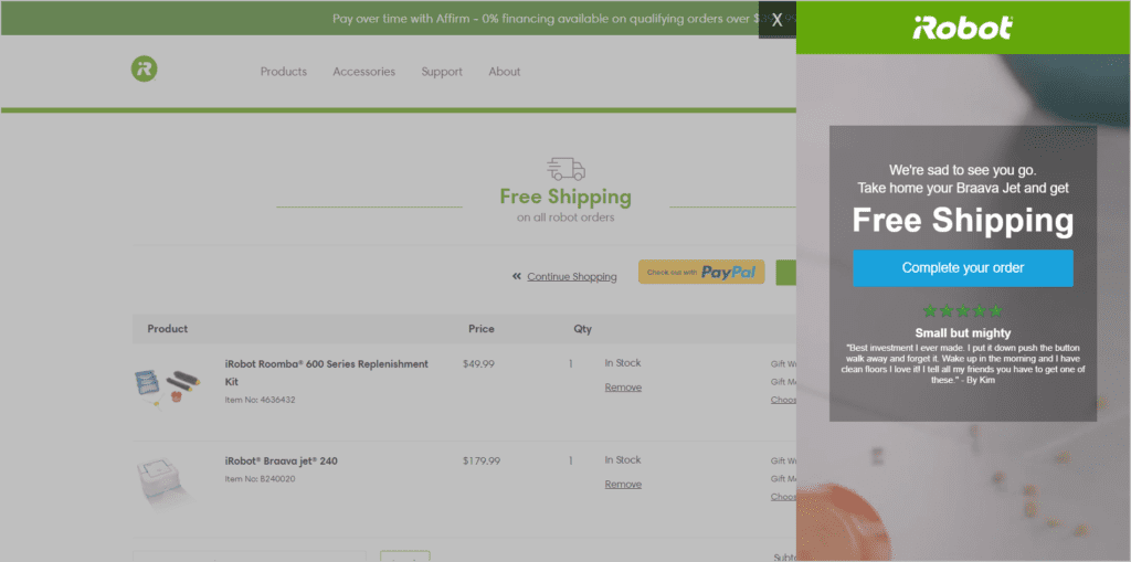
A Hail Mary pass will not always work. However, it’ll get a percentage of your visitors to continue the checkout process.
10. Save the cart state
Getting a healthy set of visitors to go back to your cart after they have left is usually the result of a few things going right for you:
- Your price points or shipping delivery times are better than those of your competitors. And the visitors who are looking to compare end up choosing you as the site to transact with.
- Your deals and offers are well crafted.
- Your email and lead nurturing game is great. And you’ve collected the e-mails at the start rather than the end of the checkout process.
Since getting the visitor back is the result of hard work, good business models, deep specialization, or a combination of all those factors, you don’t want the returning visitors to end up abandoning your cart again.
One of the best ways you can ensure you don’t waste the conversion opportunity is to return the visitors to the “saved” state of their carts. If you get your visitor to come back but they have to start over, you’re more likely to lose the visitor without getting a conversion.
Reduce friction for people by getting them everything that was in their cart when they last saw it.
11. Spend money to get some visitors back
This will be applicable to some organizations more than others, but for a fraction of your visitors, it may be a good idea to use some of your marketing dollars to get them back on the cart.
There are a few prerequisites for this:
- You understand enough about remarketing technology to segment out a set of users who have been to the cart and are prime candidates to target.
- You know how to save the cart state. So, when you bring back visitors via remarketing, the user will not have to start over.
- You have the internal clout to fight for remarketing ad spend.
If you meet all three conditions, you can try to spend some money to make (hopefully) more money back by using ads to get people back in the cart.
Employ E-commerce Checkout Best Practices to Boost Conversions
Your checkout pages are full of people who have already signaled that you have what they want.
You’re no longer fighting for attention. You’re no longer figuring out how to give them the information scent to the product that they need. And you’re no longer worrying about figuring out user intent.
It’s just time to close the deal.
That can be surprisingly hard for sites that don’t follow best practices. You need to ensure that you get this part right. If you …
- allow users to checkout without creating an account,
- limit distractions,
- set user expectations,
- write persuasive content even on the checkout pages,
- display additional charges early on,
- capture the user’s email address early,
- reduce user load,
- use form validation,
- use exit intent popups when necessary,
- learn how to save the user’s cart state, and
- utilize remarketing
… you’ll stand a better chance of converting users who get to the cart.


