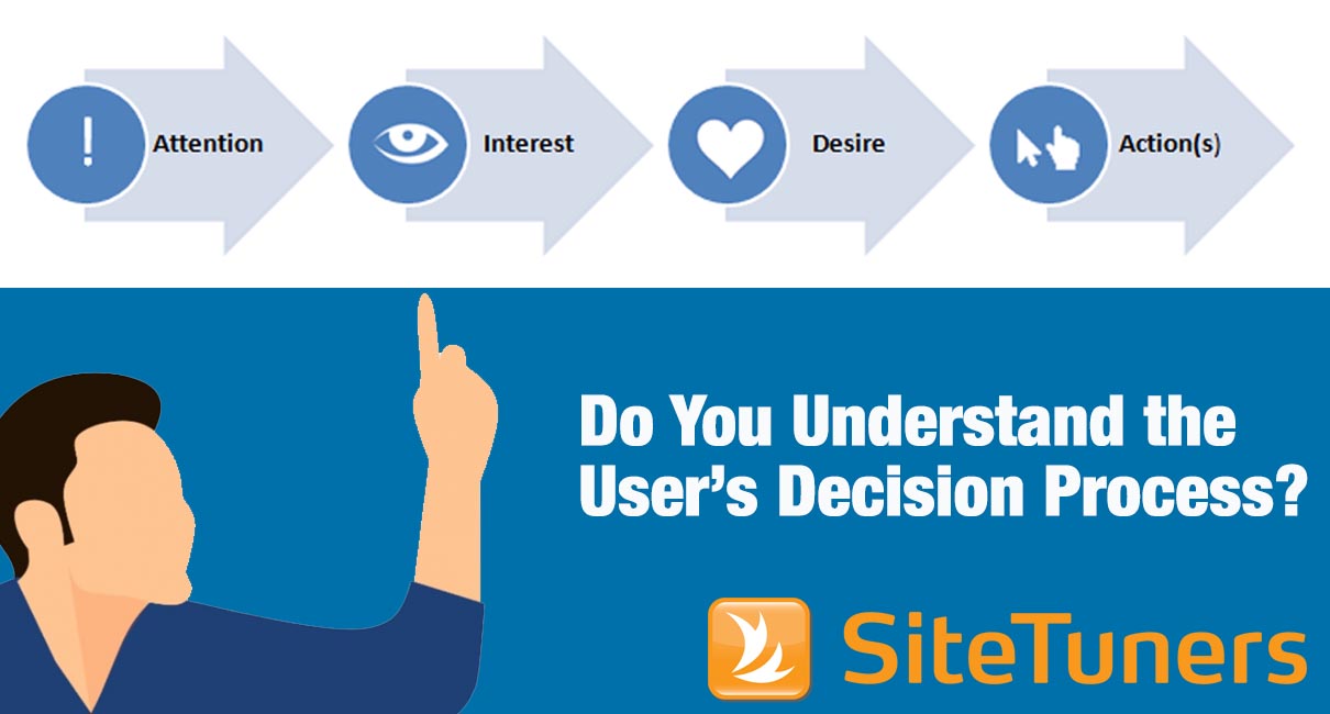
 In the fourth of our 12 days of LPO tips, SiteTuners takes you through the AIDA decision process.
The logic goes like this: browsers have an unmet need. Sometimes they know it, other times they don’t; but your job as a digital marketer is to find the right kind of presence at the right stage in the process with the right message. To get there, you need to worry not just about your users, not just about the types of conversions you have, but the nuances of the user’s decision process.
This is where AIDA comes in.

The AIDA model
Attention
With the explosion of online information comes attention scarcity. It gets tough to break through and get people to interact with your web presence, so it pays to note the rules of web awareness. They are dead simple:
-
- If the visitor can’t find something easily, it does not exist.
-
- If you emphasize too many items, all of them lose importance.
-
- Any delay increases frustration.
Page speed matters. Prioritization matters – make sure what you need to emphasize, what the user is likely to want, follows the F pattern for reading. There are exceptions but in general, important items should be arranged from left to right, from top to bottom.
Interest
Interest is a practice of knowing what the user wants.
Like with attention, the rules are extremely easy to follow:
-
- Understand who the visitor is.
-
- Understand what the visitor is trying to accomplish.
This is where personas or tasks come in handy. If you have qualitative software that can ask users what they need (like iPerceptions), results will help you understand what the user tasks are and arrange the site according to the actions for those tasks. Clickstream tools like Google Analytics or WebTrends are fairly bad at getting data related to intent, but you might be able to get insights about your audience composition.
Combine both to minimize the number of interested people leaving.
Desire
The rules are pretty universal:
-
- Make the visitor feel appreciated.
-
- Make the visitor feel safe.
-
- Understand that the visitor is in control.
The goal is to show that you have what the visitor wants, and that (s)he can get it without risks. You need to be able to provide information that makes the visitor feel appreciated like research and comparisons, an environment that makes the visitor feel secure, and interaction design that makes it clear where the visitor is at any given point in the process.
Action
Once you convince visitors that you have what they want, the next phase is to convince them that they should get it from you. This is getting tougher all the time. There is growing evidence that online consumers are getting savvier, and that the median online purchase times for many industries are steadily increasing because of comparison shopping.
So when you have something the visitors want, follow best practices.
-
- Get out of the visitor’s way.
-
- Make it easy for the visitor.
-
- Don’t surprise the visitor.
Do not interrupt the users when they are following your conversion process, make them provide what is absolutely required, and don’t change the user experience or surprise them with hidden charges at the end.
Next: “Find the Top 3 Areas to Diagnose and Tune.” SiteTuners covers methods for uncovering problems.
Take your conversions to the next level.Learn how our experts at SiteTuners can help kickstart your conversion rate optimization process or get better results from your CRO efforts. Give us 30 minutes, and we’ll show you a roadmap to your digital growth! |
