In digital marketing, that translates to ‘don’t ask prospects to take your conversion action before they’re ready.’
As in personal relationships, online, you have to let visitors get to know you first. You have to make them see that you have what they’re looking for and that you’re trustworthy before you ask them to take the big leap with you.
A lot of websites, however, seem to operate under the assumption that all visitors are ready to buy. Let’s look at how you’re doing your business more harm than good by focusing too much on the bottom of the sales funnel, and what you should be doing instead.
Let’s dive in.
1. Have the entire customer journey above the fold
When considering what should be on your site and how they should be laid out, keep in mind that visitors will be at different stages of customer journey. Not everyone will be ready to take the bottom-of-the-funnel conversion action.
Ensure that you have something for people at every stage and that it can be easily discovered without scrolling.
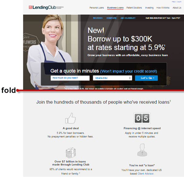
Consider this page from Lending Club Business Loans which leads with ‘Borrow up to $300K at rates starting at 5.9%.’
It leaves the visitor to wonder:
- How much do I really pay?
- Do I have to have personal guarantee?
- Is this available in my state?
The site’s visitors are small business owners, so answers to these questions are critical. They have “Am I eligible?” at the navigation bar, but it’s something answered further down the page. Instead, they ask the visitor to jump right in on the first screen fold.
Sure, people might scroll and eventually find the information relevant to them, but remember that you want this to be as effortless as possible for the visitors. Steps like going to the navigation bar, reading text, or looking at a table of interest rates add significant cognitive load to the tasks. That’s a high ask if users are not yet committed to your site.
Leverage on the fact that people are visual creatures. Instead of devoting most of your prime real estate to information useful only to people at a certain stage, have the whole customer journey sideways in the visible portion of the page. It could look something like this:
Have an information scent for visitors to follow, so you’re not essentially telling them that your desired conversion action is above the fold, while everything else, they have to look for themselves.
2. Answer critical questions before your CTA
Unless you’re a well-known brand, don’t jump to your big ‘ask’ before you let people know who you are, why you’re trustworthy, and what you’re asking them to do exactly.
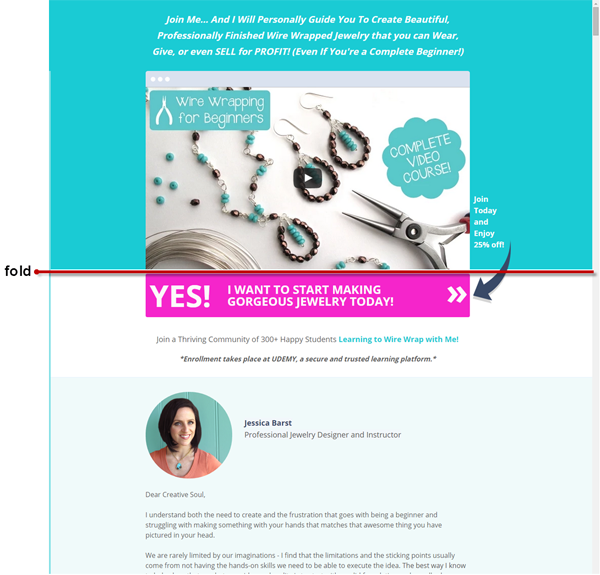
Take this page from Jewelry Tutorial Headquarters, for instance.
It wants visitors to ‘Join Today and Enjoy 25%!‘ even before they tell prospects …
- how much the course costs (25% off of what?),
- what makes the person behind the site an expert on wire wrapping, and
- who have gotten successful results from this.
These questions – which should be answered to establish trust before asking people to take advantage of the course – are addressed below the fold.
So in cases like this, you’d want to literally elevate your story, so people can see it above the fold.
Make user experience effortless. Learn how you can minimize web visitors’ visual, motor, and cognitive load.
Click here to read Practical Tips to Reduce Visitor Load and Increase Conversions.
3. Eliminate competition through content
When you focus too much on the bottom of the funnel, you miss out on the opportunity to establish thought-leadership and display competence.
To capture early stage folks, you need downloadable detailed guides, especially for complex, high-ticket sales. If prospects can easily share your content with others involved in the decision, that gives you a leg up on greedy competitors who didn’t give them that takeaway and wanted them to buy right away instead.
If you educate customers about a complicated multi-trade off, high consequence decision, they’re much more likely to trust and go with you.
This comes with caveat, though:
Don’t “gate” the content behind some information collection form.
Marketers often ask for too much information, and do it too early in the process, that the amount of information required versus the value of the content are not proportional.
By gating your content, you’re minimizing its spread. So, you’d want to give high-quality content and ask for as little information as possible. Consider if the information asked for in a form field is absolutely necessary to complete the transaction; if it’s not, take that field off the form.
Quit Being Greedy
You’ll only be doing your business disservice by railroading visitors into taking your bottom-of-the-funnel conversion action because not everyone is ready.
Create micro-conversions and have valuable information for people earlier in the journey. By being useful to earlier stage visitors, you can earn their loyalty and take the competitors out of the equation down the line.
Work with the best!Kickstart your optimization with a 90-minute Website Review from the pioneers in conversion rate optimization. Our CRO experts at SiteTuners can help diagnose your website from a conversion and usability perspective. |
