A Business-Suit Onesie. Silver Reversible Disco Hoodies. Poo Emoji Dress.
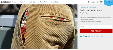
These are some of the quirky clothing items Betabrand sells. Their ticket to success, however, was anchored around corduroy pants with wales running horizontally rather than vertically, aptly called Cordarounds.
For their first 3 years in business, the company grew 423%. In 2012, their e-mail newsletters had a 40 to 45 percent open rate, and they had a daily average of 25 photos sent to them by customers wearing their products.
What catapulted the company to success?
Compelling stories that go viral.
Betabrand Founder and CEO Chris Lindland shares their motto: “99% fiction, 1% fashion.”
For instance, instead of a conventional product detail page, Cordarounds is accompanied by a description of how the pants lower the wearer’s crotch heat indicator (CHI) by up to 22%.
Conversion Scientist Brian Massey observes that Betabrand “created something with their copy far and above the value proposition of the quirky products,” and that “they’re attaching an experience to a product that otherwise might be unremarkable.”
In a webinar with SiteTuners, Brian discusses the reason creating a hook trumps simply laying down the facts and communicating in a straightforward manner.
Bouncers in the brain
Marketers will do well to understand how the brain is wired. As we’ve stressed on this blog, conversions are more about the wetware than the hardware.
Copy, for instance, to be noticed by the audience has first to get past and appeal to two filters in the brain– Broca’s area and Wernicke’s area.
Surprising Broca
Broca’s area is the part of the brain that takes words, translates them into their meaning, and then casts them into the brain’s visual spatial sketchpad. It’s responsible for drawing the pictures of future ‘us’ using a product or taking advantage of the offer.
It stands guard to the motor cortex, where actions get turned into motion, so that not all messages we perceive automatically influence us to do things.
The goal, therefore, is for copy to get past Broca, as people won’t act until they imagine themselves taking that action on the page.
Broca stores a list of words and recognizes (and will dismiss) things that are familiar. To it wake up, we need to present it with something not typical, things that are:
- Unexpected
- Unbelievable
- Just Plain Wrong
If something doesn’t make sense to Broca, that grabs its attention, and at that point, the message has made it through the first bouncer. Broca will then bring the message to Wernicke’s area to ask for more information about what the message means. (We’ll get to Wernicke’s area in a bit.)
Taking risks
In certain industries, especially in the business-to-business (B2B) space, there is an expectation of ‘safety’ as visitors will be recommending the site to higher management.
However, marketing to a conservative industry doesn’t necessarily mean that ‘safe’ will work for you. ‘Safe’ is something Broca is familiar with and will quickly discard, so Brian encourages taking chances and pushing the envelope within the voice of the business.
Winding Wernicke
Wernicke’s area is responsible for attaching nouns to the memories. When we encounter the word ‘car,’ for example, Wernicke brings the images and experiences that we have of cars to mind, so we know what the word means. It is the source of all of the information that we need to associate words with past memories.
So while we need something unusual to get past Broca, for Wernicke to reach into our memories and find persuasive things, the copy needs to have:
- Relevance
- Emotion
- Storytelling
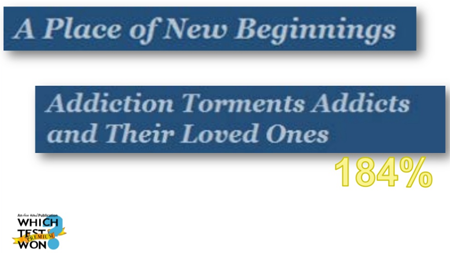
Here’s an example of how copy that appeals to Wernicke yields better results. An addiction treatment center ran a test with the following copy:
Version A: Place of New Beginnings
Version B: Addiction Torments Addicts and Their Loved Ones (resulted in a 184% increase in contacts)
Brian points out that the second version outdid the first one because aside from being an excellent example of a Broca waker, the copy is a story in seven words that those dealing with addiction can relate to – there’s ‘addiction’ the antagonist; the ‘addicts and their loved ones,’ the protagonists; the ‘tormenting,’ the conflict; and resolution is implied if the visitor continues into the page.
Establishing Relevance: 3 Tips for High-Converting Copy
With Broca’s area and Wernicke’s area standing in the way, Brian shares tips to creating copy that converts:
1. Understand who your visitors are
Understanding who’s coming to your site should be a very comprehensive procedure, but we often don’t have the data we’re looking for. So, we look for ways to simplify audience details and start to segment people based on their tendencies.
Bryan and Jeffrey Eisenberg’s book “Waiting for Your Cat to Bark” is a good resource on this. It gives a simple way of targeting copy based on whether the reader’s going to make decisions emotionally or logically and whether they’re going to make decisions quickly or deliberately. The book divides potential customers into four types.
Competitive – They make decisions logically but quickly. They …
- set goals and put processes in place to achieve those goals.
- like to find brands and guides for how they can be better.
With this type, you have to present what’s in it for them early on. Once they see that there’s something in it for them, they become a little bit methodical, a little bit more deliberate.
Methodical –They’re logical and deliberate. With them, you have to put all the proof points, explain your competitive edge and unique selling proposition, and give details on your processes, as they’re unlikely to act until they feel they know all the answers.
Spontaneous – They’re the scanners of the page, so you’d want to put the shiny objects on the page for them. They’ll only stick around if they see something, typically at the top of the page above the fold, which gives them reason do so. Powerful calls-to-action (CTAs) work for them, but you won’t have very long to deal with them.
Humanist – They make decisions emotionally and deliberately. For instance, someone looking to donate to a non-profit organization wants to make sure he/she is donating to people who really do care. He/she wants to know something about the people who will be receiving the aid. When writing for this type, you’d want to talk about who you are, tell stories about how you’ve helped people, and let them know how they can build a relationship with you.
2. Use images effectively
Images are a part of copy as they’re a powerful way to communicate part of your value proposition, so you need to put as much thought into them as you do into text. Brian Massey suggests …
Doing a caption test
Images on the page benefit from captions as captions get read and they enable you to repeat or expand on your call-to-action.
If you can’t write a logical caption for an image, it’s probably business porn – a stock photo, a filler image, something that’s merely there to visually balance out the page.
An image needs to advance your value proposition; if it doesn’t, your page is better off without it.
Showing the offer
This is the most important job of the image. Though it can be challenging if what you’re offering isn’t a physical product, it can be done.
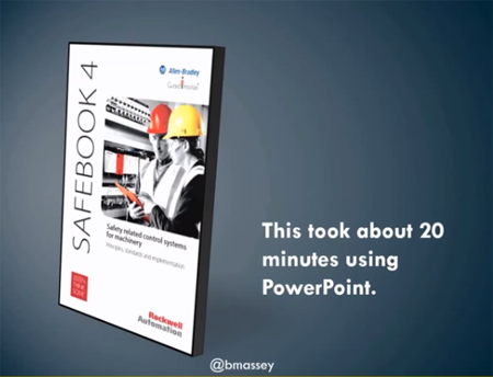
If you have PDF downloads, show an image that communicates the thickness of the download. If you have an 8-page report, for instance, there’s an advantage to a busy executive seeing that it’s thin and quick to read.
The image of the physical book helps visitors imagine on the visual spatial sketchpad holding and reading it even though they’re aware that they’re not going to get a physical book through the offer.
There are available programs like boxshot that you can use to render things like eBooks.
An image for a 150-page PDF on safety-related control systems that communicates the thickness and the value of the white paper.
Borrowing trust
Show images of clients you’ve worked with or have taken advantage of whatever you’re offering. This indicates that you’re trustworthy because these customers have let you put their logo on.
You can also put trust seals, though every audience is different on this topic. So find out which one works best for your business.
For risk reversals, stars and badges have become ubiquitous so much so that Broca’s area is bound to ignore them. However, they’re another way to communicate that you offer a guarantee or a warranty.
Getting geographical
Think about where the visitor is.
By having logos or emblems depicting countries or states, Wernicke associates the memories with home and the things that it means.
There are certain things triggered in our minds when we see the geographical shape of where we’re from. So, use location to bring those memories up, as that’s one of the things Wernicke looks for.
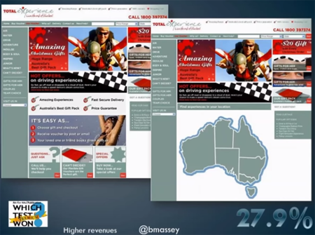
Total Experience Australia is an experience gifting site. As customers would be concerned about the proximity of where they can take advantage of the ‘experience,’ the homepage with the map of Australia and ability to search by location generated 27.9% more revenue than the homepage with the sales and benefits copy.
3. Keep your promises
There are bad ways to wake up Broca.
One way is to promise something, have Broca come to a web page and then not see what they expected. This is going to paint a negative image on the visual spatial sketchpad about your brand. So, when you think of what your headlines should say, the most important thing is you match the intent.
For visual CTAs and visual ads, consider keeping the color the same (color match). Visitors are on a scent, so keeping something standard- the model, the design, the colors used- will help get people going.
4. Segment transactionals and relationals
Assuming that you’re able to wake up Broca through presentation of value proposition that is unexpected, to connect Wernicke to the things that it’s expecting to find, it pays to understand two broad classes of types of visitors- transactionals and relationals.
Transactional visitors’ biggest fear is spending a dollar too much. They will do everything they can to save that dollar; they’ll look for coupons and visit a multitude of sites and physical stores to look for the best price on a product.
They get a Dopamine squirt when they save money and will convert higher if you give them obstacles like promotion codes. They want to be the expert in the situation and see shopping as part of the fun.
Relational visitors’ biggest fear, on the other hand, is choosing the wrong thing. They see time spent hunting for the right thing as part of the expense, so they’re willing to pay a premium for great advice.
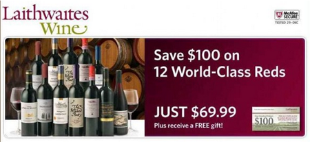
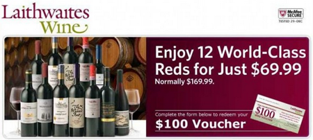
Test what type of copy appeals more to your audience. Here are two versions of copy from whichtestwon.com – one which would appeal more to transactionals, the other to relationals:
Version A: Leads with the savings so would appeal more to transactional buyers. There’s an image of the gift card to reinforce the savings and allows customers to imagine holding the discount.
Version B: Implies that the company will pick 12 world-class reds for the buyer, the company being the expert. All the offers are still there; it just leads very differently.
So, to provide relevance, remember that if your audience is composed more of transactional buyers, Wernicke will look for savings, but if they’re more of relational visitors, Wernicke will be more concerned about not making a bad decision.
Putting It All Together
Getting past Broca and connecting with Wernicke allow you to get more visitors to pay attention. Getting that balance right is difficult, even for veteran online marketers.
It’s tough to balance when you should be novel to make it past Broca, when to be straightforward when delivering details, and when to try and connect with the different audience types. (Honorable mention: It’s also difficult to know which audience type you have the most of.)
That said, while messaging is not easy, the potential payoffs are huge. Keeping Broca and Wernicke in mind while crafting your messages can provide significant advantages over the competition.
