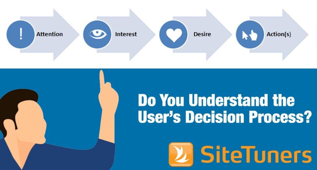
 Even though it is your goal as a marketer to get customers to complete a conversion action, you must allow them to maintain a sense of control over their decision-making process.
People appreciate feeling as though they are in control of their own actions. In fact, most people recoil at the thought of not having their own free will. But your goal as a digital marketer is to get people to complete a conversion action. And it’s easy to be so focused on directing visitors to complete a certain action that you forget the basic human need for autonomy. Your visitors don’t want to be herded into a sales funnel. They want to autonomously decide to take a certain action, driven by their own free will.
If you’re old enough to remember when people used to have their gas pumped for them or have to walk into the bank for a cash withdrawal, you’ve seen this principle in action. The shift to self-serve stations and ATMs was successful because people like to be autonomous – to do things on their own, with minimal help from others. And people are motivated by autonomy because it makes them feel in control.
Here are three easy ways you can create autonomous conversion paths for your visitors.
Give People Freedom
In order for visitors to feel in control, they must be able to move freely about your website. It should be easy for them to tell exactly where they are within the site and how to accomplish what they came to do.
To facilitate this, use a clearly labeled navigation system with drop-down menus to categorize navigational options and avoid overwhelming visitors. Make it easy for visitors to move from one section of your site to another without frustration.
Findability, the capacity of site visitors to access the page or information that they are looking for, is critical to making the website a success. Even with great navigation, some people will still go directly to your search. So make sure your search function delivers semantically appropriate results and prioritizes them well. Like the search box, your sitemap also works as a secondary navigation aide; organize it well, visually showing the site’s information hierarchy and listing your pages by name or topic.
Giving people freedom to move around extends to your checkout process as well. Have you ever been in line at the grocery store when you suddenly remember that you forgot to add something to your cart? I see this all the time – the shopper simply leaves the cart in line and runs back to get the missing item. So why is it that so many e-commerce sites restrict this freedom for their online shoppers? If your purchase path is void of any navigation, it robs the visitor of the freedom to go back and forth at will. Avoid this by optimizing the purchase flow to encourage forward movement, but add subtle links that allow for backward movement when needed.
Don’t Force the Issue
The word “mandatory” has a very negative connotation. In fact, many people have an almost visceral reaction to words like “mandatory” and “required.” Nobody likes being told what to do, and nothing strips Web users of their autonomy faster than forcing them to fill out a bunch of extraneous fields on your form.
I know what you’re thinking: “But there is certain information we must have.” And of course you’re right – you wouldn’t be able to process a purchase with payment or shipping information. It’s likely that every form has at least one field that’s required. But drawing attention to it with bright red warning labels and asterisks is probably not the best approach.
The more freedom customers feel when it comes to filling in forms, the better they tend to respond. Rather than tell them what they must do by labeling required fields, why not mark optional fields instead? This simple change gives users the feeling that they are making a choice (to provide optional information) rather than being forced to provide information that’s required. The more autonomy you can give your users when filling out your forms, the more motivation they will have to complete the process.
Give People Choices, but Not Too Many
People equate having choices with having control. Sheena Iyengar wrote a very interesting book, The Art of Choosing, which explores the complex relationship between choice and freedom. If you’ve heard of the jam experiment, you know of Iyengar’s work. She suggests that the optimal amount of choice lies somewhere between infinity and very little, depending on context and culture. So what does that mean for your site? Avoid giving just one option of anything. Don’t force buyers to register; let them also check out as a guest. Don’t just have an “add to cart” button; let people email a link to the item to someone or put it on a wish list.
But on the other hand, don’t give so many options for your product or service that it literally paralyzes the decision process. If your product or service has lots of options by nature (a mobile phone carrier, for example), use a decision wizard and filtered search options to help guide people to a choice without taking away their autonomy.
The bottom line is, when visitors are given more autonomy in their experience, they feel less stress, more confident, and more motivated to complete their task on your site. And isn’t that what conversion optimization is all about?
This article originally appeared in Tim’s ClickZ column April 29, 2014
Take your conversions to the next level.Learn how our experts at SiteTuners can help kickstart your conversion rate optimization process or get better results from your CRO efforts. Give us 30 minutes, and we’ll show you a roadmap to your digital growth! |


