Online, conversion is the Holy Grail.
Companies spend billions of dollars optimizing their digital experience for some sort of conversion event to occur on-site – may it be a purchase, a click to another page, or increased engagement.
The problem is, things don’t generally go well for marketers:
- Often, people will bounce after 5 seconds on the site.
- Only about 2% of people who come to a site convert
- And we have low ongoing retention rates
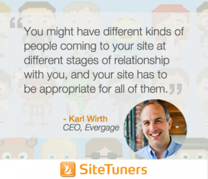 Evergage CEO and founder Karl Wirth says that this could be attributed to failure to address the fact that people are unique.
If your site is a product of a combination of AB testing, analytics, web design, and usability work, it could be the best version of your site. However, visitors have different roles and tasks and are at different stages of their relationship with you, so one generic experience for all will not cut it. Karl advises taking the best experience (the fundamental things) developed through different techniques, and then personalizing based on …
Different relationships
Think about who the visitor is by their interest and their historical relationship with you:
Acquire
Is this their first time to come to the site, and you’re just trying to get a relationship with them? If so, you’ll want to educate them about your brand and your offerings and show relevant products based on keyword or e-mail that brought them to the site.
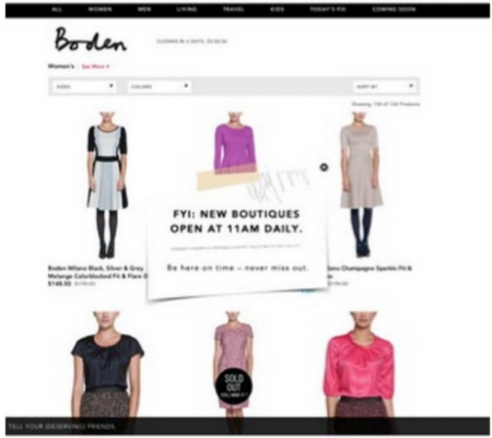
Ruelala is not your regular e-commerce company- it’s a membership site that opens new boutiques and makes specials available at 11 a.m. daily. A new visitor might not be aware of how the site works, so the company did a lot of work identifying newcomers and treating them differently from repeat visitors.
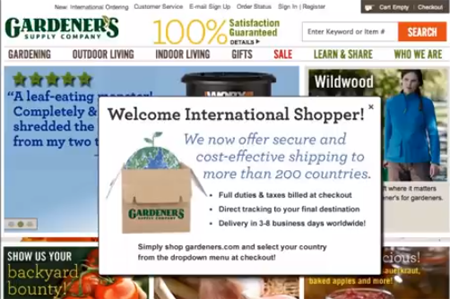
Gardener’s Supply Company’s analytics showed a very high bounce rate for international shoppers. So they ran a campaign where based on geo lookup, they popped up a message to inform an international visitor that they cater to customers overseas. This increased their carting rate by 162%.
Engage
After the visitor’s oriented on what your site’s about, as they’re looking around, you can give a limited time offer based on product affinity to create urgency. You can also personalize by changing the navigation bar to show the category where the visitor has spent the most time, or by showing the products they’ve shown most interest in on the homepage.
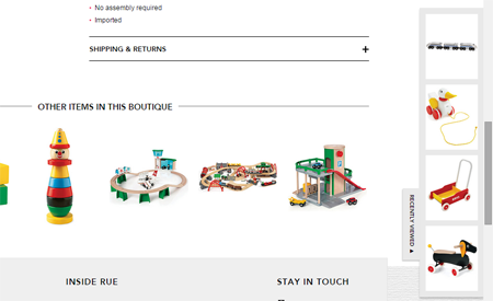
Ruelala added a column to the side of the site that shows the visitor the items they’ve recently looked at and a few suggestions of other things in the same category that is based on what that person has spent the most time in. This resulted to a 32% lift in their average order value.
Purchase
As a visitor’s leaving the site, you can pop up a suggestion or an offer for something that they’ve spent a lot of time looking at but haven’t bought (or something from the category or brand that they spent a lot of time on).
The amount of time people spend looking at stuff is crucial. Sure, clicks are important, and you need to be tracking them. However, they can be misleading because people could be clicking on stuff they’re not really interested in as they’re trying to find something on your site.
Time spent, on the other hand, is a really good metric for interest and engagement. It says a lot about the visitor’s level of interest, for example, if he/she spends a lot of time looking at a product, makes configurations (like change the colors), looks at shipping, and reads the reviews. Those are excellent indicators because people will not spend that much time on something they’re not interested in.
Post-purchase
For a customer who has bought twice from you but has not signed up for your loyalty or rewards program, you can call this out. You can also recommend complementary products in the order confirmation page.
If the customer is a repeat buyer and is signed up to your loyalty program, you can drive repeat purchases by showing products previously purchased based on product or brand affinity. Then, make sure to survey on satisfaction and use results to further personalize.
Different Intent
People coming to your site belonging to the different stages in their relationship with you can even be further segmented based on their intent, so make sure you personalize for that as well.
For example, Gardener’s Supply Company will have different types of visitors who are new to the site. Some might be there to browse around to see what’s out there and try to decide whether they should have peas or tomatoes for their first garden. Some, on the other hand, might have already made the decision of what they’re going to buy.
If you can identify the visitors’ intent, it will be very advantageous to present different experiences to these two different people.
Tailor to Increase Engagement and Conversion
People are more likely to respond to your site if the things they see on it are relevant to them. So, come up with a set of different experiences based on the stages of different relationships- first time visitor, repeat visitor-non buyer, one- time buyer, repeat buyer. And you might also set different experiences based on different roles and tasks (e.g. beginners versus experts) or the mix of roles, tasks, and relationships.
A matrix might help here – think of the different stages in the buying cycle and how you’d want to change your messaging depending on the stage.
We also have the CliffsNotes for Karl’s “4 Steps to Use Social to Increase Conversions,” but you can watch the entire webinar with SiteTuners here:
“How to Leverage Visitor Behavior and Social Preferences to Drive Website Conversion”
