 Many stand alone landing pages are designed specifically to elicit a direct response, usually signing up to a service or purchasing a product. These pages may be designed for traffic from a specific campaign or traffic source. For example, they can be used for a specific affiliate or for a paid search engine campaign, with messaging that specifically matches the visitor profile and intent of originating traffic source.
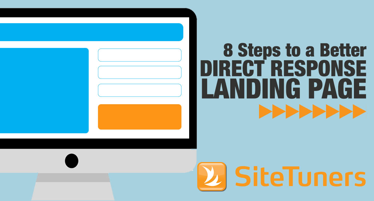
Follow these eight steps to make your direct response landing pages deliver.
Begin With a Compelling Page Headline
If your page doesn’t capture a visitor’s attention and spike their curiosity almost immediately, it will fail. A strong headline gives your visitors a reason to stay and digest more of the page content. The headline should ideally relate to solving a common need or be in a question format. Different variations should be tested to find the one with the highest positive impact on your conversion rate. You should also test increasing your headline font size and choice of color, as these aspects also play an important role in increasing conversions.
Understand the Page Fold and Avoid Scrolling
A visitor’s time on your direct response page may be fleeting. The best way to ensure they see all the key information they need, complete with a compelling call to action, is to present this all on one fairly short page. Ideally, all of the key information should be presented above the page fold and not require the user to have to scroll vertically.
 A long-form sales letter is an occasional exception to this rule. These long scrolling pages work particularly well for more expensive products and services where in-depth details are needed from a visitor in the decision-making process. Their power is primarily based on persuasive copywriting, with a powerful headline leading into sales copy that keeps you compelled to read further. So in a sense, as long as the headline is above the fold for such long-form pages, they are also meeting the general rule described earlier.
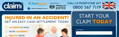
A great way to see what your page looks like above the fold for common browser types is to use Google’s Browser Size tool. In this example, you can see what the UsedWatches.net website looks like when overlaid with the distribution of browser sizes.
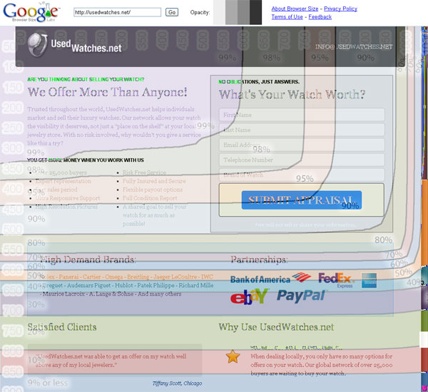 As you can see, the Submit Appraisal button would have been seen by over 90 percent of typical visitors. If it was moved a bit up and to the left-hand side of the page, this view rate can be increased to 95 or even 98 percent.
Remove Unnecessary Text and Images
As with other pages, you should remove clutter and make it simple for the visitor to understand the key benefits of what you are you trying to sell. Remove unnecessary images and streamline text. I always caution against using stock photos just for the sake of having a photo. Eliminate dense blocks of text or convert them into shorter bullet points. If you are unsure of what to remove, try removing different items one at a time and run tests to see what improves your conversion rate.
Support the Headline With Key Benefits
Just below the main headline, you need to outline the key benefits and reasons that a visitor should consider purchasing the product or service. Use bullet points to convey this information. Keep the text to one line per bullet point, since doing so makes the text easier to read and scan. Try to limit these benefits and reasons to the most important ones (keep it to five or less) – having too many bullet points will overwhelm the visitor.
 It’s also a good practice to have these bullet points shown above the page fold so the user can see them immediately without having to scroll. If it’s likely that the visitor may need more information, you should place Learn More or See Details links that display this extra information in lightbox popovers without taking the visitor away from the page.
Make Use of a Supporting Trust Area
The main benefits and call to action should live in the main body of your direct response page, but it’s important to offer a smaller supporting information block also. Users often look to this spot for additional information to help them with their decision.
Typically this supporting block contains additional elements to help influence and convert the visitor. This can include items like testimonials (both customer and outside experts) and client logos (for B2B pages). If you have a considerable user base, you should also state the number of clients. These all help build credibility of the product or service on your direct response page.
 The supporting information block is often displayed as a dedicated right column on the page, but can also be included as a horizontal row immediately below the main call-to-action block.
Make Use of Video and Audio
Remember that visitors don’t read long blocks of text on web pages unless they are highly engaged. In general, people process information much faster by listening or viewing videos. Consider creating and using audio or video segments that a user can click if they want to listen and learn more. Audio works particularly well with user testimonials – it helps build authenticity.
As a higher-risk tactic, you can even test autoplaying shorter, powerful sound bites to help increase conversion rates – just as long as you clearly show an option to turn off the sound or mute it.
Test Your Calls to Action
It almost goes without saying that one of the things that has the most influence on your conversion rates is the call-to-action button or link. It’s important to come up with variations of your call to action, including different text options and button styles, and perform A/B testing on them to find out which one converts the highest.
Remember that using distinctive colors for your call-to-action button usually will have a higher conversion rate. You should also try to avoid nondescript text like Order Now because this doesn’t focus on any benefit to the user signing up or purchasing.
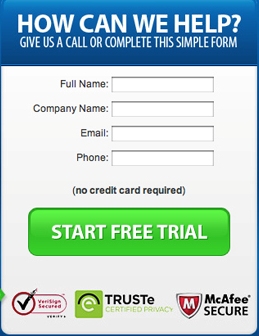
Split Up the Sign-Up Process to Key Fields on the First Page
Splitting up the sign-up form is a great tactic for any web form, but it works especially well on direct response pages.
Ideally, the fewer sign-up fields on your page that have to be completed, the better. The initial page can be as simple as name and email address, and the rest of the sign-up details can be collected on a longer, secondary sign-up page. This way, you receive key marketing information to contact the user again in case they decide to abandon your page midstream.
If you’ve got a direct response campaign, the first place to start is with an evaluation of your upstream traffic referrers. Understand what’s being promised, and then use a combination of the eight steps outlined here to build a landing page that will quickly communicate the key benefits of your offering and move people “directly” through to conversion. After all, there’s a reason it’s called “direct” response.
This article originally appeared in Tim’s ClickZ column May 15, 2012
Work with the best!Kickstart your optimization with a 90-minute Website Review from the pioneers in conversion rate optimization. Our CRO experts at SiteTuners can help diagnose your website from a conversion and usability perspective. |