Like bacon-flavored candy, #using #hashtags on #facebook, and grown women wearing rompers, many fads in web design take off without any logical explanation. But being popular or “in style” does not make a design technique effective. If you’ve incorporated any of these “everyone else is doing it” design crazes into your website, the first step – as they say in AA – is admitting you have a problem.
1. Overcomplicated design. Some web designers seem to think that every site should be a creative masterpiece that is totally unlike anything ever created before. They shun web design standards or conventions in an attempt to avoid conformity, usually at the expense of usability and user experience. But the most successful websites are those that strike a balance between form and function. Their design elements go largely unnoticed because they support the usability of the site rather than detract from it. Make 2013 the year you clean up your web design. As Leonardo da Vinci said, “Simplicity is the ultimate sophistication.”
2. Home page rotating banner. You know what I’m talking about: these giant sliders/rotating banners/carousels are impossible to miss on many online retailer sites, and they’re now cropping up on all types of websites across various industries. Rotating banners are a perfect example of why you shouldn’t follow the crowd when creating your web design: everyone may be using them, but that doesn’t mean they’re effective.
One of the justifications often cited for using a rotating banner is that the company has multiple important messages that need to be conveyed. The irony of this logic is that “banner blindness” often prevents things in the carousel from being seen at all. Way back in 1999, user advocate Donald Norman wrote a commentary about banner blindness positing that when visitors come to a website looking for something in particular, they tend to focus their attention in places where they expect to find a link that is pertinent to their need, such as the top or left navigation. Standard web conventions have trained visitors to overlook large graphics that appear ad-like.
What’s more, to try to convey multiple important messages in a rotating banner, you would need to make a lot of assumptions about the reading speed of your visitors, their Internet bandwidth, etc. If your visitors read more quickly than the carousel moves, they will get bored and leave. If they read slowly and can’t finish one message before the next slide appears, they will be irritated and leave. Either way, your banner has gotten in your visitors’ way. This year, resolve to remove this conversion killer from your home page.
3. Business porn (aka stock photos). In a previous post about the effective use of imagery on websites, I cautioned that putting the wrong image(s) on your web pages is one of the fastest ways to sow distrust and even alarm among your visitors. Humans are highly visual creatures – there is an entire area of the brain reserved only for image processing – and it takes only a fraction of a second for your visitors to spot cheesy (or fake-looking) pictures on your page.
Like porn, royalty-free stock photos are cheap and readily available. But use them sparingly, if at all. A website full of uninspiring cookie-cutter images can be quickly sized up by a new visitor as “fly by night” or shifty. Make 2013 the year you trade in your business porn for high-quality, original images that show a genuine side of your product, service, or company. And let’s make a pact to ban from the Internet any photos of a friendly operator standing by to chat or take your call. It may be the most overused of all the business porn web images today!
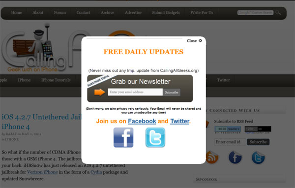
4. Pop-overs and interstitial messaging. Imagine you just landed on this article and were starting to read when my face (or an image of a chat operator!) suddenly appeared on the page asking “Like this article? Subscribe for more: [insert email address].” Irksome, right? Yet I’ve lost count of the number of sites that have interrupted me in this manner.
The worst offenders are disruptions that appear within seconds after the page loads. Visitors don’t even have the chance to evaluate the relevance or value of the page content before they’re interrupted with some sort of offer. Unless you operate a subscription site that posts content behind a paywall, minimize the obtrusiveness of your interstitial messaging by testing the timing of its appearance, as well as whether the pop-over message can be effectively presented in a less obtrusive way.
5. The premature CTA. I’ve been seeing a lot of this lately: websites that are otherwise professionally designed, except that they’re trying to get into our pants too soon. They seem to forget that you’ve got to pass first base before heading for home.
Your calls-to-action should always be contextually relevant to the content on the page as well as where in the conversion funnel the page resides. For an e-commerce site, this means knowing when the user wants to explore her options (e.g., “Shop now”), when to ask her to add an item to her shopping cart, and when to tell her to “Buy Now.” Using a “Buy” call-to-action when the user is in the browsing stage of the funnel would be the online equivalent of a retail clerk asking for your credit card as soon as you entered the store – it’s out of sequence, illogical, and rude. Vow to be more polite in 2013 by understanding your visitors’ buying cycle and using the right call-to-action at the right time.
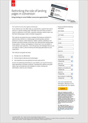
6. The never-ending form. Last but not least, it’s time to break the very bad habit of forcing visitors to reveal loads of personal information before they can get something from your website. It has been proven time and again that shorter forms reduce friction in the conversion process. It’s not rocket science: the fewer questions you ask, the greater your form-fill rate will be.
Sales and marketing teams will argue against shorter forms because the additional information is useful in screening and qualifying potential customers. But in today’s world of big data, multiple solutions exist for appending data or progressive profiling. Long forms scare off potential customers, leaving them to wonder what you planned to do with all that information: sell it? Spam them forever? Robo-call them during dinner?
However, I should mention that the type of form, and what the visitor expects to get in return, has a lot to do with what and how many fields are considered reasonable. A daily deal site shouldn’t ask for anything more than email and Zip code, as that’s all it needs to send subscribers coupons for businesses that are close to them. On the other hand, a company offering free insurance quotes will have to require more information in order to provide visitors with an accurate rate. Many web users will tolerate longer forms if what you’re offering has a high enough value to them. Still, there’s no reason to be nosy on your forms. Just as you wouldn’t meet someone at a party and immediately ask for her address, date of birth, and annual income, you should mind your manners online and ask only what is needed for the current transaction.
So, now that you know some of the biggest web design offenses, why not resolve to make some improvements in 2013? You\’re motivated, ready to shed some bad habits, and eager to adopt some good ones. And I’ll bet you find that cleaning up your website is a heck of a lot easier than losing 20 pounds.
This article originally appeared in Tim’s ClickZ column January 8, 2013
Work with the best!Kickstart your optimization with a 90-minute Website Review from the pioneers in conversion rate optimization. Our CRO experts at SiteTuners can help diagnose your website from a conversion and usability perspective. |


