 The internet is a breeding ground for distrust – data gets stolen and sites get hacked all the time. Naturally, people are wary online.
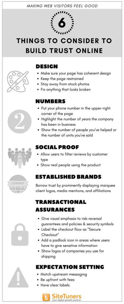
If web visitors are going to take your desired conversion action, they must feel good about your site first. Here are six things web marketers need to consider to create pages that inspire trust:
1. Design
People decide whether a web page looks professional or cheesy in a fraction of a second. That initial impression has a huge impact on whether the visitor sticks around or bounces.
Don’t get excluded from the competition merely because of your site’s appearance.
Make sure your page has a coherent design
Fonts, colors, and graphical elements should create a unified visual look.
- Make the page’s look and feel consistent. For instance, if you have several input boxes on a page, they should all look the same – don’t mix and match straight lines, rounded corners, and rounded sides on the same page
- Be disciplined with font use. It’s okay to use a different font for your logo, but font should be consistent throughout the rest of the page
Keep the page restrained
Be cautious in using strong colors; they can make your page look loud. Use them only to highlight calls-to-action or important information.
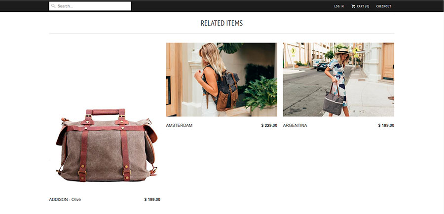
Stay away from stock photos
If using stock photos can’t be helped, avoid the most commonly used ones. Chances are, users have seen them elsewhere and they will hurt your credibility.
Fix anything that looks broken
Things that appear broken can negatively impact the visitor’s perception of your trustworthiness. Small things that look off will make potential customers question if they can trust your site with their credit card information.
2. Numbers
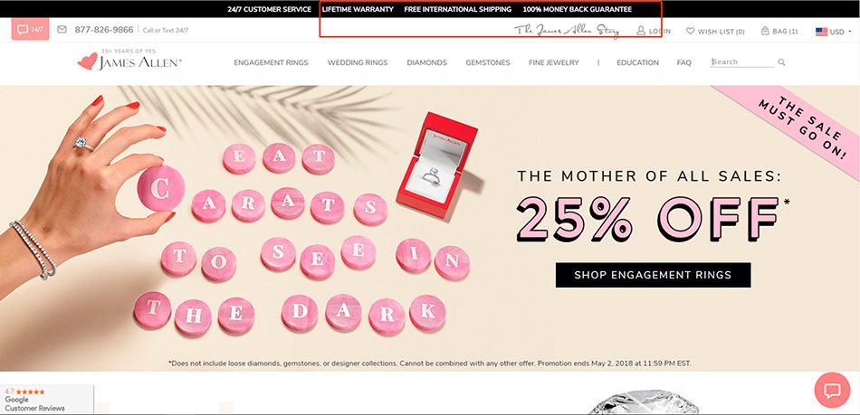
The presence of certain numbers on a web page can build visitor confidence.
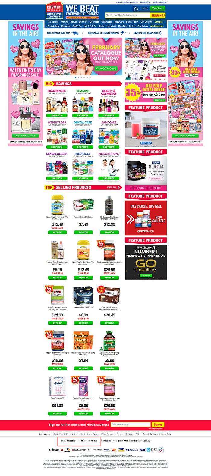
Phone number
This is your biggest trust symbol. Your phone number tells web visitors that you’re a legitimate company and that they can easily contact you if necessary.
Place your phone number where users expect it to be – the standard location for the phone number is on the upper-right corner of the page.
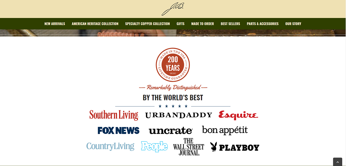
Number of years the company has been in business
If your company has been around for a significant amount of time, communicate that on your web page. The number of years you’ve been in business says that you consistently deliver on your promise.
You’ll do well to represent this information graphically as a seal, so it pops off the page.
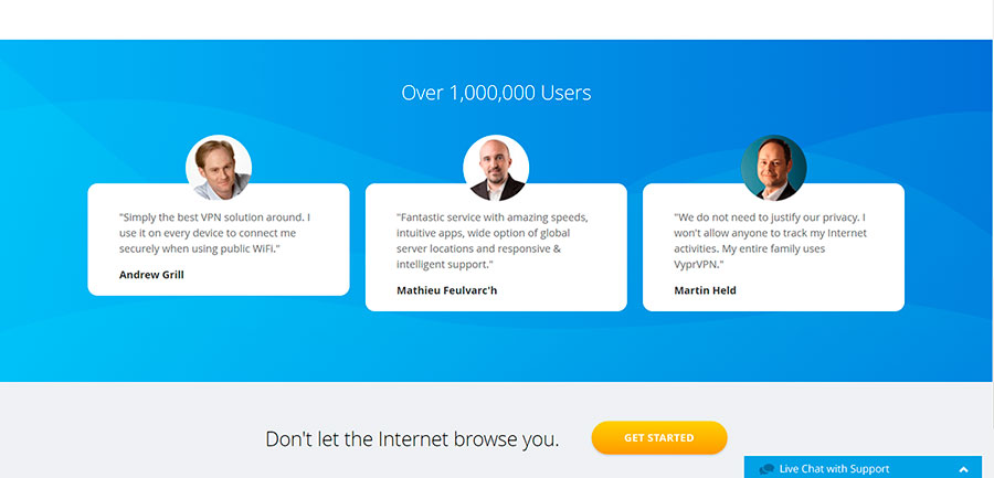
Number of satisfied customers
Aside from communicating how long the company has been around, you can indicate the number of people you’ve helped or the number of units you’ve sold to show credibility.
3. Social Proof
Human beings are social creatures. When in doubt, we look to others similar to us for answers. Here are a couple of ways you can leverage the social proof principle to establish trust:
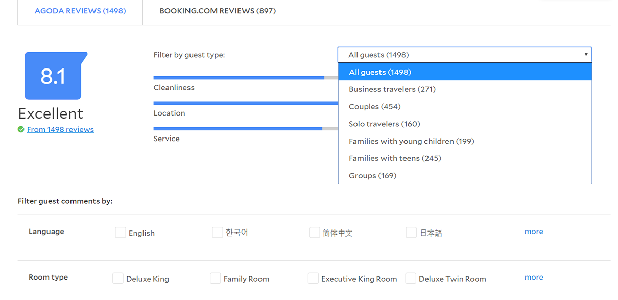
Allow users to filter reviews by customer type
Web visitors use product reviews as a shortcut to decision-making. According to PowerReviews, roughly 19 out of every 20 consumers check customer reviews, and about 17 of every 20 consider reviews a critical resource when making buying decisions.
When implementing product reviews, keep in mind that people have different needs, so different things will be relevant to them. For instance, a one-star rating given to a robotic vacuum because it performs poorly on hardwood will be relevant to those with the same floor type. The review might not matter as much to those with tile flooring.
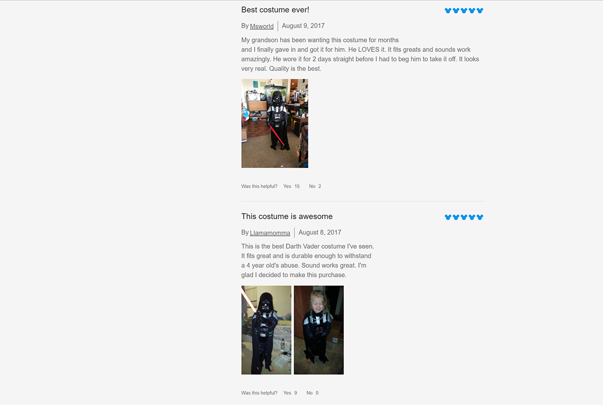
Show real people using the product
Visitors are more likely to feel good about your site if they see real people, instead of models, using your product.
A 2016 ProductReviews survey revealed that …
- 88% of shoppers look for user-submitted photos and videos before buying
- 42% of consumers consider it important that a product review includes visual content submitted by other consumers
4. Established brands
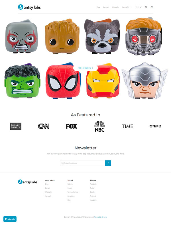
People might not have heard of your company, but they will have heard of popular brands. So, borrow trust from those brands and prominently display marquee client logos, media mentions, and affiliations.
5. Transactional assurances
Communicate your confidence in your products and services by showing your risk-reversal guarantees and policies.
Additionally, make sure you alleviate visitor anxiety by showing that you’re a safe site to transact with. Give visual emphasis to security symbols such as the Norton or Symantec logo and your SSL certificate.
Something as simple as labeling the checkout flow as “Secure Checkout” instead of just “Checkout” can also boost conversion rates on e-commerce sites. The same is true of adding a padlock icon on areas where visitors have to provide sensitive information.
You can also show logos of companies you use for shipping to assure customers that they’ll receive their orders.
6. Expectation-setting
Not matching user intent is the equivalent of not following through with what you say you’ll do in real life.
Don’t break the user’s trust:
Ensure upstream messaging matches the page
Examine what you’re promising on the ads upstream and if you deliver on that promise on the page. Upstream messaging should say exactly what users will get if they click on it.
Be upfront with fees
Don’t wait until towards the end of the checkout flow to reveal that shipping will set the customer back $25.00, for instance. Let visitors know early on of any additional charges they’ll incur with the purchase. This way, they can decide if they’re okay with the fees even before they add items to their cart.
Have clear labels
Make sure that navigation labels say exactly what happens if users click on it. This is especially important in areas like the checkout where users will want to be absolutely sure if clicking on a button takes them to a page where they can review their order, or if it completes the order and charges their credit card.
Build Trust Online to Improve Conversions
Trust elements need to be given visual prominence and need to be present throughout the sales funnel – they do not belong in the footer of the page. Your site’s trust signals might as well not exist if users have to scroll a few screens down to see them.
Keep in mind that no matter how big you make the “Buy Now” button, if people don’t feel good about your site, they’re not going to take your conversion action. So, ensure that the site …
- has a professional look and feel
- has numbers that communicate credibility
- leverages social proof
- borrows authority from established brands
- shows that it’s safe to transact with
- sets users’ expectations
If you take the time to make the visitor trust you, you’ll be in a much better position to get them to convert.
