If visitors can’t find it, then it doesn’t exist.
Web marketers often get too caught up in the aesthetics of web sites that they forget about making it easy for users to find what they need.
Sure, a modern and professional look and feel is essential in earning web visitors’ trust. However, web design should support user tasks and not undermine usability and discoverability.
Here are some common mistakes that get in the way of users efficiently navigating your site:
1. Hidden Navigation on Large Screens
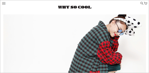
On mobile devices where you have small screen real estate to work with, it’s okay to hide navigation under a menu (typically the hamburger icon). That doesn’t make sense, however, on the desktop where there’s a lot of space to show navigation options.
Example: WhySoCool.com
A study conducted by Nielsen Norman Group and WhatUsersDo showed that, compared to visible or partially hidden navigation, hidden navigation is …
- used less and used later in the task ( if the person does use it) on both mobile and desktop
- more likely to be used on mobile than on desktop – This could be because …
- on smallers screens, the menu icon is more noticeable
- hidden navigation is the norm on mobile
- load times are slower on mobile, and people would rather use the menu than scroll to find what they need (since there’s typically less content above the fold)
The study also revealed that user experience is negatively affected by hidden navigation on both mobile and desktop:
- Content discoverability is lower
- Difficulty ratings are higher
- Time on task is longer
So, expose top-level navigation options on the desktop. Hiding them under a menu doesn’t help your users nor your site’s conversions, despite the popularity of “mobile first.”
2. False Bottom
When it’s not immediately obvious to users that there’s more content beyond a certain point, you have a ‘false bottom’ problem.
Here are some culprits for people believing they’ve reached the end of the content and, therefore, having a hard time locating what they need:
Large images or graphics that fill the entire screen
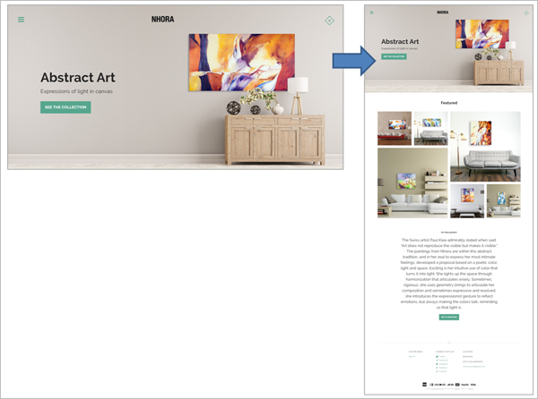
Hero shots are infamous for hogging prime above-the-fold real estate and pushing down other important elements like trust symbols and clear entry points for different customer segments. In addition, when the image takes up the entire screen, the bottom of the image could also be mistaken as the bottom of the page.
Example: NhoraOsorio.com
If you really must have a screenful of image or graphics, at least have an explicit directional cue.
WeAreMinimal.com, for instance, deliberately uses motion, in the form of a bouncing arrow, to get the user’s attention and signal that there’s more below the fold.
Example: WeAreMinimal.com
Horizontal Lines
In general, horizontal lines and rules are interpreted by the brain as stop signs.
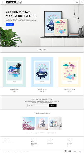
Be wary of placing horizontal lines that span the entire page width between content sections. They can discourage users from exploring further. Users might not realize that the separator signals the end of a section and not the page.
Example: StudioRakelShop.com
Ads that break content flow
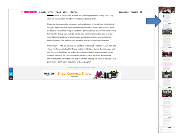
Large ads, those that make whatever is below it hard to see, can also be misinterpreted as the end of the content.
Cosmopolitan.com seems to recognize this problem and tries to alleviate it by labeling the advertisement and directing users to ‘Continue Reading Below.’
Example: Cosmopolitan.com
Overuse of negative space
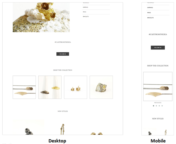
Negative space helps create visual emphasis and hierarchy on the page. Too much negative space between content elements, however, could be taken to mean ‘there’s nothing more to see.’
The problem is worse on small screens where the gap between elements becomes more pronounced, making content further down the page even less discoverable.
Example: ShopGraceGow.com
3. Lack of Affordance Signifiers
One reason users fail to find what they’re supposed to do next is the lack of affordance signifiers. Lack of visual cues to signal which elements can be interacted with results in click uncertainty – users hovering over different items on the page to identify which one is clickable.
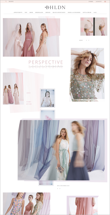
On the home page body of BHLDN.com, for example, clickable items are inconspicuous. The page uses arrows to signal that you can interact with elements, but the clickable elements do not resemble clickable elements like buttons.
Instead, you get a random mishmash of labels that can be clicked, labels that cannot be clicked, and no good way of differentiating between the two.
4. Vague Navigation Labels
Labels are your site’s road signs – if they’re confusing, users will get lost.
Ensure that your labels are clear and precise. They should be able to tell users what happens when they click on a navigation element.
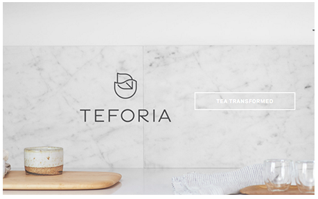
An older version of Teforia.com’s home page, for instance, had ‘Tea Transformed’ as a call-to-action (CTA). That’s a content-free label – it doesn’t really communicate anything about what users can expect if they click on it.
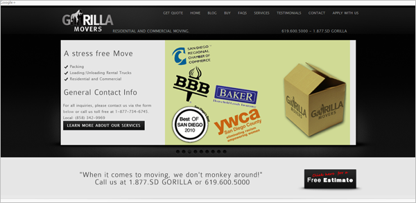
GorillaMovers.com, on the other hand, has unclear top-level navigation options. There’s ‘Buy,’ but it’s not clear what’s possible to buy; and there’s ‘Apply with us’ which can either mean ‘apply with us to get a quote’ or ‘apply with us to get a job.’
Example: GorillaMovers.com
5. Deviation from Web Conventions
The human brain relies on shortcuts a lot. If your web site does not match users’ mental model of how a web site is supposed to work, you’ll make navigation more trouble than it’s worth for a lot of visitors.
Here are a couple examples of design patterns users have been conditioned to expect on web pages:
Logo Placement
When web users land on a page, they typically get oriented about where they are on the web by looking at the top left of the page for the company logo. The logo is also traditionally a clickable element that allows users to easily navigate to the home page.
So, be wary of positioning the logo at the center or the top-right corner of the page. This might work on smaller screens where the distance between the left corner and the right corner is negligible. On bigger screens, however, it can adversely affect users’ efficiency in navigating to the home page.
Body Hyperlink Color
People spend most of their time on other sites, and on other sites, hyperlinks in the page body are usually identified by colors so they don’t blend.
You can use any color, as long as it pops and is not used on other text on the page. That way, users can immediately identify the hyperlinks. That said, your best bet is the color blue, as web users have been conditioned to associate that color with hyperlinks.
Putting It All Together
Getting navigation right can be tricky when you have a multi-device, multi-channel world. That said, just getting the fundamentals down can get you pretty far.
If you refrain from creating false bottoms, follow web conventions, avoid hiding the navigation bar on desktops and laptops, show signifiers that tell visitors which items are clickable, and label your navigation options clearly, you’ll cause fewer visitors to leave without doing anything.
