 The easiest way to get visitors’ attention is to use the element of surprise. The human brain actively scans for changes in the environment, so anything unexpected instantly piques their interest.
There are delightful surprises, but there are also unwanted and annoying ones. And if you’re operating an e-commerce site, you better make sure you’re only giving potential customers the former and none of the latter.
Here are just five of the not-so-delightful surprises on e-commerce sites that are a major turn off for online shoppers.
1. Entry Pop-ups
Eight by Eight CEO Amy Africa considers them the most efficient way to collect e-mail addresses. And SeeWhy Founder Charles Nicholls says that, without an incentive, entry pop-ups can get you a 3% subscription, compared to about 1 to 1.5% subscription rate without the pop-up.
Be wary, however, as entry pop-ups interrupt the visitor on the way to the web site. You asking the visitor to commit to something, such as liking your Facebook page or joining your mailing list to get a discount, before they can even have a sense of what you’re about is reason enough for users to bail.
What’s even more hateful for visitors are pop-ups that just won’t go away- those whose close buttons are impossible to find, and pop-ups that re-appear when you move to another page even after you’ve dismissed them from the previous one.
So, you should definitely test this. If you can get people to give you information or like your page without the bounce rate going up, then you’re in the clear. Exit pop-ups are a different story since customers are about to leave anyway, so you might as well make one last-ditch effort before they go.
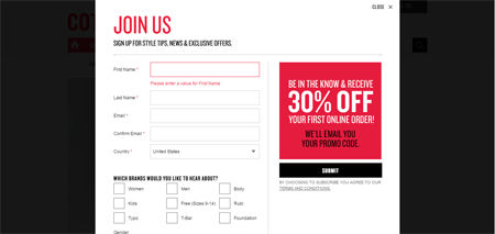
We have to admit, Cotton On’s 30% discount on the first online order is compelling; but it’s presented even before customers can see their product offerings and figure out if the discount will be useful to them in the first place.
2. Rotating Banners
On the off chance that they’re paid attention to, rotating banners end up annoying users. They take away the user’s sense of control over the page because of the possibility that the visitor will not have finished consuming the content before the next banner is shown.
Remember, too, that your homepage’s primary purpose is to get customers closer to what they’re looking for. So instead of a rotating banner, show your product line breadth through a small number of clear and distinct categories using a collage of disparate items.
The real estate you free up, once you get rid of the giant rotating banner, can also be used for other elements that tell your visitors who you are, such as a clear headline and trust elements/ social proof.
3. Irrelevant Search Results
Fairly or unfairly, Google has changed the expectations around search – users just expect it to work. Of course, Google’s business model allows them to focus their billions of dollars worth of investments in improving the search user experience, while this is only one of dozens of things you need to fix, on a limited marketing budget.
Nevertheless, if you’re running a site and making the search bar prominent, investing in solid search experience is key. By solid, we don’t mean you need to crawl through all of your pages with carefully manicured metadata so that the best results are served in exactly the right order – we just mean you don’t serve up really bad search results in between the good ones, reducing your visitor’s trust in the site.
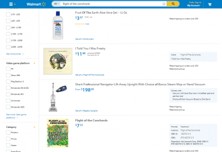
Even big players like Walmart sometimes get this one wrong.
Two bad results right next to two good ones – no one’s going to be singing praises for Walmart’s search.
The fix here can be a range of things – featured results, filters that help with a drilldown, or a new engine altogether, depending on your budget. It’s okay if you don’t fix this one right away, but it does help to keep this on the radar, especially if your analytics tool tells you the exit rates after people conduct a search is through the roof.
4. Out of Stock Items
There is quite a bit of technical nuance getting this one right, but it’s typically one of those harder problems worth solving. When your product is out of stock, it should stop getting displayed on category pages – or at least, it should stop getting featured as a product you are pushing from within other product pages.
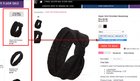
Forever21 features a headwrap you might want … except that if you do click on the featured product, it’s out of stock. Ouch.
This requires some integration between your inventory management software and your content management system – you should be able to apply rules that let you stop displaying items you don’t have inventory for.
If that requires too much technical savvy, you could do the next best thing – only feature products that have stock, and have your marketing team switch out featured products as the supply runs out.
5. Unexpected Shipping Fees
Shipping costs making the total purchase more than expected was listed as the top reason for shopping cart abandonment in a study released by comScore and UPS in 2014.
You can mitigate this by being upfront and showing your shipping and handling policies before the shoppers gets deep into the site. Instead of asking the shoppers to fill out the shipping info before they find out the fees, ask for their zip code and at least give them an estimate within the shopping cart.
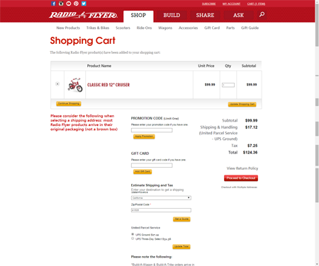
Take Radio Flyer’s lead on giving the customer a heads up on the shipping costs and taxes. They have an estimator built into the shopping cart that gives the customer a shipping and tax quote just by asking for their state and zip code.
Don’t be full of surprises
The less you interrupt and present customers things they do not expect, the better off your conversion rate will be. Customers are more likely to complete the task they set out to do if you don’t block them on their way in, freak out their primitive brain every 3 to 5 seconds with a rotating banner, show them products that are unavailable or irrelevant, or tell them at the last minute what they have to pay for shipping.
