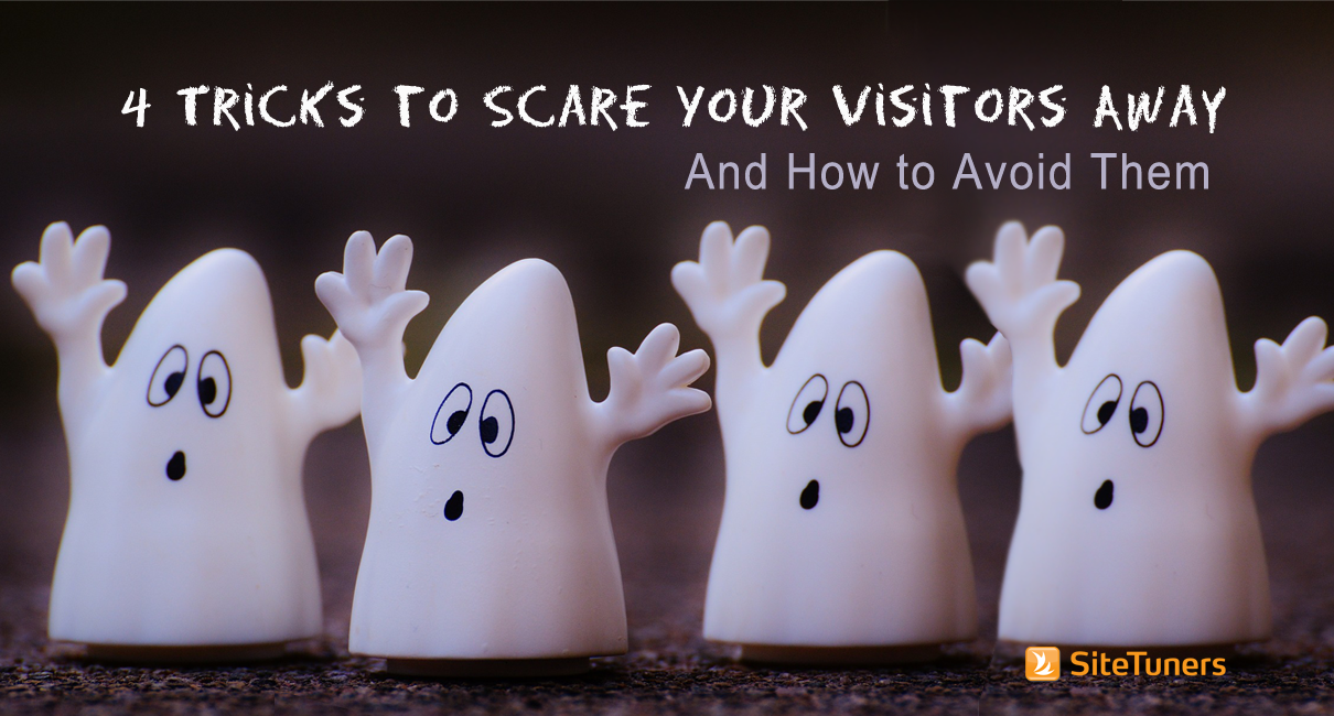
 It’s Halloween. Time to whip out the frightening images to get into the spirit with online shoppers. But then again, there are websites that don’t need to don Halloween costumes to send their potential customers running. And unless you want your e-commerce funnel to be bleeding money like Jason slashed the bejeezus out of it, you better avoid these four tricks that scare visitors away.
Ghostly Call to Action: Confusing the Customer
Take a stab at guessing what this page wants you to do:
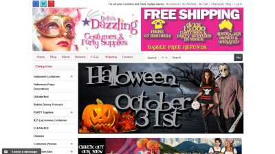
Really. Go ahead and take a minute.
Is the page trying to remind you that yes, Halloween is indeed on October 31? What do you think happens when you click on that giant image? What is it exactly that the page wants you to do?
Pages without a call-to-action are ghostly like that. Visitors get the eerie feeling that they have to do something, but they don’t know where or how to do it. So before you get excited about putting up all the Halloween decors on your website, remember that your visitors don’t go to your site to appreciate the really cool images you’ve put there; they’re there to accomplish a task. They want to check prices for Halloween decor, browse for costume ideas, or transact with you for the right-priced shirt. If what you’re showing them isn’t clear or doesn’t match their intent, you’re just getting in their way.
It’s important for the page to focus attention on a specific area, and to be very clear about what that area does. It’s important to label from the user’s perspective. Don’t use “Submit” or “Reset;” use words that complete the tasks visitors come to you for, like “Add to Cart” or “Buy It” with the price listed on the button.
Monstrous Clutter: Overwhelming the Customer
Too much text
Nielsen hit the nail on the head 16 years ago: people do not read on the web. It’s important not to overdo text for pages that get significant organic search traffic, but it’s even more critical for landing pages for AdWords. Consider the ad below:
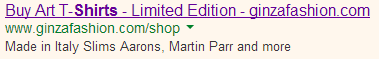
Ideally, that ad would take you to a visual listing of shirt categories, and the headline will match the ad copy. Or it could take you to a page that focuses solely on the shirt selection process. Instead, you get a web page with globs and globs of text enough to put the dwellings of the Swamp Thing to shame: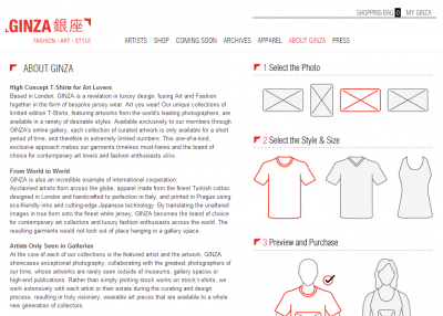
Unless people are on Time or Arts and Letters Daily, they aren’t looking forward to wading through murky blocks of text. If you are an e-commerce site, and especially if you are paying for the traffic, keep the text short and focused.
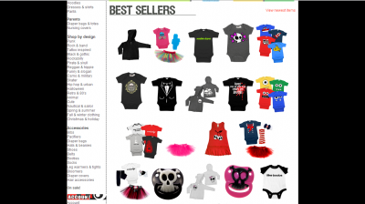
Too many choices
Cognitive science research shows that people can only hold about seven items in their short-term memory, so having a huge number of choices in the navigation column spells horror for user experience. If you have a lot of items, the trick is to use higher level groupings that the visitor can use to drill down to find the product that they’re looking for. Also, instead of putting a rotating banner or product level stuff on your homepage (even if they are your bestsellers), use this prime real estate to present your items into a few simple categories with images of constructed collages representative of those categories.
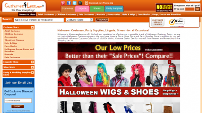
Freakish Design: Losing the Customer’s Trust
Your page has another task besides navigation, and that is to establish trust and credibility. You can do this by making important trustmarks visible and by making sure your site has high production quality. And remember that just as every image on your site has to support your desired action, font treatment has a purpose too: to differentiate something from the rest of the page and help the visitor organize information. So don’t go on a “fontify-ing spree” if it doesn’t serve that purpose.
Take the homepage below, for example. It uses too many different font treatments that are unnecessary and make the site look cheesy and unprofessional:
Paranormal Activity: Visually Distracting the Customer
There are seasons when some visual flair is forgivable, and Halloween thrives on pizzazz. Still, you want to draw a line between “flair” and “distraction.” And sometimes pop-ups appearing out of nowhere can just induce heart attacks. Like the pop-up below from BuyCostumes.com, which shows itself way too soon (even before you’re through looking at navigation elements):
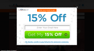
The lesson here: Try not to get in the user’s way. When the visitor goes through options on your site, that’s a good thing – don’t try to compete for attention using a set of elements they did not request.
Remember, users come to your web site with a task in mind. You won’t help all of them accomplish the task, but you do want to keep their success rate as high as possible. It might be Halloween, but the last thing you want to do is chase customers away. Steer clear of terrifyingly unprofessional designs, don’t spook visitors with an unclear CTA, keep the monster away by cutting content down to a precise minimum, and don’t jump your visitors with unwelcome distractions.
Work with the best!Kickstart your optimization with a 90-minute Website Review from the pioneers in conversion rate optimization. Our CRO experts at SiteTuners can help diagnose your website from a conversion and usability perspective. |