Early in the year is a good time to step back from the crazy rush of quarterly reports, hitting all the required conversion metrics for the year, and just … SEEING if the web site works.
That’s not in the “does my web page load quickly on desktop and mobile” sense, but in the “is it actually usable for my target audience” sense. Every web site has usability issues. The key is to eliminate the crippling usability issues that keep your audience from performing the actions that you want them to perform.
So it might be time to stop thinking about the quarter’s goals for just a while, and evaluate your web site usability pan.
1. Find a Way to Target the Deal-Breakers
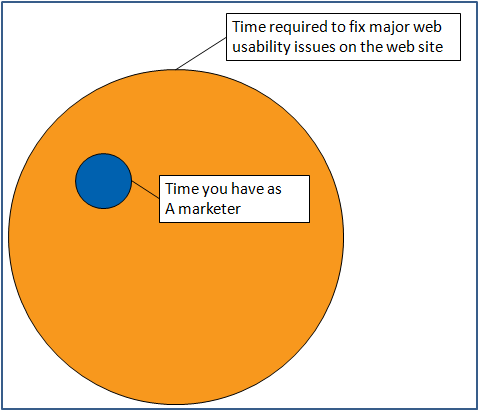
Steve Krug, author of Don’t Make Me Think, notes that there’s never enough time to fix all major usability issues on a web site. All web sites essentially deal with this:
The key to a good user experience, then, is to make good use of the smaller circle – to make sure that with the limited time you have, you are fixing the absolute deal-breakers, the things that make people leave annoyed at your web site.
That means putting more wood behind fewer arrows, and really analyzing where things go wrong. There are some great ways to check for that:
- If you have a user survey, the worst usability issues are usually the tasks that have the lowest accomplishment rates (where people say they can’t find what they need)
- If you have Google Analytics, this is where things like weighted sort come into play, to show you the most abandoned high-traffic areas
- If you have periodic usability tests, these are the ones where majority of the participants can’t perform their tasks
- If you have Google Analytics intelligence alerts set up, they’ll tell you when major bad things happen to the web site without you constantly monitoring for worst-case scenarios – that creates more time for you to focus on surveys, usability tests, etc.
The key is to not try to blindly fix everything, but to use web analytics data and usability tests to uncover which issues are absolutely crippling your users, then target those first.
2. Evaluate and Improve Your Technology Stack
Depending on what tools you have available, some usability issues on your site may be invisible to you.
If you’re just starting out and all you have is Google Search Console to check if your web site is getting indexed, you may be fine with that. If, however, you’re not in the “just launched this web site” phase, you really should check where you should be as far as tools go:
- Use this list to see the kinds of tools you should be using at different stages of web site and conversion maturity
- Use this article to help you select a survey tool that’s right for you – an effective survey will reveal usability blind spots that tools like Google Analytics just can’t
- Use these questions to get the most out of your surveys – the right questions will let you know almost immediately what the biggest web site problems are
Find out what visitors want, whether they can get to it, and what’s broken on your site in 5 essential survey questions.
Your technology stack is going to help determine how well you’ll be able to spot usability problems – leave it dormant too long, and more and more invisible problems will plague your site.
3. Treat Web Usability Tasks as a Cycle
You may have individual projects that get done and pertain to web usability, but web usability itself isn’t a projectand can’t be “done.” Just like search engine optimization and conversion rate optimization, web usability isn’t a project you can tick off a list – you can’t really call it a day after you launch a feature that fixes something. You have to tackle web usability as a cycle:
- Don’t focus too much on the absolute number.Your bounce rate can be 35%, it can be 50% – but you need to obsess about the trend line. You need to check that your bounce rate, cart abandonment rates, and other bad things trend down over time
- Don’t rely on web site overhauls, and never stop fixing issues. You should always have some split test going on, some usability test active, etc., even if you don’t necessarily have the bandwidth for a web site audit or relaunch to fix known issues
- If simple and complicated fixes exist, have a bias towards simpler fixes – they are less likely to break something else
Putting It All Together
If you use your time to find and fix the deal-breakers, regularly update the technology stack, and think of usability as a cycle rather than a project, you’ll be in a great position to keep usability issues to a minimum.

