Let’s jump right in.
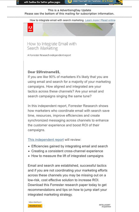
1. No Mobile Adjustments at All

2. Unadjusted Text and Hotspots
Adobe is one of the best there is at digital software – which makes mistakes like this one stand out more. On mobile, there’s a read-to-tap asymmetry: many of the things that are large enough to read are not large enough to tap. To deal with this, you have to make your hotspots for interaction larger.
The thumb operating on a 4-inch screen isn’t nearly as precise as a mouse interacting with a 19-inch screen, so you need to give your users larger targets.
3. Death By Promos
Speaking of that 4-inch screen, there’s only so much of it. We certainly don’t recommend wasting any space on the desktop, but on a mobile screen, one inch will spell the difference between an engaged visitor and a visitor who will bounce.
Target’s home page doesn’t leave any room for the categories when you land – it just shows 3 promos. Promo areas are fine, but you need to show users how they can navigate through your mobile site first. They almost do that here, towards the bottom of the page, but you can do a lot better by presenting promos further down the line, when the user has made a few choices.
4. Unclear Icons
The hamburger menu – the three stacked lines typically found at the upper left hand corner of the site – indicates that you can use that area to show the primary navigation options. Some sites actually add “MENU” next to that just to be very explicit, since this is an emerging standard. People are just getting used to this, so it pays to follow the standard pretty closely.
CDW’s clipboard area at the upper left hand creates enough ambivalence to be noticeable, but it does not help users in any way. In general, you want users not to think about what your navigation options look like, so you can get out of the way of a transaction.
5. Missing Call to Action
Remember splash screens, from when we were just starting out with the web? Do you feel an overwhelming sense of nostalgia, and wish we went back to that? No?
Then you probably hate the return of that trend as much as we do.
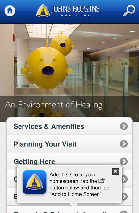
For whatever reason, the web site folks at Johns Hopkins University think mobile home pages like this are okay – and they are not alone. Since smart phones became a thing, a lot of sites have resorted to 1997-era, no call-to-action pages, just when you thought the war with the splash page is long gone.
Don’t make this mistake – create pages with clear navigation elements and calls-to-action.
6. Jumping the Gun
Not to pick on Johns Hopkins, but their medicine site immediately asks you to add the home screen to your phone without even letting you navigate. These are the mobile counterparts of popups on desktops before you’ve had the chance to view the page for two seconds.
It’s a bad idea – let your users navigate, provide value, and then when you’ve provided a good user experience, make offers like these. These should never be used right out of the gate.
7. Unfocused Visuals
Saying the New York Barbells site has “unfocused visuals” really doesn’t begin to capture the point. That’s like calling the white-hot, face-melting explosions at the center of the sun, “mildly warm.” Heck, even the screen capture doesn’t do it justice, since some of those selections towards the bottom are animated.
Suffice to say, even in 2015, a lot of sites still get visuals wrong. Visuals should be used to reinforce navigation options, and you can’t use too many of them in too small a screen without overwhelming the user. Be deliberate and tactful when using images for mobile, is what we’re trying to say.
Avoid the Worst Mistakes
Remember, just about everyone makes mistakes about the mobile experiences, but you can’t afford to make the bigger ones. If you care about the user experience at all, you’ll avoid the ones that will make users scramble out of your mobile site:
- No Mobile Adjustments at All
- Unadjusted Text and Hotspots
- Death By Promos
- Unclear Icons
- Missing Call to Action
- Jumping the Gun
- Unfocused Visuals
