Price activates our loss-avoidance mechanism – all our brains work that way.
Fear of loss motivates us twice as much as the potential for gains. So for purchases to go smoothly, you have to work with the part of the brain that handles pain, and soothe away the hurt.
Thankfully, that’s a fairly well understood science. You can optimize the way you present price points. What you need to remember is simple: you are dealing with irrational brains.
Brains anchor against the first thing they “see.” They get affected by options that add nothing to the conversation. They are affected by the format of the presentation, on top of the meaning of the content – so they will like one thing over another even if those options are essentially the same thing.
Let’s dive in.
1. Show Items in Decreasing Price Order
When you shop for men’s clothing, notice that they offer the suit first; the shoes, belt, tie, and cufflinks come later. Selling a $50 tie before the $1000 suit wouldn’t work because people anchor on first thing they see.
That’s completely irrational – you should be comparing suits to suits, and ties to ties – but you will think of it the next time you shop, even if you know it’s irrational.
So what does that mean for you as a marketer? It means you need to pay attention to what people see first. You need to optimize for that irrationality.
Putting plans or packages in a logical manner can cost you a lot of money.
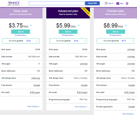
For instance, if you look at Yahoo Small Business Website Hosting plans, you’ll see the $3.75 plan first, the $5.99 plan second, and the one for $8.99 last (from left to right because that’s how people generally read). Experienced this way, you probably won’t be inclined to sign up for the most expensive plan because it has to be about 2.4 times better than the cheapest one.
By contrast, the Attention Wizard, a piece of software from SiteTuners that predicts where visual attention goes on a landing page, lists its three packages in decreasing price order. The first one is $197/month, the second is $97/month, so by the time you get to the last one, you’ll probably consider it a bargain at $27/month.
If you look closely though, you’ll realize that the cheapest plan does not offer the best bang for your buck. You get 200 heatmaps for $197 (that’s essentially a $1/piece), the silver’s $2/piece, and the bronze costs about $3/piece.
That’s not how most will look at it, however. Your brain will be too focused on how the total price of the third plan is so much lower than the other two, for you to realize that you’re getting less for your money.
2. Add an Inferior Option
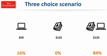
Dan Ariely, a psychologist focused on behavioral economics, ran a test on subscription packages that The Economist was offering which were as follows:
- Online subscription – $59
- Print subscription- $129
- Online and print subscription- $129
He asked 100 MIT students to choose one option, and the market share was:
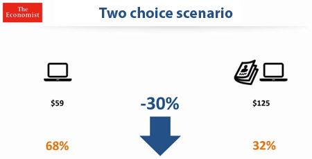
Since nobody chose the print-only plan, Dan removed it and presented only two choices to another set of 100 MIT students. That resulted to this:
By removing what seemed to be a useless option, revenue decreased by 30% as more people chose the cheaper plan. The $125 print-only plan, which did not make sense, actually biased people towards the $125 print and online plan – the $125 print-only plan made the print and online plan at the same price look like a steal.
3. De-emphasize Price Symbols
Price is mapped to the same area in the brain as physical pain. When we see currency symbols, we experience it as pain as we automatically associate that with price. To lessen that pain, you can remove the symbol if it’s obvious the number represents a price. Otherwise, make the symbol as small as you possibly can.
This is what some smart restaurants are doing right with their menu. They …
- take off the dollar sign,
- don’t include the .00 because that makes the number look bigger, and
- bias towards the higher-priced items – they put expensive stuff (entrees) before the upsell (sides)
Lessening the Pain
Context and the specific set of choices you present to people have an impact on what they end up choosing.
So be deliberate in what you include as choices (put irrational anchors to increase the sales of the reasonable compromise), in how you arrange the offers, and how you present prices.
