When a lot of people think of split tests, they usually think about changing the headline of a page or the color of the call-to-action (CTA). There’s room for those tests in the overall scheme of things, but testing is so much broader than that.
There are a ton of interesting things you can do to boost conversions using tests, but you can only start getting to the more rewarding tests once you get the belief that headlines and CTAs are the only things you can test out of your system.
Case in point: persuasion.
You can test which persuasion principles works best on your audience.
The Trouble with Traditional Split Testing
One of the most famous cases of using testing data to assess color actually comes from Google. What Google did was, they tested 41 shades of blue to assess which one resulted to the most click-throughs.
There are still debates in the marketing community whether that activity was a smart use of data, or data overkill that leaves designers basically crippled. But the incident was popular enough that when some people think of using split tests to be “like Google,” they sometimes mean do what Google did with colors, only on a smaller scale.
These three elements often get tinkered with on tests:
- Headline text
- CTA text
- Button color
There’s nothing wrong with testing those elements per se – they should be optimized. They absolutely should be part of the testing toolbox. The problem with how a lot of companies run tests is that they treat those three things as the only tools in the box – that’s when you start running into artificial limits of testing, and get in trouble.
There are a ton of other things you can test.
Persuasion Principles
If you’re looking to expand on elements to test, a great place to start is the set of elements you use to persuade users into doing things:
-
Liking
In his new book Pre-Suasion: A Revolutionary Way to Influence and Persuade, Robert Cialdini reminds us that, ‘We like those who are like us.’
And the more your audience likes you, the more likely they are to do business with you.
On the web, this translates to speaking the language that your users speak. Identify who your target audience is and make sure that your editorial tone appeals to them. Consumers want to do business with companies who seem to understand them.
Don’t worry about alienating those who are not part of your target audience– don’t try to sell to everyone.
-
Scarcity
When offers are only on the table for a limited amount of time, users are more likely to act rather than wait. For web sites, this means either adding elements like “stock left” or “time until this offer expires.”
Booking.com, for instance, persuades visitors to book a room now by showing the number of rooms left and indicating that a property is ‘In high demand.’ (Emphasis mine.)
-
Consistency
Once people have started down a particular path, they are more likely to continue on the path because people want to be consistent.
Cialdini notes that, “ … we want to be (and to be seen) as consistent with our existing commitments—such as the previous statements we’ve made, stands we’ve taken, and actions we’ve performed.”
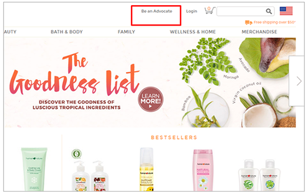
Human Heart Nature, a social enterprise that sells environment-friendly and cruelty-free cosmetic products, leverages the consistency principle. Instead of asking the customer to ‘Sign Up’, the site encourages shoppers to ‘Be an Advocate.’ (Emphasis mine) By calling shoppers ‘advocates,’ the company makes shoppers more likely to become repeat buyers. This is because customers will want to be consistent with the ‘advocate’ label.
You can also employ the consistency principle by using progressive disclosure on forms – only ask for a few pieces of information on the first page of the checkout, then ask for more information once users have started down the checkout path.
-
Authority
The more you’re seen as an expert, the more persuasive you are.
One way to bolster your web site’s authority is by adding logos of popular clients or media companies where you have been featured.
Hotjar, for instance, establishes authority by showing marquee client logos. They tell web visitors that if Nintendo and Microsoft trust Hotjar, so should you.
-
Reciprocity
People are likely to reciprocate goodwill. Online, this could mean giving away that whitepaper without asking users to give up their email address.
-
Social Proof
When in doubt, people tend to follow how others acted in a similar situation. And things used and viewed positively by other people get extra credibility.
Online, this can mean adding customer reviews, ratings, and messages like “used by over a million happy customers.”
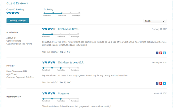
Disneystore.com, for example, leverages the social proof principle by helping visitors decide what size of a clothing item to get by showing other customers’ fit rating.
Audiences are Different
Now, while each of those persuasion principles has some power on its own, the principles usually work better when 2 or 3 of them are utilized in unison. To complicate matters further, some people respond more to authority and social proof, others to scarcity and liking, and so on – you need to test what works best with your particular audience.
Operative word: test.
Split Testing to the Rescue
Say you have primary real estate at the top of your page, below your headline. You can either use it to display the ratings for your product page, or the time limit on your offer – the other element will still be there, it’s just not going to be as prominent.
That’s the perfect scenario for a split test – and it has nothing to do with your headline and CTA.
Now, apply that to other persuasion elements, and you have a pretty good base of ideas to start testing in your critical product pages.
Putting It All Together
There’s a time and place to test your headline and call-to-action. That said, those shouldn’t be the only things you test. A good place to start when looking for things to test for improved conversions is your set of persuasion elements.
You should test how prominent persuasion elements are, especially those for authority, scarcity, and social proof.


