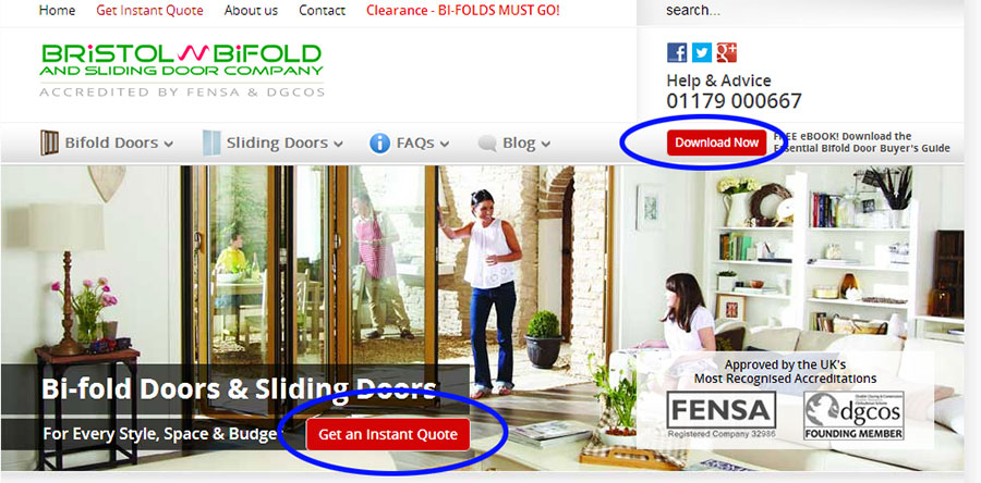
Bristol Bifold gets a number of things right. First off, they present what the company does to a visitor who is just scanning the page rather than reading everything. At a minimum, a site visitor will know what the company does within seconds of entry. The landing page has three key areas that work particularly well:
1. There is a clear headline and subheadline
2. While the image may be too large, (taking up precious real estate above the fold) it does a solid job of reinforcing the headline
3. The accreditation elements are above the fold, and those help initiate the relationship of trust with the user (FENSA and dgcos)
Navigation
The navigation is confusing at best. First off, there are navigation elements above the Site ID (the logo that links back to the home page). No one will think to look for it there – but visitors might find the navigation elements below the Site ID. There can be better information “chunking” done to get the categories right, and display those where users expect them to be, which is below the company logo.
If this page is getting used for a PPC campaign, it’s the wrong page to use. This is the landing page and there are multiple paths to take that would lead visitors away from the desired conversion path. Further, it’s tougher to make tweaks required to make it convert better, because every department in the company wants a piece of the landing page.
Elements
The elements on the actual page can use some work. Not everything about the company belongs to this one page, but everything is crammed here:
1. Six paragraphs about the company
(This belongs to the About Us section, not the landing page)
2. Showroom opening hours
3. A copy of the navigation links at the top
Steve Krug’s mantra, aside from “don’t make me think,” is “take out 50% of the content, then leave half of that,” and it applies here.
Layout
To make matters worse, important elements like testimonials are buried below the fold, and research shows visitors are not likely to scroll down to see those elements.
Calls-to-Action
The calls-to-action are above the fold, and they apply good messaging techniques. “Get an Instant Quote” sets the expectation for the visitor and uses the correct action (rather than, say, “submit” for a form, or “free trial” for software).
Images as Link Anchors
As navigation anchors, images indicating “Find Out More” are about as bad as things can get. There are very few visitors who will associate the link “Aluminum Bifold Doors” with the image below the bullets while scanning a page. If images are associated to a navigation element, put them at the left side of the option, where visitors expect them, or do not use elements between the nav element and the image.
Bottom Line
This page has the beginnings of a good page in the clear headline, prominent trust elements, and good CTA messaging, but it needs to get trimmed. The page can do without the “Find Out More” image anchors, “And There’s More” section, showroom opening hours, and “About Bristol Bifold” section – those should be either moved or deleted.
With the space that will free up, a smaller version of the testimonials can move above the fold, along with social proof if the company keeps that handy. Confusing navigation elements can be streamlined and navigation cleaned up, retaining only what’s required for the page.
We at SiteTuners hope you can find common things to improve on here that you can apply to your site. For more usability reviews, check out Tim’s Webinar with Oli.


