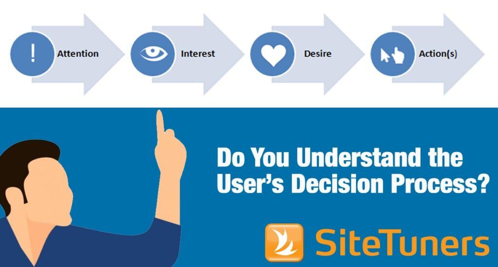
 I’ve talked about “how” you can make your product pages more persuasive before. The idea is that usability is just scratching the surface. Product page usability is about making sure your visitors CAN find the call-to-action. That by itself is very important but it’s a mediocre criterion for success. Persuasion is the craft of making visitors WANT TO click on your CTAs.
Motivation, Triggers, and Persuasion
 Here, it’s worth revisiting Dr. BJ Fogg’s Behavior Model. According to the model, people will only respond and act on your triggers if ability and motivation are both high. When one of these conditions is absent, it’s harder to spur people to take action.
Your mission as a digital marketer is to make sure the convergence in motivation, trigger, and ability happens. When motivation is already present, your job becomes easier; you just have to give a little nudge to folks who have expressed interest or a need of your products or services. This means ensuring that visitors can easily find your call-to-action a.k.a. trigger (e.g. making the CTA stand out by using irregular shapes, utilizing color contrast, using a larger size, or using negative space to draw attention to the right things).
Fixing things at the ability side means ensuring an effortless interaction with your website (remember Steve Krug’s “Don’t Make Me Think”). It can also mean lesser form fields, saving a customer’s cart for a longer period of time, or providing a guest option during checkout.
But what do you do when motivation is low?
This is where knowledge of persuasion tools based on human behavior and psychology come in handy.
Persuasion Tools
The most obvious tools you have at your disposal are what psychologist Susan Weinschenk likes to call tricks of the mind.
One trick is anchoring – brains attach themselves to the first number they notice. That’s why it’s important to put the discount, and the discounted price because people will “anchor” against the list price, and notice what they’ll save.
The second trick is avoiding what Daniel Kahneman calls “system 2.” According to Kahneman, majority of our day is spent on autopilot: take a bath, brush your teeth, get to work. So most of thinking that happens is quick, intuitive, and effortless. That is, until we have to solve math problems in our head, name 10 animals that start with “e,” or otherwise need to think really hard – that kicks in the other gear, system 2. There are some uses for it – people tend to solve problems a little better when the fonts are harder to read, for instance – but for your product pages to be persuasive, you need to keep system 2 from taking over.
Motivators: Hopes and Fears, Social Acceptance and Rejection
The other idea is that you need to have elements that tend to the visitors’ hopes, as well as their fears. The hopes can be taken care of by the nice product “hero” shot, or the price and discount anchoring. However, to get more out of your page, you also need to put in “limiters.” This means displaying the number of stock available, or the amount of time left before a promo runs out. At an instinctive level, the brain gets motivated by the fear of loss more than the excitement of a gain, so you can’t afford to miss out on the fears aspect.
The other knob you can turn for persuasion is social. For campaigns, this is why “be a donor” works better than “donate.” The noun helps people attach themselves to a group, to self-select. Our brains are still tribal, we’ve just formed more sophisticated tribes – we have a need to belong, and the right social signals help tap into that.
Stories We Tell
Still related to the need to belong is that people like to be consistent about the groups they belong to, and the stories they tell about themselves. This is the reason Amazon uses systems that tell people, “Customers who bought this item also bought” related items.
Our self-image, along with strong ties to a self-selected group, makes features like those really work.
Beyond Usability
Scarcity, price anchoring, social proof, and related items are hardly new tools, but they help you make the sale so much more than if you were just concerned about usability. Remember, celebrating that your CTA can be found is a little like KFC celebrating that their delivery numbers are easy to find – by itself, it’s a vanity metric. The real test is how many people order the chicken.
Take your conversions to the next level.Learn how our experts at SiteTuners can help kickstart your conversion rate optimization process or get better results from your CRO efforts. Give us 30 minutes, and we’ll show you a roadmap to your digital growth! |