Direct response landing pages take some work to get right, but they offer unique opportunities.
That is, if you control where the traffic comes from (e.g. an AdWords ad for a product trial, an email offer for a service, etc.) and your landing page is designed specifically for that offer, you have options to improve the page that would not exist for more “general” pages on your site.
To improve the experience on your landing pages, you’ll need two things:
- General web usability knowledge
- Tools and processes that can help get you kick into high gear
Let’s dive in.
General Landing Page Tips
We’ve written about general tips for landing pages before, so let’s just run through the CliffsNotes version:
- Eliminate unnecessary elements and choices – keep your batting average high by having a main action the page supports, and zero distractions
- Don’t ask for too much information – sure, you need that sign up. Do you need more than name and email, though? Keep your demands at this point low
- Have a clear action – let the user know what he or she needs to do next
- Make trust elements visible – visitors who don’t feel secure interacting with you won’t do much on your site. It doesn’t take a lot of space to show trust elements, and they are absolutely worth putting above the fold
If any one of those things are broken, the tools and processes listed below will not move the needle. You have to fix what’s broken first – those are table stakes.
If you have those four down, you can then work on optimizing your landing pages.
Don’t make your visitors walk on broken glass.
Click here to read 7 Things You’re Doing Wrong on Your Landing Pages and How to Fix Them.
Tools and Processes to Improve Direct Response Landing Pages
Use Google Content Experiments on the Headline and CTAs
One of the most basic tenets of landing pages coming from a specific source is upstream continuity.
Your page has to do what it says on the tin. The ad cannot be about “how to select digital cameras” while your landing page is about the features of your company’s digital camera. The matching has to be pretty close, and you need to work on your headline and your CTA to optimize how you match the intent.
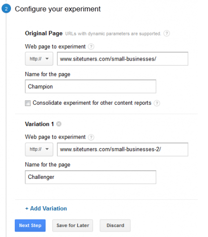
If you’re not split testing this kind of content yet, it’s a good idea to get your feet wet on testing using Content Experiments within Google Analytics.
Here’s a primer on how you can get your first test up – for those who are on the fence about testing, it should take minutes rather than weeks, and it’s not very technical.
With direct response landing pages, you’ll want to …
- … split test the headline while matching the ad or traffic source
- … split test the call-to-action
The nice thing about split testing a page like this is that it serves a very particular master. With other types of pages, you might lift the conversion rate for a certain group of visitors while tanking it for another group. There’s minimal risk of that here – you can’t really shoot yourself in the foot if the page is designed for a very specific group of users with known intent.
Use Chrome Window Resizer to Check What Your Users See
If you have Google Analytics, you can see the device and screen size breakdown for any given section of the site. That data is very important to landing pages, where what’s above the fold is even more critical. While GA can give you the data and thus, the screen size to prioritize, it can be hard to visualize the different sizes you need to care about accurately.
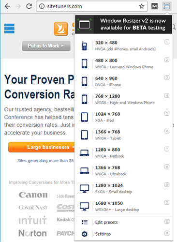
That’s where Chrome Window Resizer comes in. (Add it to your extensions here)
Essentially, it helps you see what your page will look like given a specific screen size quickly:
That can help you find and fix issues more efficiently.
Use Auto-fill to Make it Easy for Users to Fill Out your Forms
Auto-fill is one of those things that tend to go into the backburner for most organizations. Everyone tends to agree it is valuable, while not being sure how easy or technical it is to implement.
If you have a short form on your direct response landing page, though, auto-fill is not some theoretical next step you should take next year when you have more time – it is something that you should look into now.
As for how technical it is, well, here’s the amount of scripts you’ll need for a name auto-complete:
Auto-fill Name
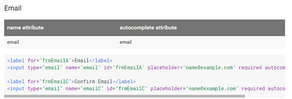
And here’s what you’’ll need for email: (note that there’s a part of the script cut off – get the whole sample here)
Auto-fill Email
If those fields don’t look all that intimidating, (and it should be in the wheelhouse of most organizations, even those with very few development-centric resources) there’s no reason to wait on auto-fill implementation.
Putting It All Together
Improving landing pages isn’t easy, but it is critical.
If you follow general web usability best practices, use split tests on the headline and CTAs, check the screen sizes efficiently, and remove the friction from user tasks by implementing things like auto-fill for forms, you will become much better at not leaving money on the table.
