 Mobile is where the consumers are. So that’s where marketers need to be.
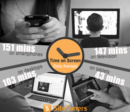
According to SeeWhy Chief Strategy Officer Charles Nicholls, on average per day people spend …
-
- 151 minutes on smartphones,
-
- 147 minutes on TV,
-
- 103 minutes on desktops, and
-
- 43 minutes on tablets
Time spent on TV is also impacted by smartphones and tablets due to multiscreening. Consumers don’t devote their time to a single screen – 84% use either a tablet or a smartphone while watching TV.
Charles shares that currently in conversions, PCs dominate and that tablets are better conversion devices than phones. He predicts, however, that phone conversions will pass tablets within a quarter. This is because, although tablets are growing at 52%, phones are 4 to 5 times the volume of TV and PC.

Last year, SeeWhy’s Conversion Academy interviewed more than 60,000 consumers in the US and the study revealed that …
-
- 81% were not comfortable shopping on smartphones, and
-
- 80% were not comfortable shopping on tablets
However, Charles notes that, on average, it takes 5 touches and 2.6 different devices before a consumer converts. So, while people don’t perceive mobile as a buying device yet, it is often part of the purchase path.
Here are 4 ways to optimize the mobile user experience and ultimately overcome the mobile perception challenge.
Break forms into multiple, simple steps
A major contributing factor to Uber’s success is people’s perception of the taxi app as being effortless. (It only takes 2 clicks to get a cab)The app looks easy, so people are encouraged to give it a go.
Create the perception of effortlessness by having the users go through a series of baby steps.
According to Charles, evidence shows that the further people go into a conversion process, the more committed they get. Once a consumer commits to one little thing, they’re more likely to go through with the process because that behavior of that initial commitment -the micro conversion – is reinforced.
A case study by Kyle Rush on a heavily tested landing page resulted in a 5% + conversion lift by breaking the form into multiple, simple steps.
Retarget through e-mail
A couple of significant numbers about how e-mail and mobile go together:
-
- 65% of e-mail is opened on a smartphone first
-
- 83% of conversions come from a direct link, and 62% of this come from e-mail
E-mail is great at driving conversions because it eliminates half of the of the conversion process. If you have a direct link to the subject of the conversion (e.g. whitepaper, product page), consumers don’t have to do the same search they just did on another device.
E-mail solves identification, personalization, and tracking people across devices. With Amazon.com (which is 7 times larger than their nearest competitor in mobile sales), for example, it takes only 5 clicks from a follow-up e-mail to a mobile purchase:
-
- Click through from e-mail – email showing previously browsed item
-
- Add to cart – Product detail page
-
- Login page (which already has the e-mail address) –
-
- Click ‘Proceed’ – Cart Summary
-
- Buy- Order Summary
Ask for less information
Storing login details makes it easy for people to log in on different devices and result to a dramatic increase in conversion rates. The same is true with storing payment details in e-commerce.
Also, offering alternate payments such as PayPal and Google Wallet doubles conversions.
In mobile, 94% of shoppers who get to the selection process don’t proceed because the next page typically requires them to enter data. So you need to have an alternative payments checkout flow and offer the alternative payments method before the user gets to the register/ login page.
Charles advises to just use one or two alternate payment methods, and to test which ones work for your audience. He warns that research shows that consumers generally distrust PayPal because they get a sense that they’ll be hit with hidden charges.
You can also reduce friction by not asking for unnecessary details. For instance, when a visitor gives you the zip code, you don’t need to ask for the city and state.
Design for OmniChannel
A cookie is assigned to the consumer’s user ID when signed in, and allows them to access their cart across multiple devices/ browsers.
You can make it easier for customers to actively move between channels. When a customer comes back to an empty cart, they sign in, and you store it correctly with a full persistent cart rather than a cookie-based cart. Essentially, a cookie-based system will only remember one device – one desktop, one laptop, one tablet. But if you have a full persistent cart, the visitor will be remembered regardless of what device they use.
This in turn helps reduce the friction, which is especially important because as stated before, it takes an average of 2.6 devices across multiple touchpoints for a conversion activity.
Phone as a conversion device
Gilt Mobile’s (a flash sale site) fastest checkout was 0.2 seconds for a $5,995 Volkswagen Jetta on an iPhone.
This, according to Charles, shows that consumers will and do convert on mobile if the motivation is right and the experience easy enough.
In mobile, making it look effortless and frictionless (and delivering on those perceptions) is critical. Marketers should aim to leverage the time people spend checking their phones by making sure their mobile experience is optimal. If you eliminate research by having consistency across channels and devices, you’re better positioned in the age of mobile traffic.
https://youtube.com/watch?v=e3pgNWQVKXk
Take your conversions to the next level.Learn how our experts at SiteTuners can help kickstart your conversion rate optimization process or get better results from your CRO efforts. Give us 30 minutes, and we’ll show you a roadmap to your digital growth! |

