 There’s nothing more frustrating to an online marketer than to get a visitor to click on an ad, follow the conversion path through the site, and just when it’s time to sign up – bail out while filling out a form. The fact is, registration flows can be overwhelming – and should be continually analyzed, tweaked, and tested to reduce the number of visitors who abandon mid-stream. The old school of thought was to minimize the amount of “clicks” required of the user by clumping all fields together on a single page. Now, however, most websites can achieve a higher completion rate by simply splitting the registration flow into multiple parts. The first page captures the most important information (the bare information needed to register or sign up), and the secondary information is moved to subsequent pages in the flow.
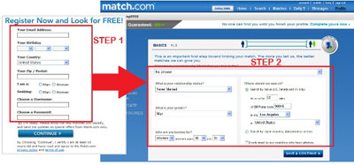
Match.com is an example of getting essentials onto a first page, in a sense signing visitors up. All additional information for full personal profile setup is asked for on later pages, which accomplishes two things: first, it increases the number of visitors who start the sign-up process, because Step 1 makes it seem very quick and easy. Second, it gives Match.com enough information about the visitor to remarket to them if they abandon before completing and posting their profile.
Experiment With Information Staging and the Number of Total Pages
You will eventually need to collect all the necessary information in order for the visitor to complete the transaction, but how you stage and chunk the required data can have a big impact on your completion rate.
Staging refers to the order that you ask for the information. By examining your form fill-out behavior, you can determine which fields are most commonly left blank or take the longest time to complete. Consider asking for the “easy” information first, and only asking for the “difficult” items closer to the end of the process when the visitor has more personal effort (“skin in the game”) already invested.
Similarly, you should experiment with the “chunking” of the form fields. The problem with many flows is that the information that appears on a single screen is not conceptually unified, so the visitor is immediately faced with at least one of these thoughts: “What a hassle” or “I don’t have time for this.” By simply reordering and splitting up the fields into categories you can create a more compact page with a logical sequence built into the flow.
On the other hand, if your sign-up flow requires a relatively small amount of information, you may find that combining the steps into a single page with clear category headings makes sense. “One-step sign-up” can be compelling because the visitor knows exactly what will be expected of them at one glance.
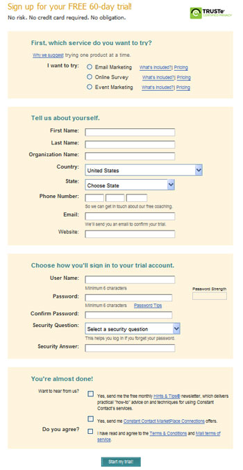
Email service provider Constant Contact, which uses this single-page format, does an effective job of breaking up the fields into conceptual groupings by using action blocks with subheading labels. The clear subheadings help explain why the details are needed, while the right margin is used to reiterate the benefits of sign-up to provide support and reassurance along the way.
This form could have just as easily been broken up into multiple pages. There is no correct answer for form chunking or staging, and you must experiment to get the highest conversion rates.
Clearly Indicate Steps and Progress
Particularly when detailed information is needed across multiple pages, visitors like to know how much progress they are making in the sign-up flow and what steps are ahead of them. Much like in a shopping cart checkout, these progress indicators are usually shown at the top of the page either above the headline (breadcrumb style) or immediately below it.
Limit Sign-Up Fields to the Essentials
Regardless of what type of online form you create, it’s always a best practice to limit the number of fields to what is absolutely essential to complete the transaction. Yes, your sales team wants as much qualifying information as they can get, but that doesn’t mean you should ask for it on the sign-up form. If your form includes fields such as industry, job title, household income, etc., test an alternate version that excludes those extraneous fields. It is often possible to obtain that information through publicly available data or by asking for it at a later point, after the visitor feels a stronger connection to your organization. In most cases, using fewer fields will increase your sign-up conversion rate, hopefully with little impact on your sales and marketing teams.
This article originally appeared in Tim’s ClickZ column June 12, 2012
Take your conversions to the next level.Learn how our experts at SiteTuners can help kickstart your conversion rate optimization process or get better results from your CRO efforts. Give us 30 minutes, and we’ll show you a roadmap to your digital growth! |


